Neutral Sans Workhorse

Blood Horror + Swaraga
Lets Blood Horror own the focal silhouette while handling secondary copy, sizing and subheads cleanly.
Inspect Swaraga specimenDisclosure: MakerFileHub may earn a commission from qualifying purchases via paid links on this page. How our links work.
Dripping horror capitals with ragged edges and hanging tails
Blood Horror is a dripping horror capital alphabet in which the strokes stay chunky, the bottoms melt into hanging tails and the edges stay ragged, so a word reads as something painted in a hurry on a wall.
Paid link
Get this fontProject & layout blueprintsAt-a-glance maker compatibility
Weld or Unite overlapping script joins into one continuous vector path before sending to the blade.
Visual anatomy & craft review
The B holds two fat bowls, the L runs its foot into a drip, the O closes a rough ring, the D hangs two tails, the H keeps a low bar and the R turns a ragged leg, all at a heavy display weight with irregular contours and drips of different lengths below the baseline. The drips are the character: they fall under the word, so the face needs room below and cannot be set tight against another line. Because the shapes are solid, the face holds from 30 pt and prints in one colour, and the ragged edge reads as paint rather than as damage. The dark wall, the fogged edges and the small line beneath are presentation; the red dripping words are the face.
Horror · Dripping · Heavy
Two-font hierarchy recipes
Tested contrast partners — pairing Blood Horror with grounded secondary typography.
Blood Horror + Swaraga
Lets Blood Horror own the focal silhouette while handling secondary copy, sizing and subheads cleanly.
Inspect Swaraga specimen
Blood Horror + Papillon Serif – Elegant Modern Luxury
Grounds bold display lettering with classic typographic authority on posters, badges and apparel.
Inspect Papillon Serif – Elegant Modern Luxury specimenPractical applications
Concrete hierarchy, scale and production guidance tailored to Blood Horror’s stroke geometry.
The drips give a fright night poster its whole mood in a single ink, and the heavy shapes read across a dark wall at 90 mm.
Hierarchy & layout recipe
Print an A2 poster: set the title at 90 mm in one colour, keep 35 mm of clear space under the baseline for the drips, and set the time in a 16 pt caps sans in the bottom band.
Pre-production check
Drips printed over a second line of type look like a fault; check the poster and keep the space under the word empty.
The ragged paint edge suits a temporary haunted house sign, and the heavy weight reads at 120 mm on a board under low light.
Hierarchy & layout recipe
Print a 700 by 400 mm board: set the word at 120 mm, keep 30 mm of border on three sides and 60 mm below for the drips, and print in one flat colour on a matte board so the glare does not swallow it.
Pre-production check
A glossy board under spotlights hides the ragged edge; check the venue lighting and choose a matte stock.
The dripping contours read at 40 mm on a Halloween sweets bag, and the single ink keeps a cheap two-pass print clean and sharp.
Hierarchy & layout recipe
Print a 60 mm round sticker: set the word at 40 mm, keep every drip inside the die by 4 mm, and leave the bottom arc empty so the longest drip is not cut away.
Pre-production check
A die cut through the longest drip leaves a sliver; check the sticker sheet and shorten the drips rather than the word.
Technical & licence verification
Confirm included OTF/TTF/WOFF formats, full glyph tables and licence coverage on the live store page before batch production.
Closest visual alternatives
Matched across letterform anatomy, stroke behaviour and craft applications.
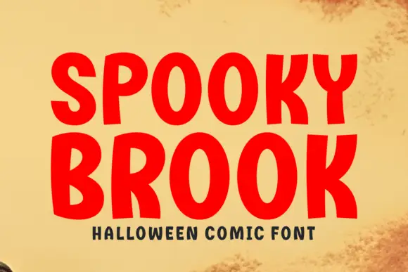
Bold comic caps
Spooky Brook is a bold comic display in red on aged yellow paper: heavy rounded caps with flat tops, a slight bounce, an R with a straight leg and a K whose arm meets the stem at a sharp angle, with a tracked caption beneath in a small bold sans.
Ideas for this font
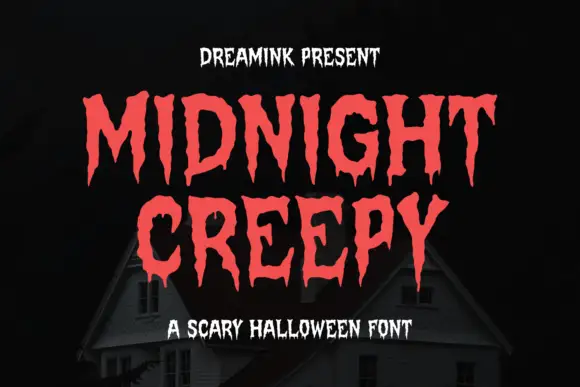
Display
Midnight Creepy is a horror display face in which every stroke melts: the caps are heavy and irregular, and the bottoms of the letters run down into long drips that end in rounded drops.
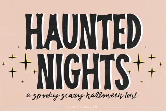
Tall irregular spooky capitals with wobbly contours
Haunted Nights is a tall irregular capital alphabet in which the stems wobble, the counters sag and the outline breaks unevenly, so a two-word greeting reads as lettering cut quickly for a porch sign.
Ideas for this font
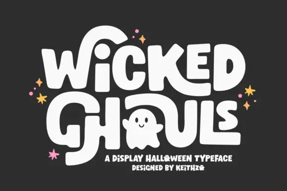
Round Halloween blocks with oversized sweeping strokes
Wicked Ghouls builds heavy softly rounded capitals and then lets one counter become a ghost, with oversized strokes sweeping away from the word.
Ideas for this font
Same independent foundry
Allow optional Google Analytics to measure visits and catalogue actions. Your search words and notes are not included. Privacy & storage