Neutral Sans Workhorse

Nether Black + Furion
Lets Nether Black own the focal silhouette while handling secondary copy, sizing and subheads cleanly.
Inspect Furion specimenDisclosure: MakerFileHub may earn a commission from qualifying purchases via paid links on this page. How our links work.
Jagged symmetrical death-metal thorn display
Nether Black is a ferocious death-metal display typeface erupting with symmetrical thorn spikes and splintered outer wings.
Paid link
Get this fontProject & layout blueprintsAt-a-glance maker compatibility
Fine grain and micro-texture excel in 300 DPI print, sublimation, and screen print rather than small vinyl weeding.
Visual anatomy & craft review
Nether Black is a jagged symmetrical death-metal thorn display: dense blackletter-derived stems with spikes thrown from every arm, mirrored ornaments along the vertical axis and a solid inner field that makes each word read as a barbed plate. It is a scene face, so it belongs on a record sleeve and a club flyer rather than on a product label. The spikes are the finest element and they fill into a solid edge when the face is reduced or screened. It needs roughly 40 mm for the spikes and the stems to read, and it is best one white ink on a black ground or the reverse.
Aggressive · Thorny · Dark
Two-font hierarchy recipes
Tested contrast partners — pairing Nether Black with grounded secondary typography.
Nether Black + Furion
Lets Nether Black own the focal silhouette while handling secondary copy, sizing and subheads cleanly.
Inspect Furion specimen
Nether Black + Vanielst Elegant Serif Display Stylistic
Grounds bold display lettering with classic typographic authority on posters, badges and apparel.
Inspect Vanielst Elegant Serif Display Stylistic specimenPractical applications
Concrete hierarchy, scale and production guidance tailored to Nether Black’s stroke geometry.
A jagged thorn display reads as a hand-cut haunt poster rather than a cartoon monster. The spikes hold at 120 mm on a poster, and one white ink on black prints the poster and the tickets in one order.
Hierarchy & layout recipe
Poster A2, word 120 mm with 16 mm spike clearance, details 36 mm, 20 mm margins. Ticket 100 x 50 mm, word 14 mm, 4 mm perforation. Door plate 200 x 300 mm, word 60 mm, 20 mm margins.
Pre-production check
A 100 x 50 mm ticket at 14 mm fills the spikes into a solid edge and the word reads as a black plate. Raise the ticket to 22 mm, and print one ticket before the batch.
A death-metal thorn face is the printed language of a scene sleeve, so it reads as authentic rather than borrowed. The ornament holds at 90 mm on a sleeve, and one white ink on blackboard carries the cover and the insert.
Hierarchy & layout recipe
Sleeve 310 x 310 mm, word 90 mm with 16 mm spike clearance, 20 mm margins. Insert 300 x 300 mm, head 30 mm, text 9/12 pt. Spine 6 x 310 mm, word 4 mm, 2 mm margins.
Pre-production check
On a 6 mm spine the ornaments close to a solid line and the title is unreadable. Set the spine in a plain cut, and print one sleeve before the run.
A thorn display gives a metal bar a flyer that looks printed by the scene rather than by an agency. The ornament holds at 60 mm on a flyer, and one ink carries the flyer and the coasters.
Hierarchy & layout recipe
Flyer A5, word 60 mm with 14 mm spike clearance, details 9/12 pt, 14 mm margins. Coaster 95 mm round, word 14 mm, 4 mm die margin. Sign 600 x 400 mm, word 100 mm, 25 mm margins.
Pre-production check
On a 95 mm coaster at 14 mm the spikes merge into a saw edge and the word reads as a black disc. Raise the coaster to 22 mm, and print one coaster before the batch.
Technical & licence verification
Confirm included OTF/TTF/WOFF formats, full glyph tables and licence coverage on the live store page before batch production.
Closest visual alternatives
Matched across letterform anatomy, stroke behaviour and craft applications.
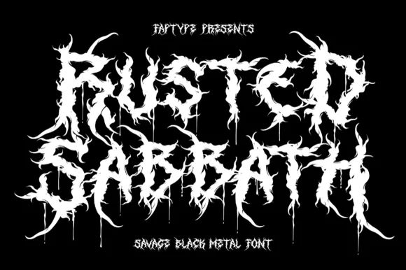
Savage black metal capitals built from spiked, dripping strokes
Rusted Sabbath is a black metal display alphabet in which the stems split into spikes, the counters disappear and the tops of the letters run into flame-like hooks, so a band name reads as a sigil before it reads as words.
Ideas for this font
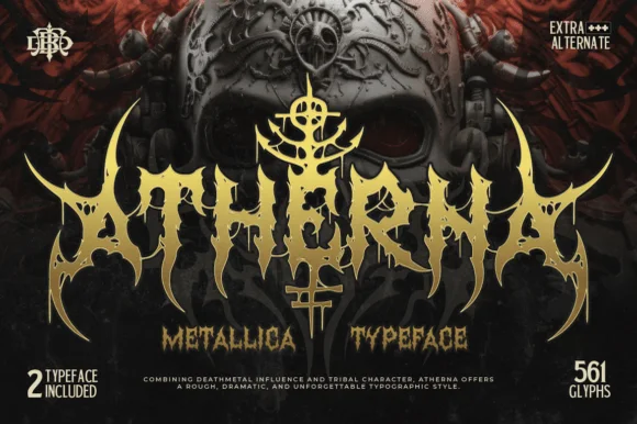
Tribal-horned extreme metal face with dripping points and a horned crest
Atherna is an extreme-metal face in which the letters grow horns and thorns, the joins drip downward and a crest sits above the word, so the mark reads as a tribal sigil rather than as type.
Ideas for this font
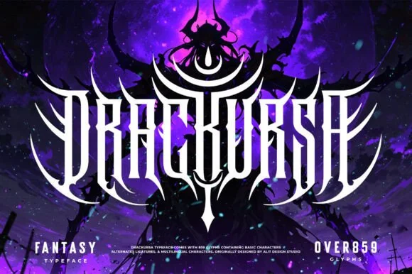
Symmetrical dark-fantasy & death-metal crest font (859+ glyphs)
Drackursa is a monumental 859-glyph dark-fantasy & death-metal typeface engineered with tall vertical blade stems and sweeping wing ligatures.
Ideas for this font
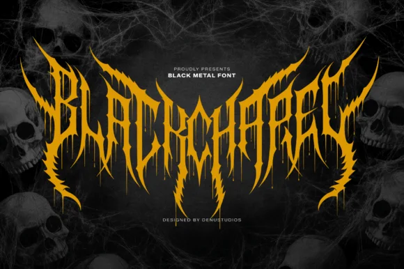
Spiked black-metal sigil lettering with ragged edges and dripping points
Blackchapel is an extreme-metal sigil face in which the letters merge into a spiked mass, the stems split into thorns and the bottoms run into drips, so a word reads as a band logo rather than as readable type.
Ideas for this font
Same independent foundry
Allow optional Google Analytics to measure visits and catalogue actions. Your search words and notes are not included. Privacy & storage



