Editorial Serif Anchor

Wicked Brush + Raffined
Anchors Wicked Brush's fluid strokes with crisp Roman proportions on wedding suites, headers and packaging.
Inspect Raffined specimenDisclosure: MakerFileHub may earn a commission from qualifying purchases via paid links on this page. How our links work.
Rough horror brush script with dry edges and a forward lean
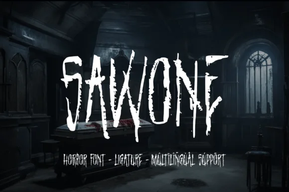
Wicked Brush is a rough brush script in which the strokes tear at the edges, the letters lean forward and the joins break, so a two-word title reads as something scrawled on a wall in a hurry.
Paid link
Get this fontProject & layout blueprintsAt-a-glance maker compatibility
Fine grain and micro-texture excel in 300 DPI print, sublimation, and screen print rather than small vinyl weeding.
Visual anatomy & craft review
The W drags two dry strokes into a point, the i keeps a light dash, the c opens a ragged crescent, the k breaks two diagonals and the d drops a torn bowl, all at a brush weight with inconsistent edges and a hard forward slant. The dryness is the character: the brush runs out of paint mid-stroke, which is why the sample sets two words at large size over a dark ground. Because the edges are ragged, the face needs 40 pt before the texture reads as a brush and not as a bad print, and it prints best in one light colour on a dark ground. The green wall, the painted eye, the dripping mark and the small caps above and below are presentation; the white brush words are the face.
Horror · Brush · Rough
Two-font hierarchy recipes
Tested contrast partners — pairing Wicked Brush with grounded secondary typography.
Wicked Brush + Raffined
Anchors Wicked Brush's fluid strokes with crisp Roman proportions on wedding suites, headers and packaging.
Inspect Raffined specimen
Wicked Brush + Kohilo
Keeps small-scale dates, URLs, nutrition facts and care instructions crisp and legible below script titles.
Inspect Kohilo specimenPractical applications
Concrete hierarchy, scale and production guidance tailored to Wicked Brush’s stroke geometry.
The dry brush suits a late-night horror screening, and the torn edges read across a dark poster at 90 mm in one light ink.
Hierarchy & layout recipe
Print an A2 poster: set the title at 90 mm in white over the dark ground, keep 35 mm of border, and set the time in a 16 pt caps sans in the bottom band with 30 mm of clearance.
Pre-production check
A dry brush printed in reverse fills its torn edges; check the proof and keep the title at 80 pt or above.
The scrawled look suits a temporary scare attraction, and the forward lean reads at 110 mm on a board under coloured light.
Hierarchy & layout recipe
Print a 700 by 400 mm board: set the word at 110 mm, keep 30 mm of border, and print on a matte board so the torn edges stay visible under spotlights.
Pre-production check
A glossy board under coloured light flattens the texture; check the venue lighting and choose a matte stock.
The rough script gives a genre feature its energy, and the brush contrast holds a two-word head at 72 pt over a photograph.
Hierarchy & layout recipe
Print an A4 spread: set the head at 72 pt over the darker part of the image, set the standfirst in a 10 pt sans beneath, and keep 18 mm of clearance so the torn edges stay readable.
Pre-production check
Dry edges over a mid-tone photograph vanish; check the proof and move the head onto the darkest band of the image.
Technical & licence verification
Confirm included OTF/TTF/WOFF formats, full glyph tables and licence coverage on the live store page before batch production.
Closest visual alternatives
Matched across letterform anatomy, stroke behaviour and craft applications.
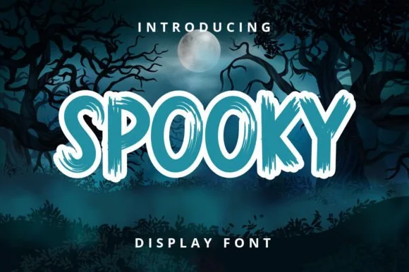
Chunky brush display with dry edges
Spooky 6 is a chunky brush display in teal with a white outline: thick uneven strokes, dry brush edges that break the contour, and letters that lean and bounce against each other, printed over a moonlit forest scene.
Ideas for this font
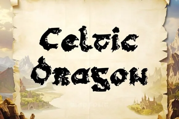
Jagged dragon-scale & weathered Gaelic uncial display
Celtic Dragon is a rugged medieval uncial display font combining rounded Gaelic manuscript skeletons with jagged dragon-wing / torn-parchment edges.
Ideas for this font
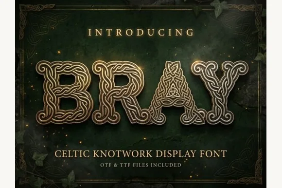
Celtic knotwork display with bevelled strands and interlaced bowls
Bray is a Celtic knotwork display alphabet in which every stroke is a braided band with a bevelled edge, the bowls close into interlaced rings and the letters share one outline, so a word reads as cast metal rather than as type.
Ideas for this font
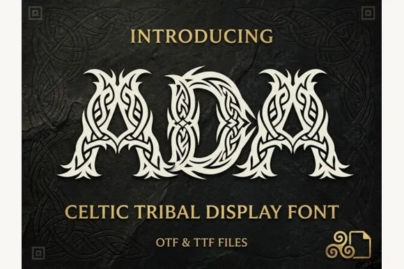
Mythic Norse & Celtic braided-knotwork tribal display (OTF & TTF)
Ada is an ornate Celtic & Norse tribal display font sculpting flared capitals entirely out of interwoven Viking-style ribbon braids (OTF & TTF).
Ideas for this font
Same independent foundry
Allow optional Google Analytics to measure visits and catalogue actions. Your search words and notes are not included. Privacy & storage