Modern Grotesque Body

Witch Hazel + Inkora
Creates crisp high-hierarchy contrast beneath Witch Hazel headlines across menus, websites and labels.
Inspect Inkora specimenDisclosure: MakerFileHub may earn a commission from qualifying purchases via paid links on this page. How our links work.
Flared mixed-case serifs with long curling terminals
Witch Hazel shows substantial white serif letters on teal beside an illustrated bottle, where the strokes flare before each serif, the bowls stay round, a tall h curls across the top and a broad z sweeps into a long low tail.
Paid link
Get this fontProject & layout blueprintsAt-a-glance maker compatibility
Sturdy stroke walls and open counters weed cleanly on adhesive vinyl, HTV apparel film, and cut cardstock.
Visual anatomy & craft review
The stems carry a real weight, the flares widen just under the serifs, the counters close round and two letters leave the baseline: the curled h and the long z tail. The flare is the character, since it gives a plain word a witchy edge without adding ornament. Source notes also list PUA extras, ligatures, stylistic alternates and a bold cut, so check which of those the file actually carries before promising a swash, and keep 30 pt as the floor so the thin flares survive print.
Flared · Curled terminals · Substantial
Two-font hierarchy recipes
Tested contrast partners — pairing Witch Hazel with grounded secondary typography.
Witch Hazel + Inkora
Creates crisp high-hierarchy contrast beneath Witch Hazel headlines across menus, websites and labels.
Inspect Inkora specimen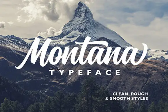
Witch Hazel + Montana
Adds a warm human signature touch for 1-to-3-word callouts without competing against structured serif capitals.
Inspect Montana specimenPractical applications
Concrete hierarchy, scale and production guidance tailored to Witch Hazel’s stroke geometry.
The flared serif gives a supper invitation its seasonal tone, and the round bowls hold a two-word line at 28 pt on an A6 card without extra ornament.
Hierarchy & layout recipe
Print an A6 card: set the invitation line at 28 pt in mixed case across the upper third, keep 14 mm of clear ground beneath for the curled h and the low z tail, and set the date at 10 pt in a plain serif at the foot.
Pre-production check
A flare printed under 24 pt closes into a blob; check the proof and hold the invitation line at 26 pt or above.
The substantial serif suits a herbal label, and the flared joins stay solid at 20 pt on a 55 mm panel printed in one dark ink.
Hierarchy & layout recipe
Print a 55 by 40 mm label: set the shop name at 20 pt, keep 5 mm of border so no flare is trimmed, and set the town at 6 pt in small caps 4 mm beneath the name.
Pre-production check
Pale lettering on a tinted ground loses contrast; check the label as a greyscale print before choosing the second colour.
The curled terminals set a folklore heading, and the wide bowls hold a two-word title at 48 pt across a printed page with a generous measure.
Hierarchy & layout recipe
Print a 210 mm page: set the heading at 48 pt on one row, keep 20 mm beneath before the standfirst at 10 pt, and keep the whole block inside the text column so the z tail does not reach the gutter.
Pre-production check
Long terminals on a justified column can collide with body text; check the page and keep the heading ragged right.
Technical & licence verification
Confirm included OTF/TTF/WOFF formats, full glyph tables and licence coverage on the live store page before batch production.
Closest visual alternatives
Matched across letterform anatomy, stroke behaviour and craft applications.
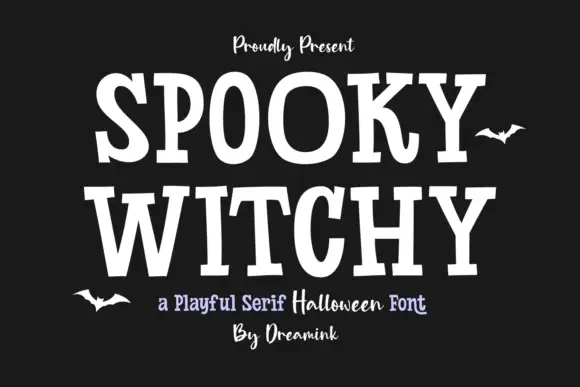
Heavy playful serif
Spooky Witchy is a heavy serif in cream on near-black: broad uneven caps with wide slab feet, a curled K leg and slightly rotated letterforms, with a script line above and a mixed line beneath that names the style.
Ideas for this font
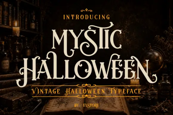
Curled tall mystic display serif
Mystic Halloween is a curled display serif in cream on a dark apothecary shelf: tall condensed capitals with hooked serifs, hairline flourishes in the counters, and a small inline detail on the thick stems.
Ideas for this font
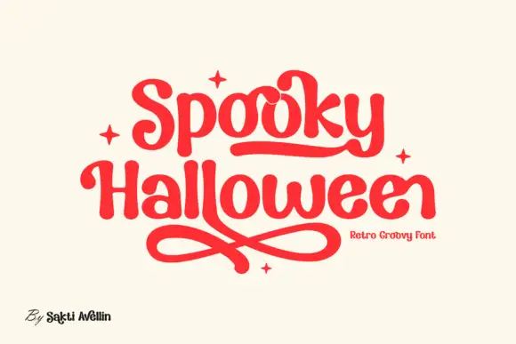
Rounded retro letters with looping underlines
Spooky Halloween uses soft heavy serif shapes rather than sharp or dripping forms, set in red on cream, with a rounded underline that runs under the first word, crossed loops sweeping beneath the second and four small four-point stars placed around the block.
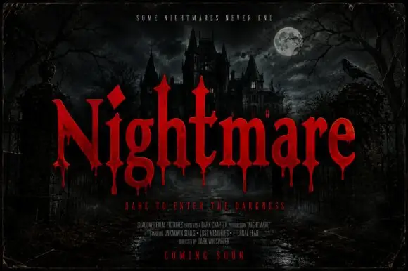
Pointed horror serifs with descending drips
Nightmare Bloodline is a horror display in red on a moonlit castle scene: tall pointed serifs, sharp shoulders and drops of blood falling from the lower terminals of the letters.
Ideas for this font
Same independent foundry
Allow optional Google Analytics to measure visits and catalogue actions. Your search words and notes are not included. Privacy & storage