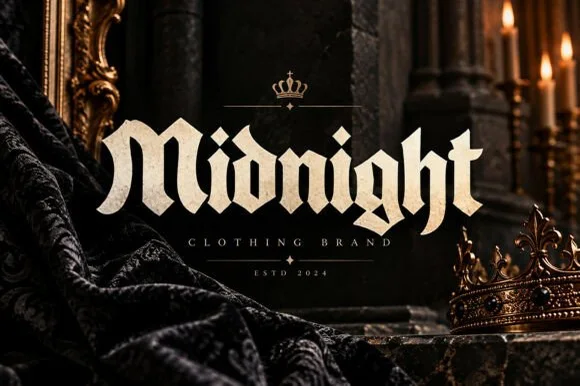
Neutral Sans Workhorse

Blade Gothic + Monure
Lets Blade Gothic own the focal silhouette while handling secondary copy, sizing and subheads cleanly.
Inspect Monure specimenDisclosure: MakerFileHub may earn a commission from qualifying purchases via paid links on this page. How our links work.
Sharp angular blackletter with fractured serifs and kept lowercase counters
Blade Gothic is a blackletter display in which the strokes break into sharp angles, the serifs fracture and the vertical rhythm stays clean, so a title reads as medieval lettering that still resolves at headline scale.
Paid link
Get this fontProject & layout blueprintsAt-a-glance maker compatibility
Sturdy stroke walls and open counters weed cleanly on adhesive vinyl, HTV apparel film, and cut cardstock.
Visual anatomy & craft review
The B stacks two angular bows, the l raises a straight shaft, the a keeps an open counter inside a fractured bowl and the t crosses with a flat bar, all at a heavy weight with crisp cuts at every junction. The retained counters are the character: unlike extreme metal faces the letters stay readable, which is why the sample stacks two rows on a dark ground. Because the cuts are thin, the face wants 30 pt before the fractures print cleanly, and it works best as a short headline rather than a paragraph. The dark field and the small caption are presentation; the sharp blackletter rows are the face.
Blackletter · Angular · Readable
Two-font hierarchy recipes
Tested contrast partners — pairing Blade Gothic with grounded secondary typography.
Blade Gothic + Monure
Lets Blade Gothic own the focal silhouette while handling secondary copy, sizing and subheads cleanly.
Inspect Monure specimen
Blade Gothic + Cervelique
Grounds bold display lettering with classic typographic authority on posters, badges and apparel.
Inspect Cervelique specimenPractical applications
Concrete hierarchy, scale and production guidance tailored to Blade Gothic’s stroke geometry.
The fractured lettering sets the genre instantly, and the retained counters keep a two-word title readable at 80 pt on a printed poster from across a room.
Hierarchy & layout recipe
Print an A2 poster: set the title at 80 pt on two rows, keep 22 mm of clear ground beneath the block for the date and venue, and keep 30 mm of border so the sharp serifs are not trimmed.
Pre-production check
Thin fractures printed at 24 pt fill in on uncoated stock; check the poster proof and keep the title at 60 pt or above on that paper.
The angular strokes hold on fabric, and the heavy verticals stay solid at 70 mm across a printed chest where a thinner blackletter would break up in the screen.
Hierarchy & layout recipe
Print a 280 mm chest print: set the band name at 70 mm, keep every fracture at 1.5 mm minimum, and keep 45 mm of clear shirt beneath for the tour dates in a plain face.
Pre-production check
A fracture under 1 mm fills in with ink; check the film at full size and thicken the cut rather than shrinking the word.
The medieval weight suits a fiction section, and the clean verticals keep a three-word title readable at 34 pt above the story text across a printed page.
Hierarchy & layout recipe
Print a 130 mm column: set the section head at 34 pt, set the author line at 10 pt in a serif beneath it, and keep 12 mm of clear ground above the first paragraph so the sharp serifs do not touch the text.
Pre-production check
A blackletter head set tight over body text looks like a smudge; check the spread and keep 10 mm of air beneath the block.
Technical & licence verification
Confirm included OTF/TTF/WOFF formats, full glyph tables and licence coverage on the live store page before batch production.
Closest visual alternatives
Matched across letterform anatomy, stroke behaviour and craft applications.
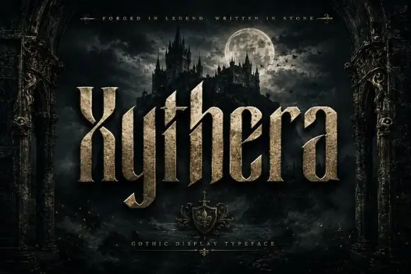
Textured gothic display
Xythera is a textured gothic display in gold on a dark scene: tall capitals with sharp spurs, a carved surface, and a stone-like speckle inside the strokes, framed by an arched stone border with a moonlit castle behind, so the plate reads as a fantasy title rather than a blackletter.
Ideas for this font
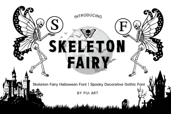
Skeleton-fairy monogram display
Skeleton Fairy is a display set on a white ground: two winged skeleton figures in black line, each raising a circled serif initial, framing a central word in heavy sans over a pale moon, with a graveyard silhouette along the foot and a plain credit line beneath.
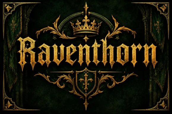
Spiked blackletter with diamond serifs
Raventhorn is a blackletter in gold on dark green: spiked capitals with diamond serifs and long hairline terminals, framed by a crown, a shield and a symmetric gold border drawn to the same weight.
Ideas for this font
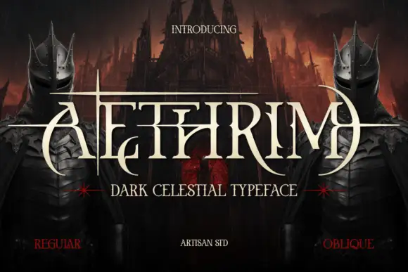
Fantasy capitals with needle-like extensions
Aethrim has high-contrast upright capitals with fine pointed cross-strokes and sweeping crescent-like curves, and long horizontal extensions cut across the title near cap height while armoured figures and a dark castle frame the word.
Ideas for this font
Same independent foundry
Allow optional Google Analytics to measure visits and catalogue actions. Your search words and notes are not included. Privacy & storage