Adhesive vinyl, HTV & cardstock
Screen the strokes
before the blade drops.
Four checks that catch torn hairlines, sliced connectors and two-hour weeding sessions before you waste a sheet.
The gap between a font that cuts cleanly and one that ruins an evening is rarely visible at specimen scale. It shows up in the thinnest stroke, in the number of separate vector islands, and in whether the letters are meant to touch each other. Screen for those three things first and most of the disappointment disappears.
1. Weld overlapping script connectors
Connected scripts are drawn as individual letterforms that overlap. Sent to a cutter as typed text, the machine follows every outline, including the slivers where one letter sits inside its neighbour — which is how you end up with hairline cuts between every pair of letters and a word that lifts off the backing in pieces. Unite or weld the word into one compound path before cutting. Keep an un-welded copy for the pen or print version if you are producing both.
Welding has a side effect worth planning for: very tight overlaps create a dense doubled stroke where two letters merge, and a very loose script leaves a visible kink at the joint. Both are fixable by nudging tracking by a few units before you unite, which is faster than editing nodes afterwards.
2. Measure the thinnest stroke, not the average one
Adhesive vinyl tolerates a narrow stroke far better than heat transfer vinyl or cardstock does, and every material has its own floor. A practical way to work: scale your intended word to the real finished height, then look at the thinnest place in the whole word — usually a lowercase crossbar, a hairline serif, or the join inside a lowercase a or e. If that detail is thinner than roughly half a millimetre at your finished size, expect trouble: lifting during weeding, tearing at the transfer stage, or a blade that simply skips the line.
Fine hairline scripts are therefore excellent for print and questionable for a 1-inch keychain. The usual fix is not a different aesthetic but a different scale: a face that fails at 1 inch often cuts perfectly at 3 inches. When the size is fixed by the product — a mug wrap, a favour tag, a pen barrel — move to a medium or bold script, a rounded display face, or a slab with real stroke weight. Our cut-friendly vinyl roundup is sorted with that constraint first.
3. Count the islands inside a texture
Distressed, chalk, dry-brush and speckled display faces are built from hundreds of tiny separate shapes. They are wonderful printed and miserable cut: every island becomes its own piece to weed, and small ones fall off the backing before you reach the transfer tape. If you love the texture, keep it for sublimation, direct-to-garment, posters or stickers printed as a single sheet, and use a smooth-contour face for anything that gets cut, weeded and applied by hand.
Stencil faces are the deliberate exception — the bridges are structural, not decorative, and they are what keep the counters attached. Check the bridge width at finished size before you buy, and remember that a stencil cut in cardstock behaves differently from the same file cut in vinyl: cardstock holds a thinner bridge, vinyl stretches it.
4. Know whether you need outlines or a single-line path
Standard OTF and TTF files are closed outlines, drawn for blades and presses. Send one to a plotter pen, foil quill or engraving tip and it will trace round the bubble of every letter, producing a double-line outline rather than handwriting. If the job is a foil quill or a pen plotter, look for a dedicated single-line, monoline or writing-path font — the single-line and Foil Quill roundup covers that category — or accept the outline look and size accordingly.
Layered and duo families add one more decision: which layer is the base and which is the accent. Test the layers separately before welding them, because a shadow layer welded into the base becomes permanent.
5. Test cut, then commit
Every machine, blade, mat and material combination has its own answer, and no article can give you that number. Cut a short word — three letters and one of your hardest pairs — on a scrap of the exact material at the exact finished size. Check that the blade cut the vinyl and not the backing, that the smallest detail came through, and that the piece weeds in one motion. Change one variable at a time. When the test word is clean, the full sheet will be.
Side-by-side summary
Four profiles from this checklist.
Previews are the creators' own artwork. The middle columns describe the letterform decisions the steps above are about, not a test of your machine.
| Font | Style & file notes | Role in this workflow | Catalogue |
|---|---|---|---|
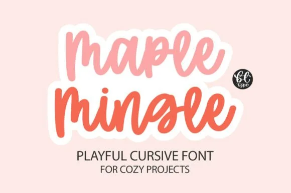
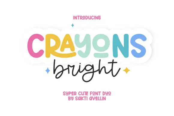
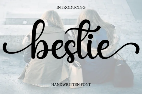
 | Chunky bouncy cursive, overlapping connectors | One-line names, welded, 3 inches and up | Open profile |
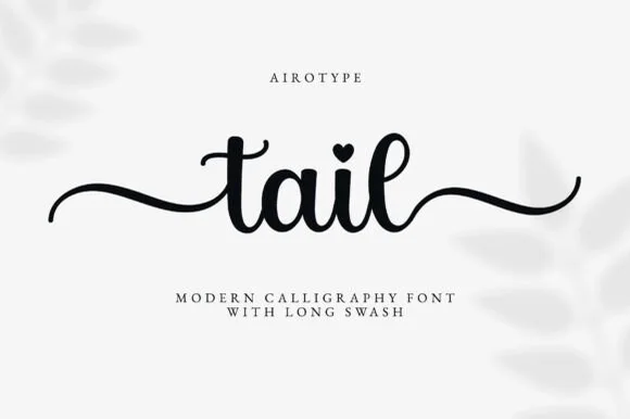
 | Craft calligraphy with long wavy tails | Mugs, keychains and favour tags | Open profile |
 | Thick monoline cursive, PUA-flagged | Door signs and large wall decals | Open profile |
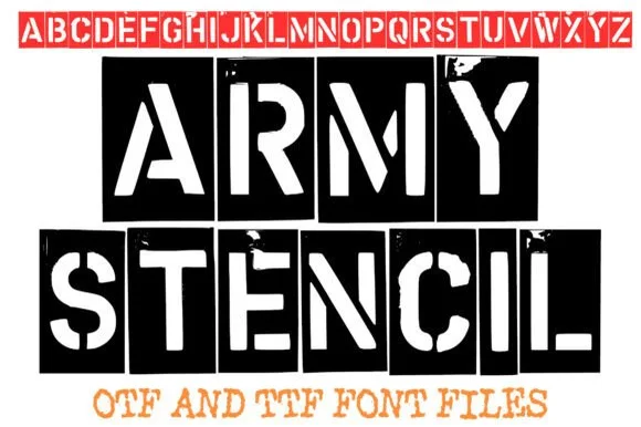 | Heavy stencil capitals with vertical breaks | Laser-cut and cardstock templates | Open profile |
Visual specimen examples
Cut-friendly scripts, bold vinyl faces & pen paths.
Inspect previews with maker scorecards for vinyl weeding, foil-quill pens and bridged stencils.

Cut-friendly fonts Single-line pen fonts Fonts with tails Laser stencil fonts Pairing guide