High-Contrast Display Serif

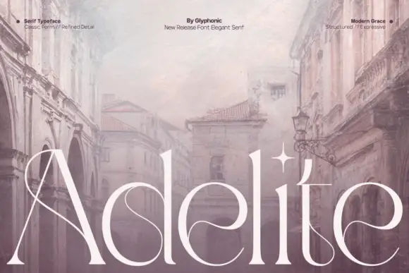
Furion + Raffined
Pairs sculptural editorial warmth with Furion's clean modern geometry.
Inspect Raffined specimenDisclosure: MakerFileHub may earn a commission from qualifying purchases via paid links on this page. How our links work.
Broad heavy capitals with a round O and sharply pointed N diagonal
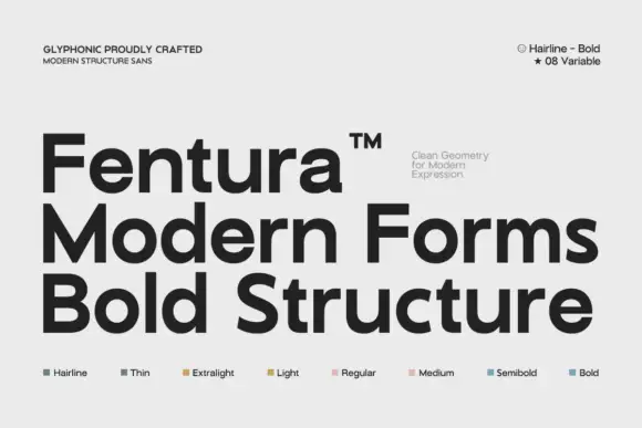
Furion presents a large black uppercase name on a pale technical cover. Broad near-even strokes form a circular O, an open U, flat F arms, a diagonal R leg and a sharply pointed upper start to the N, while the surrounding panels advertise a variable system and list weights.
Paid link
Get this fontProject & layout blueprintsAt-a-glance maker compatibility
Sturdy stroke walls and open counters weed cleanly on adhesive vinyl, HTV apparel film, and cut cardstock.
Visual anatomy & craft review
The strokes stay broad and even, the O turns circular, the F arms run flat and the N starts in a point. That single pointed junction is the character: a neutral wide capital set gains one technical detail, which is why the sample keeps one word on a clean field. Only one treatment is shown, so confirm which weights and axes your file actually carries, check the N and R at 20 pt and keep the palette high-contrast so the wide forms stay readable.
Broad heavy capitals with a round O and sharply pointed N diagonal
Two-font hierarchy recipes
Tested contrast partners — pairing Furion with grounded secondary typography.
Furion + Raffined
Pairs sculptural editorial warmth with Furion's clean modern geometry.
Inspect Raffined specimen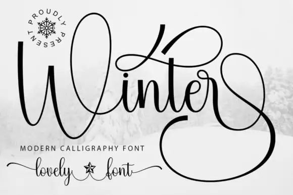
Furion + Winter
Introduces organic movement on pull-quotes, signatures and gift tags.
Inspect Winter specimenPractical applications
Concrete hierarchy, scale and production guidance tailored to Furion’s stroke geometry.
The broad caps give a studio a technical mark, and the pointed N carries the detail at 28 pt on a card, where the circular O balances the row.
Hierarchy & layout recipe
Print an 85 by 55 mm card: set the wordmark at 28 pt on one row, keep 16 mm of clear ground beneath before the address at 7 pt, and keep the O and N clear of punctuation so the point stands alone.
Pre-production check
The pointed junction is lost beside a tight bracket; check the setting and add space around the pair.
The wide even caps set a confident heading, and the flat F arms hold a two-word title at 52 pt on a page, where the circular O keeps the row open.
Hierarchy & layout recipe
Print a 210 mm page: set the heading at 52 pt on one row, keep 22 mm of clear ground beneath before the standfirst at 10 pt, and keep the body in a narrower face so the wide heading reads as a deliberate contrast.
Pre-production check
Two wide rows stacked crowd the measure; check the layout and keep the deck in a narrow face.
The technical caps read on a door, and the broad forms hold a room label at 34 pt on a printed plate, where the pointed N stays distinct at corridor distance.
Hierarchy & layout recipe
Print a 250 by 100 mm plate: set the room label at 34 pt on one row, keep 12 mm of clear ground beneath before the hazard line at 9 pt, and keep 14 mm of margin for the fixings.
Pre-production check
The variable axes may not match the shown weight; check the file before using a lighter treatment.
Technical & licence verification
Confirm included OTF/TTF/WOFF formats, full glyph tables and licence coverage on the live store page before batch production.
Closest visual alternatives
Matched across letterform anatomy, stroke behaviour and craft applications.
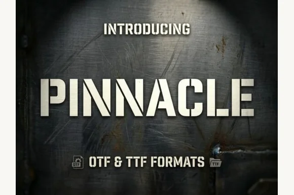
Angular stencil sans with cut corners
Pinnacle is an angular stencil sans in beige on dark brushed metal: heavy capitals with forty-five degree cut corners, notched stems and flat apexes, lit as if the letters were cut from a plate.
Ideas for this font
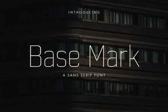
Very fine narrow mixed case with rounded-square bowls and long clean diagonals
Base Mark is a light geometric sans in mixed case: monoline strokes, circular bowls, a flat-sided s, and spacing wide enough that a word reads as a series of shapes.
Ideas for this font

Light geometric capitals with circular O and broad angular diagonals
Modern Heritage shows black capitals in two closely stacked lines on white, where thin nearly even strokes form a circular O, a broad M and N and a large triangular A, while the G keeps an open right side with a short inner bar.
Ideas for this font

Light geometric lowercase with circular bowls and single-storey a and g
Mango Dream sets a black lowercase name on a pale paper-like ground, where thin nearly even strokes form wide circular bowls, the a stays single storey, the m arches stay low and the g opens its lower curve into a short rounded descender while the d rises above the word.
Ideas for this font
Same independent foundry
Allow optional Google Analytics to measure visits and catalogue actions. Your search words and notes are not included. Privacy & storage