Neutral Sans Workhorse

Night Mare + Lemon Milk Pro FTR
Lets Night Mare own the focal silhouette while handling secondary copy, sizing and subheads cleanly.
Inspect Lemon Milk Pro FTR specimenDisclosure: MakerFileHub may earn a commission from qualifying purchases via paid links on this page. How our links work.
Angular spiral-terminal horror serif
Night Mare is an angular decorative serif in which the letters stay uneven, the feet come to points and the terminals coil inward in tight spirals, so a stacked title reads as gothic horror lettering rather than a clean historical blackletter.
Paid link
Get this fontProject & layout blueprintsAt-a-glance maker compatibility
Sturdy stroke walls and open counters weed cleanly on adhesive vinyl, HTV apparel film, and cut cardstock.
Visual anatomy & craft review
The G and E curl their terminals inward, the T stretches a long bar over neighbouring letters, the feet sharpen to points and the letter heights shift by design. The coiled terminal is the character: it puts the fright in the letterform instead of in added artwork, which is why the sample stacks a tall uneven title. Because the spirals are small, the face wants 36 pt before they resolve, and the points thin out in vinyl under three quarters of an inch of cap height. The extra characters are PUA-encoded, so any swash must be accessed deliberately.
Angular · Coiled · Horror
Two-font hierarchy recipes
Tested contrast partners — pairing Night Mare with grounded secondary typography.
Night Mare + Lemon Milk Pro FTR
Lets Night Mare own the focal silhouette while handling secondary copy, sizing and subheads cleanly.
Inspect Lemon Milk Pro FTR specimen
Night Mare + Askinо
Grounds bold display lettering with classic typographic authority on posters, badges and apparel.
Inspect Askinо specimenPractical applications
Concrete hierarchy, scale and production guidance tailored to Night Mare’s stroke geometry.
The coiled terminals suit a horror poster, and the uneven stack holds a two-word title at 64 pt on an A3 sheet in one ink. The uneven heights keep the stack from looking like a clean historical face.
Hierarchy & layout recipe
Print an A3 poster: set the title at 64 pt on two stacked rows, keep 25 mm of clear ground around the block for the long T bar, and set the times at 12 pt in a condensed sans at the foot.
Pre-production check
Spiral terminals under 2 mm close into blobs; check the film at full size and keep the title at 50 pt or above.
The pointed serifs set a dark feature, and the coiled ends give a one-word title a dagger shape at 56 pt across a printed spread. Points and spirals carry the tone without added illustration.
Hierarchy & layout recipe
Print a 210 mm spread: set the title at 56 pt on the opening page, keep 24 mm beneath the points before the standfirst, and set the standfirst at 10 pt in a serif with 12 mm of clear ground.
Pre-production check
Points printed over body text crowd the column; check the spread and keep 10 mm of air below the last point. Ask for the film at 100 percent.
The angular serif gives a bottle presence, and the coiled terminals stay readable at 20 pt on a 60 mm label in one metallic ink. The inner curl reads as a flourish at label size.
Hierarchy & layout recipe
Print a 60 by 45 mm label: set the brand at 20 pt, keep 6 mm of border so the points are not trimmed, and set the volume in a 6 pt caps at the foot with 5 mm of clear ground. Centre the brand on the bottle shoulder.
Pre-production check
Thin points printed in metallic ink break up; check the plate proof and keep the brand at 20 pt or above. Metallic ink needs a smoother stock.
Technical & licence verification
Confirm included OTF/TTF/WOFF formats, full glyph tables and licence coverage on the live store page before batch production.
Closest visual alternatives
Matched across letterform anatomy, stroke behaviour and craft applications.
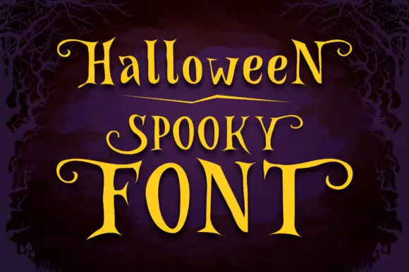
Narrow spooky serifs with curled ends
Halloween Spooky shows tall high-contrast letters with pointed serif tips and long curling terminals, and the enlarged F and T extend horizontally across the lowest word of the composition.
Ideas for this font
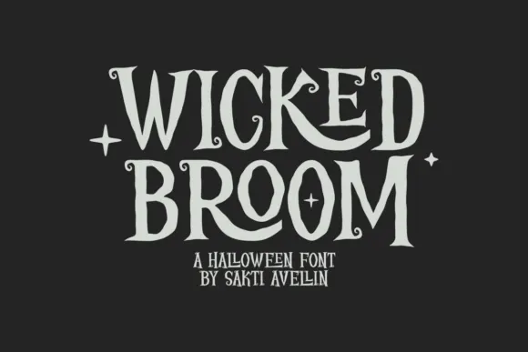
Curled narrow Halloween capitals
Wicked Broom shows tall narrow serif capitals with irregular pointed ends and tiny spiral terminals, where the R leg curls broadly beneath its neighbour and the O stays a long oval rather than rounding out.
Ideas for this font
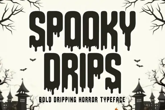
Bold dripping horror display
Spooky Drips is a bold dripping display in near-black on a bone ground: very heavy condensed letters with long viscous drips running from the baseline and the counters, flat terminals and a squared top, framed by bare branches and a row of haunted houses along the foot.
Ideas for this font
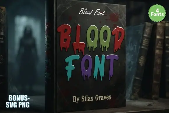
Tall irregular horror capitals with thin hanging drips and mixed colours
Blood is a decorative horror set in which narrow upright letters keep soft corners, thin drips hang unevenly from the lower edges and the words are drawn in mixed dark reds, greens and violets, so a heading reads as lettering running down a page.
Same independent foundry
Allow optional Google Analytics to measure visits and catalogue actions. Your search words and notes are not included. Privacy & storage