High-Contrast Display Serif

One More + Brenco
Pairs sculptural editorial warmth with One More's clean modern geometry.
Inspect Brenco specimenDisclosure: MakerFileHub may earn a commission from qualifying purchases via paid links on this page. How our links work.
Modern extended grotesque
One More is a modern extended grotesque in white over a photograph of a tennis court: wide even caps with flat terminals, tall x-height and open counters, set in two lines with technical notes in the corners, so the plate reads as a contemporary brand specimen rather than a poster.
Paid link
Get this fontProject & layout blueprintsAt-a-glance maker compatibility
Sturdy stroke walls and open counters weed cleanly on adhesive vinyl, HTV apparel film, and cut cardstock.
Visual anatomy & craft review
The two words are stacked and the drawing is an extended grotesque: the letters are wide, the strokes are even, and the counters are open ovals, which keeps a very wide setting readable at large sizes. The flat terminals and the straight-sided bowls give it a technical, almost engineered tone, and the tight leading lets two lines read as one block. Because the width is generous, the face suits headlines and signage rather than paragraphs, and the specimen is honest about that: the corners carry small tracked notes about the character set, and a short line of copy sits at the upper right. The ground is a photograph of a court with a racket and a ball, which gives the white type a mid-tone to sit on without a panel.
Extended, modern, neutral, confident
Two-font hierarchy recipes
Tested contrast partners — pairing One More with grounded secondary typography.
One More + Brenco
Pairs sculptural editorial warmth with One More's clean modern geometry.
Inspect Brenco specimen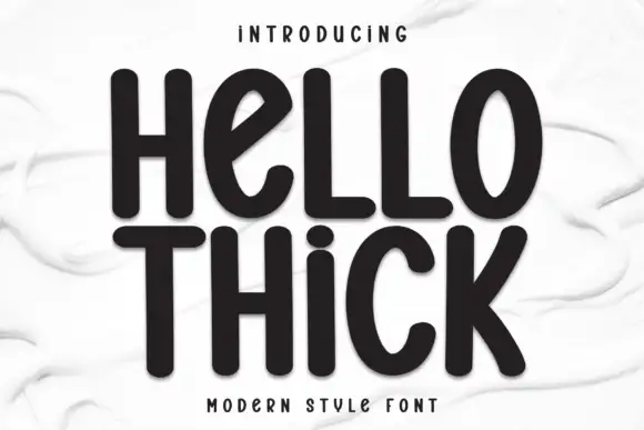
One More + Hello Thick
Introduces organic movement on pull-quotes, signatures and gift tags.
Inspect Hello Thick specimenPractical applications
Concrete hierarchy, scale and production guidance tailored to One More’s stroke geometry.
An extended grotesque reads as engineered and modern, and the wide letters fill a fascia or a shirt graphic without needing a second element.
Hierarchy & layout recipe
Set the mark at 40 mm on a chest print, 20 pt on a card and 120 mm on a wall, tracking slightly negative above 60 mm. Keep one colour and hold clear space equal to the counter width so the mark never crowds.
Pre-production check
Check the 20 pt card mark, where open counters can make the word look airy at small size; tighten the tracking. Confirm the wall mark reads at ten metres and that the chest print survives a wash.
An extended grotesque gives an annual the confidence of a brand campaign, and the wide caps fill a cover band without a photograph behind the title.
Hierarchy & layout recipe
Set the title at 100 mm cap height across 240 mm, the subtitle in a 10 pt grotesque, and the year at 8 pt. Keep the title on a flat band and let the photograph occupy the lower two thirds.
Pre-production check
Check the title at 100 mm, where wide letters can push past the trim; reduce the tracking. Confirm the 10 pt subtitle reads at newsstand distance and that the title holds at thumbnail size online.
An extended sans gives a sports centre a signage system that reads from a distance and looks consistent across panels, and the wide letters suit short words.
Hierarchy & layout recipe
Specify 150 mm door headers, 40 mm wayfinding and 10 mm rules in one weight. Keep one colour on a light ground, align every panel to the same left edge, and hold clear space equal to half the cap height.
Pre-production check
Check the 40 mm wayfinding at five metres, where open counters can read as gaps; keep the weight. Confirm the 150 mm headers read from the entrance and that all panels align on the same grid.
Technical & licence verification
Confirm included OTF/TTF/WOFF formats, full glyph tables and licence coverage on the live store page before batch production.
Closest visual alternatives
Matched across letterform anatomy, stroke behaviour and craft applications.

Spaced light minimal sans
Modern Limited is a light spaced sans in charcoal on a pale pink brush swash: wide-tracked caps with simple straight stems and rounded O and D, set on two lines with a tracked line above and beneath, and a brush stroke behind the block.
Ideas for this font
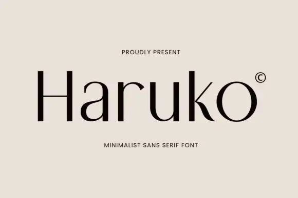
Light contrasting mixed case with a low H bar and curved k leg
Haruko shows black title-case lettering on a flat pale beige field, where thin cross-strokes meet more substantial upright and curved sides, the H crossbar sits low, the a stays a simple round and the u opens broad, while the k moves into a curved tapering leg and the r ends in a small pointed shoulder.
Ideas for this font
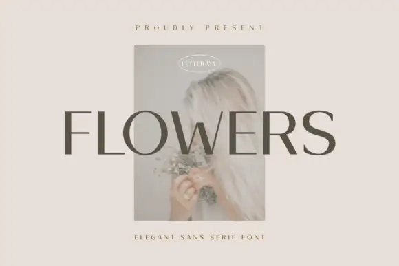
Restrained contrasting capitals with round O and fine horizontal arms
Flowers shows grey uppercase lettering across a small faded portrait on a pale beige field, where more substantial vertical and curved sections meet fine horizontal arms, the S retains a broad smooth curve and the F ends in flat unornamented arms.

Contemporary grotesque
Saltriver Grotesk is a contemporary grotesque in black on off-white: heavy caps with flat terminals, tight spacing and a high waist, set in two flush lines with a thin rule beneath and two small colour accents naming the subject and the foundry.
Ideas for this font
Same independent foundry
Allow optional Google Analytics to measure visits and catalogue actions. Your search words and notes are not included. Privacy & storage