High-Contrast Display Serif

Memoir Slang + Bulgary
Pairs sculptural editorial warmth with Memoir Slang's clean modern geometry.
Inspect Bulgary specimenDisclosure: MakerFileHub may earn a commission from qualifying purchases via paid links on this page. How our links work.
Bold neo-grotesk display sans with hooked double-story g
Memoir Slang is a heavy, tight-set modern sans-serif distinguished by crisp neo-grotesk geometry and sharp, horned ear details.
Paid link
Get this fontProject & layout blueprintsAt-a-glance maker compatibility
Sturdy stroke walls and open counters weed cleanly on adhesive vinyl, HTV apparel film, and cut cardstock.
Visual anatomy & craft review
Memoir Slang is a bold neo-grotesk display sans with a hooked double-storey g: even squared stems, tight apertures, a straight-sided g with a hooked ear and a slightly narrow width that keeps a long masthead on one line. The hook is the only detail and it closes when the face is reduced. It needs roughly 22 mm for the hook and the aperture to read, and it is best in one dense ink on uncoated stock, or a single white on a dark ground where the tight apertures still open.
Sharp · High-fashion · Confident
Two-font hierarchy recipes
Tested contrast partners — pairing Memoir Slang with grounded secondary typography.
Memoir Slang + Bulgary
Pairs sculptural editorial warmth with Memoir Slang's clean modern geometry.
Inspect Bulgary specimen
Memoir Slang + Honey
Introduces organic movement on pull-quotes, signatures and gift tags.
Inspect Honey specimenPractical applications
Concrete hierarchy, scale and production guidance tailored to Memoir Slang’s stroke geometry.
A neo-grotesk display sets a masthead that reads as printed rather than styled. The hook holds at 30 pt, and the narrow width keeps a long section name on one line in a rail.
Hierarchy & layout recipe
Masthead 30 pt with 6 mm aperture clearance, body 9/13 pt over two columns of 82 mm, 18 mm margins and a 12 mm head. Section head 20 pt in a 30 mm rail. Caption 8/11 pt.
Pre-production check
At 8 pt the caption's tight apertures silt and the line reads as a grey band. Set captions in the text weight and keep the display at 18 pt and above, then proof one page at 1:1.
A neo-grotesk display reads as a printed wordmark rather than a web logo, which is what a small studio wants on stationery. The stems hold at 20 mm on a card, and one ink prints the card and the letterhead in one order.
Hierarchy & layout recipe
Card 85 x 55 mm, word 20 mm with 5 mm aperture clearance, details 7/9 pt, 5 mm margins. Letterhead 210 x 297 mm, word 28 mm, 20 mm margins. Envelope 160 x 110 mm, word 14 mm, 10 mm margins.
Pre-production check
On an 85 x 55 mm card the apertures close and the name reads as a solid bar. Raise the card word to 26 mm, and check one card before the run.
A narrow neo-grotesk fits a long stall name on a board and stays legible in bad light. The stems hold at 100 mm on a board, and one white ink prints the board from a dark ground.
Hierarchy & layout recipe
Board 600 x 900 mm, word 100 mm with 12 mm aperture clearance, items 26 mm, 30 mm margins. Price card 105 x 75 mm, item 18 mm, price 24 mm. Bag print 200 x 250 mm, word 50 mm, 15 mm margins.
Pre-production check
A 105 x 75 mm price card at 18 mm fills the apertures and the item reads as a bar under the market lamp. Raise the item to 24 mm, and check one card in the actual light.
Technical & licence verification
Confirm included OTF/TTF/WOFF formats, full glyph tables and licence coverage on the live store page before batch production.
Closest visual alternatives
Matched across letterform anatomy, stroke behaviour and craft applications.
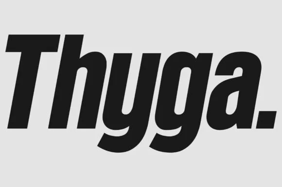
Heavy condensed rounded sans
Thyga is a heavy condensed sans in black on light grey: tall narrow lowercase with tight spacing, round bowls that almost close, and a period set as a solid square, so the word reads as a contemporary retail mark rather than as text.
Ideas for this font

8-weight + Variable contemporary condensed grotesk (170+ languages)
Bargain Condensed is a full 8-weight + Variable (100–800) condensed grotesk sans supporting uppercase, lowercase, and 170+ languages.
Ideas for this font
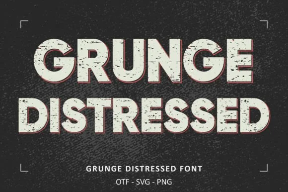
Heavy wide stamp-weathered sans + SVG & PNG letter sets!
Grunge Distressed is a wide, heavy stamp-textured sans serif bundled with OTF, SVG, and PNG files for rugged posters, shirts, and badges!
Ideas for this font
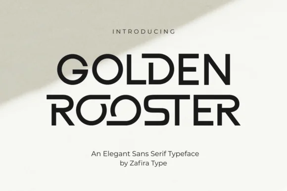
Geometric art-gallery sans with interlocking ligature bowls
Golden Rooster is a crisp, medium-bold geometric sans-serif distinguished by circular interlocking 'OO' ligatures and sculpted leg curves.
Ideas for this font
Same independent foundry
Allow optional Google Analytics to measure visits and catalogue actions. Your search words and notes are not included. Privacy & storage