Neutral Sans Workhorse

Magic Witch + Miniplate
Lets Magic Witch own the focal silhouette while handling secondary copy, sizing and subheads cleanly.
Inspect Miniplate specimenDisclosure: MakerFileHub may earn a commission from qualifying purchases via paid links on this page. How our links work.
Groovy seventies capitals melting into rounded slime drips
Magic Witch is a groovy display in which chunky seventies capitals soften into rounded drips that hang from the baseline, so a short phrase reads as friendly spooky lettering rather than gore.
Paid link
Get this fontProject & layout blueprintsAt-a-glance maker compatibility
Sturdy stroke walls and open counters weed cleanly on adhesive vinyl, HTV apparel film, and cut cardstock.
Visual anatomy & craft review
The M spreads two soft arches, the a closes a round bowl, the g drops a thick tail and every letter sends one or two rounded droplets below the baseline at different lengths. The rounded melt is the character: the drips are drawn as smooth drops rather than pointed runs, which is why the sample suits a kids' party. Because the drops hang low, a layout needs 14 mm of clearance under the line from 30 pt, and the face weeds cleanly from three quarters of an inch of cap height. The orange ground, the small bats and the caption are presentation; the melting letters are the face.
Groovy · Melting · Friendly horror
Two-font hierarchy recipes
Tested contrast partners — pairing Magic Witch with grounded secondary typography.
Magic Witch + Miniplate
Lets Magic Witch own the focal silhouette while handling secondary copy, sizing and subheads cleanly.
Inspect Miniplate specimen
Magic Witch + Stanza
Grounds bold display lettering with classic typographic authority on posters, badges and apparel.
Inspect Stanza specimenPractical applications
Concrete hierarchy, scale and production guidance tailored to Magic Witch’s stroke geometry.
The friendly melt suits a children's shirt, and the rounded drops stay solid at 70 mm across a printed chest in one ink.
Hierarchy & layout recipe
Print a 280 mm chest print: set the phrase at 70 mm, keep each drop at 5 mm wide so it stays open, and keep 45 mm of clear shirt beneath the drips for the date.
Pre-production check
Drops under 3 mm fill in on a screen print; check the film and thicken the drop rather than the letter.
The groovy weight reads on canvas, and the thick letters hold at 50 mm across a printed cotton tote in one flat black ink.
Hierarchy & layout recipe
Print a 300 mm tote: set the words at 50 mm, keep the drips clear of the bag seam by 20 mm, and keep the handle stitching well outside the printed area.
Pre-production check
A drip printed into a seam disappears in the fold; check the template and keep 18 mm of clear canvas.
The melting letters suit a paper wrap, and the rounded forms stay clear at 26 pt around a printed band in one flat black ink.
Hierarchy & layout recipe
Print a 220 by 60 mm wrap: set the phrase at 26 pt, keep 10 mm of clear wrap at each end so a drip is not cut by the seam, and set the name in a 9 pt sans beneath.
Pre-production check
A wrap seam through a droplet looks like a printing error; check the template and centre the phrase on the visible band.
Technical & licence verification
Confirm included OTF/TTF/WOFF formats, full glyph tables and licence coverage on the live store page before batch production.
Closest visual alternatives
Matched across letterform anatomy, stroke behaviour and craft applications.
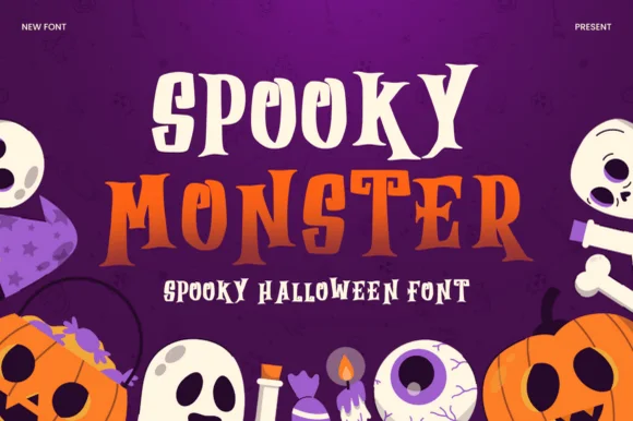
Layered Halloween display with two cuts
Spooky Monster is a two-cut Halloween display in cream and orange on purple: a sharp gothic-flavoured capital cut for the first word and an ornate swashed serif for the second, both stacked over flat illustrations of ghosts, pumpkins and skulls.
Ideas for this font
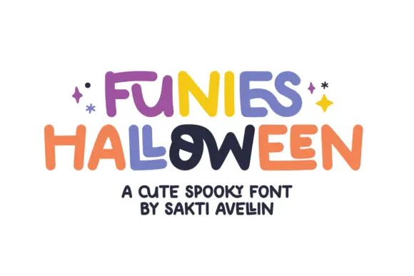
Loose rounded lettering with varied heights and uneven crossbars
Funies Halloween is a loose rounded display alphabet in which the letters bounce above and below the baseline, the heights vary and the crossbars sit at different levels, so a word reads as something cut out and taped down.
Ideas for this font
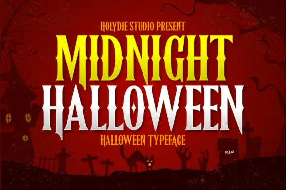
Pinched-waist pointed display
Midnight Halloween is a tall display in yellow and white over a dark red illustrated scene: capitals with pinched waists, pointed serif ends, high contrast and a slight inward curve on the stems, set in two lines with a small line above and beneath, against a silhouette of a house, crosses and a cat.
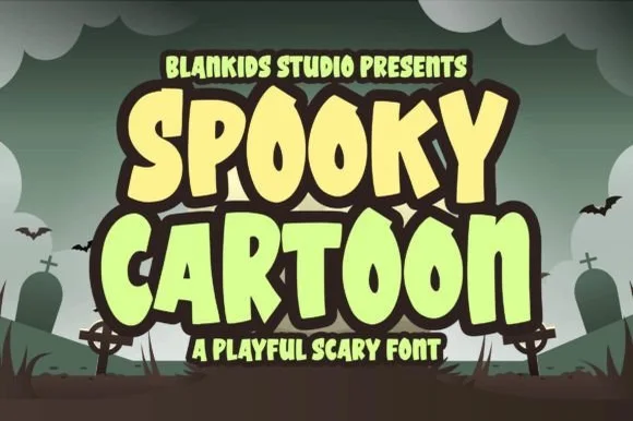
Playful cartoon display with rounded terminals
Spooky Cartoon is a playful display in cream and pale green on a cartoon graveyard: fat bouncy letters with fully rounded terminals, a heavy dark outline and a tilt, stacked as two lines with a small line beneath.
Ideas for this font
Same independent foundry
Allow optional Google Analytics to measure visits and catalogue actions. Your search words and notes are not included. Privacy & storage