Two-voice typography
One voice leads.
One voice grounds.
A method for combining an expressive face with a quiet one, and for knowing when a foundry has already done the work for you.
Pairing goes wrong in one of two directions. Either both faces want to be the protagonist, so the layout has no entry point; or the companion is so timid that the design reads as one font plus some text. The fix is structural, not taste-based: give the decorative voice a short, fixed job, and choose the supporting face by measurable properties.
1. Budget the decoration
Decide the total amount of personality the layout can carry, then spend it in one place. A script headline of one to five words is a budget spent well: it appears once, at a size where its details read, and everything after it can be plain. The same script used for a subhead, a caption and a label stops being a voice and becomes a texture — and texture is what readers skip.
Practically, that means the supporting face carries every repeating element: body copy, menus, price lists, address blocks, ingredient lines, RSVP details. It should be boring in the most useful sense — consistent, comfortable at small sizes, and unremarkable when read at arm's length.
2. Build the contrast deliberately
Contrast is what makes two faces read as a system rather than a mistake. The reliable axes are category and case: a flowing title-case script against small, generously tracked uppercase sans is the classic combination because straight capitals establish a hard horizontal line beneath organic curves. The same logic works upside down — a heavy condensed display face over a light roman with real x-height contrast.
Tracking is the setting most often forgotten. Uppercase companions want extra space, often somewhere in the range of 80 to 150 units (roughly 8 to 15 percent of the em) depending on the face; at default spacing, small caps under a script tend to look cramped and shouty. And if the script's baseline is lively — bouncy, rising, irregular — the companion should be dead calm. Two lively faces fight; one lively face and one flat baseline cooperate.
3. Match weight and x-height, or use a duo
Stroke weight is the first thing the eye notices even when it cannot name it. An ultra-heavy marker script next to a hairline sans looks like a printing error, not a hierarchy. Either match the apparent stroke weight of the two faces, or make the mismatch so deliberate that it reads as contrast — thin over heavy, which is a common editorial move.
x-height is the second. A companion with a small x-height next to a script with large lowercase bodies will look undersized at the same point size, and you will end up faking optical balance with numbers instead of choosing a better pair. If you would rather skip this work, start from a foundry-matched duo: those families were drawn together, share proportions, and usually ship with a clear base-and-accent split. The font duos roundup collects the ones that hold up, and minimalist sans and luxury serif are the two most useful companion archives if you are pairing by hand.
4. Prove the pair on real content
Set a real block, not a slogan. A logo lockup hides everything: it is short, centred and forgiving. The test is a menu section, an invitation back page, a product label with an ingredient list, or a shop sign with an opening-hours block — content with at least four type sizes and a mix of uppercase, numerals and punctuation. If the pair survives a dense block at 9pt, it will survive the poster.
Check the joints while you are there: does the numeral set of the companion match the script's digits in weight, does the ampersand belong to the same world, and do the quotation marks look borrowed from another century? Small inconsistencies at the seams are what make a two-font layout feel assembled rather than designed.
Side-by-side summary
Four profiles from this checklist.
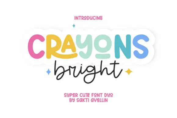
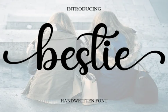
Previews are the creators' own artwork. The middle columns describe the letterform decisions the steps above are about, not a test of your machine.
| Font | Style & file notes | Role in this workflow | Catalogue |
|---|---|---|---|
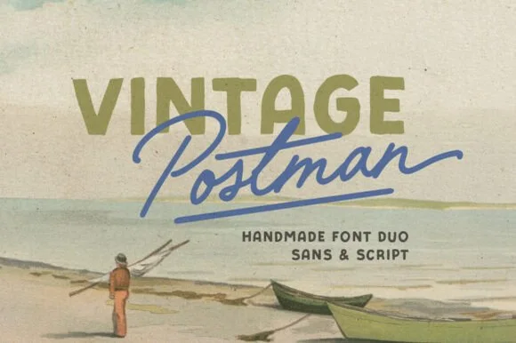 | Chubby retro sans with a monoline script in the same family | Logo, label and packaging lockups | Open profile |
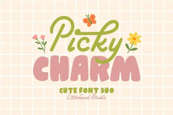 | Vintage stamp sans with a monoline script companion | Shop signage and menu headers | Open profile |
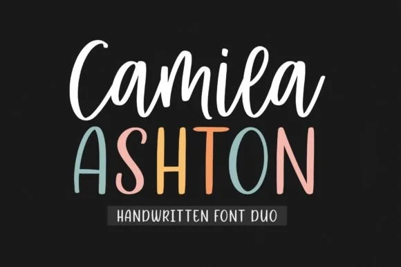 | Brush script, tall sans and 80+ party doodles in one set | Invitations and social templates | Open profile |
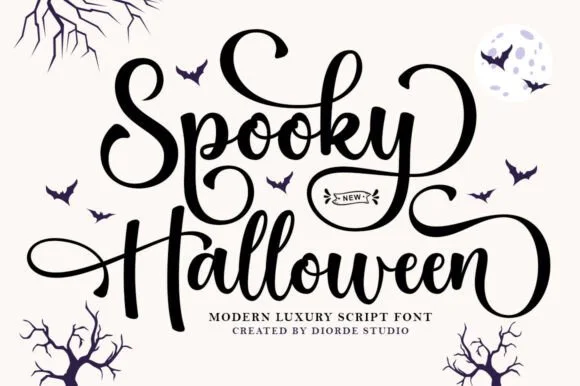
 | Fine calligraphy with a broad open S, best as the only lead voice | Brand headline over a calm text face | Open profile |
Visual specimen examples
Duos & clean contrast anchors.
Every profile carries two suggested companions; start from these when the pair has to survive dense text.

Font duos Minimalist sans Signature logo fonts Luxury serif Invitation checklist