High-Contrast Display Serif

Lemon Milk Pro FTR + Worldstar
Pairs sculptural editorial warmth with Lemon Milk Pro FTR's clean modern geometry.
Inspect Worldstar specimenDisclosure: MakerFileHub may earn a commission from qualifying purchases via paid links on this page. How our links work.
Geometric sans with a light suffix
Lemon Milk Pro FTR is a geometric sans in near-black on white: capitals in a firm even stroke beside a lighter rounded suffix, set as a single line at moderate size with a small boxed yellow badge beneath.
Paid link
Get this fontProject & layout blueprintsAt-a-glance maker compatibility
Sturdy stroke walls and open counters weed cleanly on adhesive vinyl, HTV apparel film, and cut cardstock.
Visual anatomy & craft review
The plate is deliberately spare: one line, a lot of white, and a boxed badge under it, which is how a working sans is often presented when the seller expects it to be judged in use rather than admired. The drawing is a geometric capital with circular bowls and flat terminals, and the second half of the line drops to a light rounded cut, so the buyer sees two weights of the family in one setting. That construction sets a modest size floor and makes the face usable for a wordmark as well as a heading. The white ground is neutral staging and the badge names the foundry. Because the forms are geometric and even, the face suits a technology brand, a poster and a label, and it behaves predictably at small sizes, which is the point of a working face.
Sans serif, geometric, clean, corporate
Two-font hierarchy recipes
Tested contrast partners — pairing Lemon Milk Pro FTR with grounded secondary typography.
Lemon Milk Pro FTR + Worldstar
Pairs sculptural editorial warmth with Lemon Milk Pro FTR's clean modern geometry.
Inspect Worldstar specimen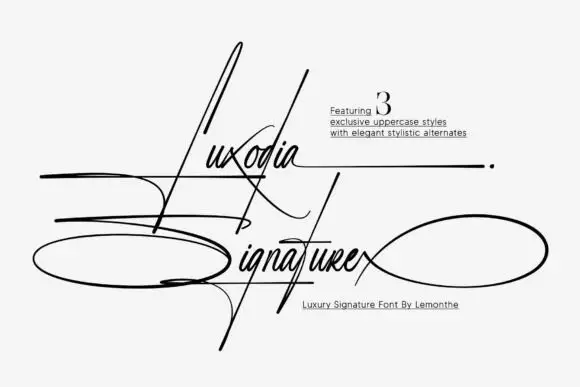
Lemon Milk Pro FTR + Luxodia Signature
Introduces organic movement on pull-quotes, signatures and gift tags.
Inspect Luxodia Signature specimenPractical applications
Concrete hierarchy, scale and production guidance tailored to Lemon Milk Pro FTR’s stroke geometry.
A geometric sans gives a studio a mark that reads as engineered, and the light suffix lets one name carry two weights. A working face is judged in use, not on a poster.
Hierarchy & layout recipe
Set the mark at 15 pt on a card, 95 mm on a wall and 10 pt in a footer, keeping the light cut only above 18 pt. Keep one colour and clear space equal to the cap height.
Pre-production check
Check the 10 pt footer in the light cut, where a thin stroke can fill; use the regular there. Confirm the wall mark reads at eight metres and that the suffix stays lighter than the name.
A geometric capital sans reads as a technical document, and the even stroke holds a long title across a wide cover. Technical subjects read better in even strokes.
Hierarchy & layout recipe
Set the title at 85 mm cap height across 200 mm, the subtitle in the light cut at 10 pt, and the date at 8 pt. Print two colours on a matte stock and keep 22 mm margins.
Pre-production check
Check the title at 85 mm, where a flat terminal can look blunt; keep it consistent. Confirm the 10 pt subtitle holds on the stock and that the title clears the trim.
A geometric sans signals a technical course, and the clean strokes hold on a corridor board seen at an angle. A course notice has to be trusted at a glance.
Hierarchy & layout recipe
A3 poster: the course at 75 mm cap height, the dates in a 20 mm sans, and the room at 11 mm. Keep 25 mm margins and print two colours on a light stock.
Pre-production check
Check the poster at four metres, where an even stroke can look flat; keep the weight up. Confirm the 11 mm room reads at two metres and that the poster sits at eye height.
Technical & licence verification
Confirm included OTF/TTF/WOFF formats, full glyph tables and licence coverage on the live store page before batch production.
Closest visual alternatives
Matched across letterform anatomy, stroke behaviour and craft applications.

Light geometric capitals with circular O and broad angular diagonals
Modern Heritage shows black capitals in two closely stacked lines on white, where thin nearly even strokes form a circular O, a broad M and N and a large triangular A, while the G keeps an open right side with a short inner bar.
Ideas for this font

Light contrast capital sans
Mansory is a light contrast sans in black on cream, shown small against a sunlit venetian blind: wide capitals with a broad circular O, fine diagonal joins and hairline uprights, with a small serif line beneath and an italic credit under that.
Ideas for this font
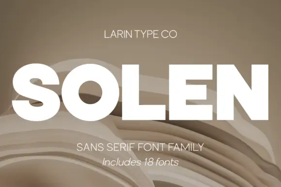
Heavy neutral grotesque family with italic
Solen is a heavy neutral sans shown as a white caps wordmark on layered beige paper folds, presented as an eighteen-font family: thick uniform strokes, tight apertures and an italic companion that gives the same weight a forward lean.
Ideas for this font

Open rounded mixed case with a tall t and broad circular bowls
Cultivo shows a large black title-case name across the lower part of a pale beige cover, where light to moderate nearly even strokes form an open C, a broad u and near-circular bowls, the t finishes with a rounded lower turn and the v opens a clean diagonal.
Ideas for this font
Allow optional Google Analytics to measure visits and catalogue actions. Your search words and notes are not included. Privacy & storage