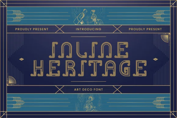
Neutral Sans Workhorse

Midnight Meow + Montreal
Lets Midnight Meow own the focal silhouette while handling secondary copy, sizing and subheads cleanly.
Inspect Montreal specimenDisclosure: MakerFileHub may earn a commission from qualifying purchases via paid links on this page. How our links work.
Jack-o'-lantern & peeking black-cat counter Halloween font (Regular & Italic)
Midnight Meow is an adorable chunky Halloween display duo ('Regular & Italic') hiding carved jack-o'-lantern faces and peeking black-cat ears right inside the letter counters!
Paid link
Get this fontProject & layout blueprintsAt-a-glance maker compatibility
Sturdy stroke walls and open counters weed cleanly on adhesive vinyl, HTV apparel film, and cut cardstock.
Visual anatomy & craft review
Midnight Meow is a Halloween novelty alphabet in which the counters hide jack-o'-lantern faces and a black cat peeks over the top of certain letters, with a regular and an italic cut. The cat's ears and the cut eyes are the finest elements, and the faces sit inside the bowls, so the counters must stay open. It needs roughly 34 mm for the face and the peeking cat to read, and it is best in one warm orange and one black on white, or two inks on a dark ground where the eyes stay as paper.
Cat-and-pumpkin-counters · Regular-and-Italic · Cute-spooky
Two-font hierarchy recipes
Tested contrast partners — pairing Midnight Meow with grounded secondary typography.
Midnight Meow + Montreal
Lets Midnight Meow own the focal silhouette while handling secondary copy, sizing and subheads cleanly.
Inspect Montreal specimen
Midnight Meow + Gorga
Grounds bold display lettering with classic typographic authority on posters, badges and apparel.
Inspect Gorga specimenPractical applications
Concrete hierarchy, scale and production guidance tailored to Midnight Meow’s stroke geometry.
A pumpkin-and-cat alphabet is the party itself, so a Halloween invite in it needs no illustration. The faces read at 34 mm, and two inks print the invite, the bag labels and the door sign in one pass.
Hierarchy & layout recipe
Invite A6, word 34 mm with 10 mm cat clearance, details 8/11 pt, 12 mm margins. Bag label 80 x 50 mm, word 14 mm, 5 mm margins. Door sign 250 x 350 mm, word 60 mm, 20 mm margins.
Pre-production check
A 80 x 50 mm bag label at 14 mm closes the cut eyes into dots and the pumpkin reads as a plain counter. Raise the label word to 20 mm, and print one label before the batch.
A pumpkin alphabet separates an October birthday from the generic Halloween card, which is what a child born that week wants. The cat ears hold at 40 mm on an invite, and two inks print the invite and the wraps as one set.
Hierarchy & layout recipe
Invite A6, word 40 mm with 10 mm cat clearance, details 8/11 pt, 12 mm margins. Topper 130 x 110 mm, word 44 mm with a 6 mm stick slot and 14 mm clear above the ears. Cup wrap 200 x 90 mm, word 20 mm, 12 mm from the rim.
Pre-production check
A 130 mm laser-cut topper thins the cat ears under 0.8 mm and they snap in the machine. Cut the silhouette without ears and print them, and test one before the set.
A novelty Halloween alphabet turns a seasonal page into a visual joke, which is what a light feature wants at the opener. The faces hold at 60 pt, and the italic cut supplies a second voice in the same family.
Hierarchy & layout recipe
Opener 210 x 297 mm, title 60 pt with 10 mm cat clearance, standfirst 11/15 pt, body 9/13 pt, 18 mm margins. Pull quote 40 pt in italic. Section head 24 pt.
Pre-production check
At 24 pt on the section head the pumpkin face turns to dirt and the word looks stained. Keep the face at 40 pt and above, and proof one spread at 1:1.
Technical & licence verification
Confirm included OTF/TTF/WOFF formats, full glyph tables and licence coverage on the live store page before batch production.
Closest visual alternatives
Matched across letterform anatomy, stroke behaviour and craft applications.
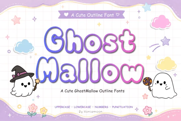
Puffy pastel marshmallow-ghost Halloween outline font (Full charset)
Ghost Mallow is a squishy, pastel-cute Halloween outline font with wavy ghost-hem bottoms across uppercase, lowercase, numbers & punctuation!
Ideas for this font
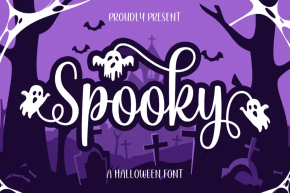
Swash script with seasonal ornaments
Spooky is a swash script in white with a heavy outline on a purple graveyard scene: a fat connected script with long entry and exit swashes, small ghosts hanging from the swashes, and a bouncy baseline, so the plate reads as a friendly Halloween title.
Ideas for this font
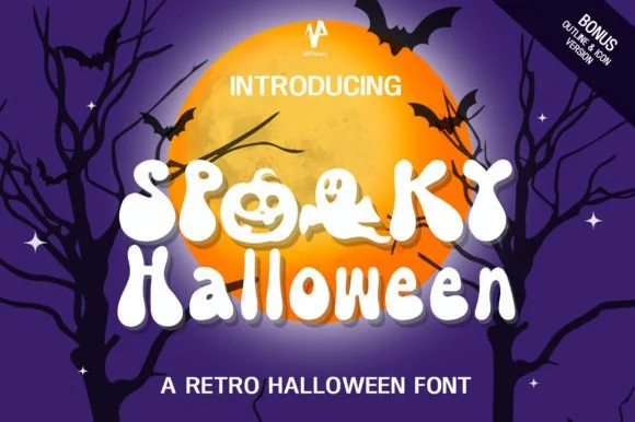
70s groovy ghost & jack-o'-lantern counter font (+ Bonus Outline & Icons!)
Spooky Halloween (by NPNaay) is a 1970s groovy display pack hiding cute ghosts & jack-o'-lanterns inside letter bowls—PLUS a Bonus Outline & Icon version!
Ideas for this font
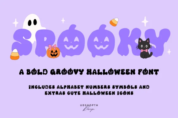
Bold groovy bubble display with faces
Spooky is a bold groovy display in lilac-purple on a pale lavender ground: fat rounded letters that swell and narrow, jack-o-lantern faces cut into three of them, and a bounce that lifts alternate characters, so the word reads as a seventies novelty rather than as a horror face.
Ideas for this font
Same independent foundry
Allow optional Google Analytics to measure visits and catalogue actions. Your search words and notes are not included. Privacy & storage