Editorial Serif Anchor

Thick Black + Evoire
Anchors Thick Black's fluid strokes with crisp Roman proportions on wedding suites, headers and packaging.
Inspect Evoire specimenDisclosure: MakerFileHub may earn a commission from qualifying purchases via paid links on this page. How our links work.
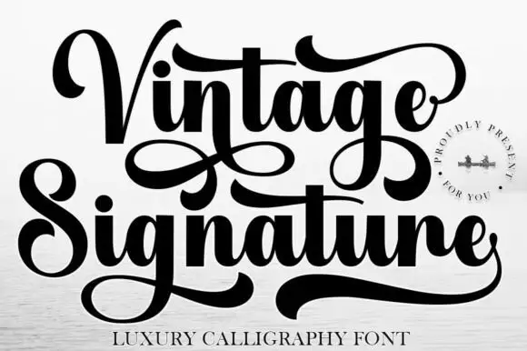
Heavy calligraphy with large curled terminals
Thick Black combines heavy rounded stems with large looping T, B and k forms, where two stacked words sit with tight middle counters and sweeping outer terminals, and a faint landscape runs behind the lettering as separate artwork.
Paid link
Get this fontProject & layout blueprintsAt-a-glance maker compatibility
Weld or Unite overlapping script joins into one continuous vector path before sending to the blade.
Visual anatomy & craft review
The stems stay heavy, the loops grow large, the counters close tight and the terminals sweep out. That heavy loop is the character: the word reads as brush calligraphy rather than a delicate script, which is why the sample keeps two words stacked. The landscape is not part of the letters, so test the script on flat colour, keep 34 pt before the counters close and allow 22 mm at each end for the terminals. The tight counters are the risk: they plug at about 30 pt and the word greys into a black mass, so keep 34 pt and give each end 22 mm for the swept terminals.
Heavy · Curled · Compact
Two-font hierarchy recipes
Tested contrast partners — pairing Thick Black with grounded secondary typography.
Thick Black + Evoire
Anchors Thick Black's fluid strokes with crisp Roman proportions on wedding suites, headers and packaging.
Inspect Evoire specimen
Thick Black + Headline
Keeps small-scale dates, URLs, nutrition facts and care instructions crisp and legible below script titles.
Inspect Headline specimenPractical applications
Concrete hierarchy, scale and production guidance tailored to Thick Black’s stroke geometry.
The heavy script gives a bag warmth, and the curled terminals hold a two-word name at 24 pt on a 65 by 95 mm bag, where the tight counters stay open on kraft.
Hierarchy & layout recipe
Print a 65 by 95 mm kraft bag label: set the name at 24 pt on one row, keep 12 mm of clear ground beneath for the loop, and keep one flat ink so the heavy curves stay clean.
Pre-production check
Closed counters printed at 16 pt fill in badly; check the plate proof and hold the name at 22 pt or above before the run.
The brush weight suits a rustic suite, and the sweeping terminals give a pair of names weight at 30 pt on heavy card, where the loops frame the row.
Hierarchy & layout recipe
Print a 130 by 180 mm invitation: set the names at 30 pt on one row, keep 22 mm of clear ground beneath for the descenders, and keep 18 mm of margin at each end so the terminals stay inside the trim.
Pre-production check
Terminals running past the trim look cut off; check the artwork, keep 18 mm of white on both sides and test one card first.
The rounded mass keeps a note friendly, and the heavy strokes hold a short line at 28 pt on an A6 sheet, where the looped T anchors the message.
Hierarchy & layout recipe
Print an A6 card: set the line at 28 pt across the upper half, keep 18 mm of clear ground beneath before the signature at 12 pt, and keep the card cream so the heavy black feels warm.
Pre-production check
Two script rows on one card tangle; check the card and keep the signature in a plain hand.
Technical & licence verification
Confirm included OTF/TTF/WOFF formats, full glyph tables and licence coverage on the live store page before batch production.
Closest visual alternatives
Matched across letterform anatomy, stroke behaviour and craft applications.
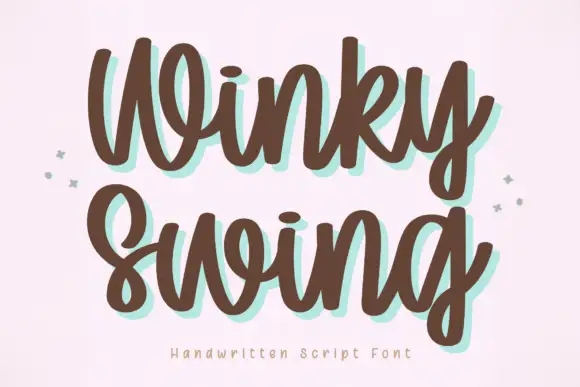
Bold handwriting with a coloured drop shadow
Winky Swing is a bold handwritten script in brown on cream: fat rounded letters with open loops, a tilted baseline and a mint shadow offset behind them, with two small sparkles either side and a tracked caption below.
Ideas for this font
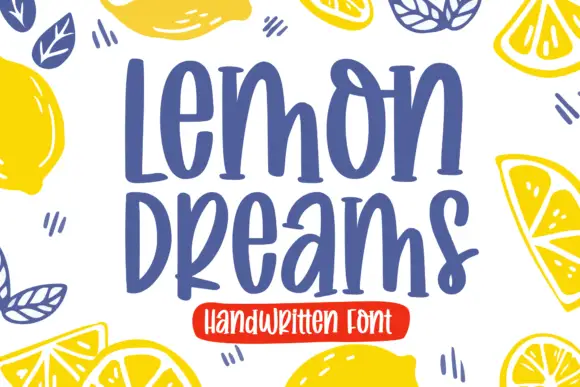
Quirky handwritten display
Lemon Dreams is a quirky handwritten display in navy on cream, surrounded by drawn lemons: a tall irregular hand with a straight-legged a, an open e and a hooked y, set in two lines with a small caps line above and a red banner beneath naming the category.
Ideas for this font
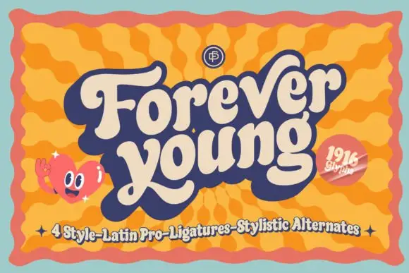
Heavy retro script with broad curled terminals and a tight rhythm
Forever Young is a heavy retro script with broad strokes, curled terminals and a tight rhythm, drawn so two stacked words read as a single filled shape with no gaps between letters.
Ideas for this font
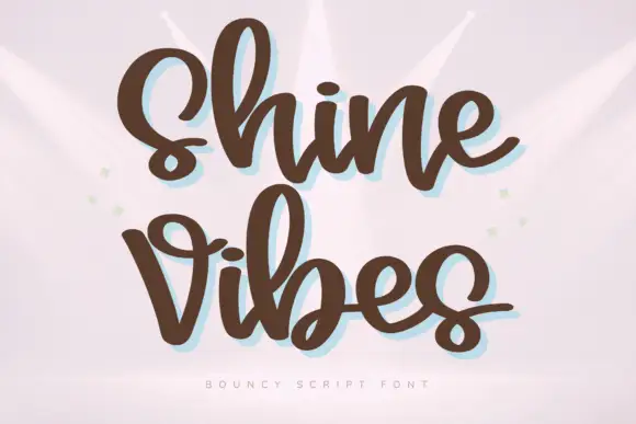
Heavy rounded bouncing script
Shine Vibes is a heavy rounded script in warm brown: fat even strokes, short ascenders, a strong bounce across the line and a pale blue shadow that sits behind the lettering.
Ideas for this font
Same independent foundry
Allow optional Google Analytics to measure visits and catalogue actions. Your search words and notes are not included. Privacy & storage