High-Contrast Display Serif

Spooky Ghouls Duo + The Avenue Editorial
Pairs sculptural editorial warmth with Spooky Ghouls Duo's clean modern geometry.
Inspect The Avenue Editorial specimenDisclosure: MakerFileHub may earn a commission from qualifying purchases via paid links on this page. How our links work.
Bouncy rounded Halloween caps with thin casual script
Spooky Ghouls Duo pairs fat rounded Halloween capitals on a bouncing baseline with a hairline casual script above and below them, and turns two counters into faces.
Paid link
Get this fontProject & layout blueprintsAt-a-glance maker compatibility
Weld or Unite overlapping script joins into one continuous vector path before sending to the blade.
Visual anatomy & craft review
Each capital keeps a small wedge serif at the corners and a soft inner shadow, so the shapes read plump rather than novelty-thin. Two counters are drawn as faces, a pumpkin with cut eyes inside one O and a ghost in another letter, which means those characters are illustration rather than neutral shapes. The capitals do not sit level: every word rises and dips by roughly a tenth of its cap height, producing the hand-cut sticker feel. The companion script is a thin, high-waisted marker with a slight right lean and short entry strokes. Stars scattered between the words are cover decoration, not glyphs.
Playful · Bouncy · Illustrated
Two-font hierarchy recipes
Tested contrast partners — pairing Spooky Ghouls Duo with grounded secondary typography.
Spooky Ghouls Duo + The Avenue Editorial
Pairs sculptural editorial warmth with Spooky Ghouls Duo's clean modern geometry.
Inspect The Avenue Editorial specimen
Spooky Ghouls Duo + Simple Handwriting
Introduces organic movement on pull-quotes, signatures and gift tags.
Inspect Simple Handwriting specimenPractical applications
Concrete hierarchy, scale and production guidance tailored to Spooky Ghouls Duo’s stroke geometry.
The illustrated counters set a children's party tone while the thin script supplies a calm line for time, address and reply details.
Hierarchy & layout recipe
Set the capitals at 36 pt across two bouncing lines, then the script at 14 pt for date and venue, leaving a 6 mm gap so the dip of the second line never touches it.
Pre-production check
Confirm whether the pumpkin and ghost counters ship as alternates; without them those letters print as ordinary round bowls.
Rounded capitals stay legible from across a room, and the script line can name the flavour without competing with the headline.
Hierarchy & layout recipe
Print the capitals at 1.5-inch cap height on A4 card and place a single script line at 18 pt at the bottom, aligned to the widest capital rather than centred on the pair.
Pre-production check
Proof your actual words first: any letter whose counter is drawn as a face still has to read as a letter at 1.5 inches.
Three to five letters per pennant keeps the bouncing baseline from looking like a mistake across a run of hanging flags.
Hierarchy & layout recipe
Cut 4-inch pennants with one word each, keep all capitals at 60 percent of the flag height and thread the string through the top margin rather than the letters.
Pre-production check
Avoid scaling below one inch, because the inner shadow and wedge serifs turn to mud when the capitals get small.
Technical & licence verification
Confirm included OTF/TTF/WOFF formats, full glyph tables and licence coverage on the live store page before batch production.
Closest visual alternatives
Matched across letterform anatomy, stroke behaviour and craft applications.
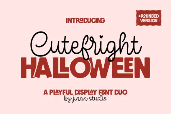
Looped script with heart tittles paired with a heavy rounded display
Cutefright Halloween is a duo that pairs a fine looping script, dotted with small hearts, against a very heavy rounded display face whose counters close into narrow slits.
Ideas for this font
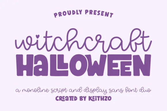
Monoline script paired with a fat rounded sans
Witchcraft Halloween is a duo in purple on pale lilac: a monoline script with open loops and a heart tittle for the first word, and a very fat rounded sans with quirky joins for the second, sold as one pair.
Ideas for this font
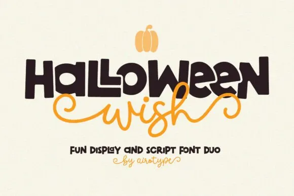
Chunky hand-drawn display paired with a curly script
Halloween Wish pairs a big hand-drawn block word with a curly script that stretches beside it, so a short line gains a strong silhouette without losing the friendly spooky tone.
Ideas for this font
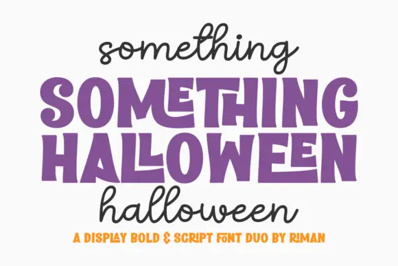
Chunky uneven blocks with monoline handwriting
Something Halloween is a duo in purple and black on white: fat display capitals with slightly hand-drawn edges and a stepped baseline for the headline, and a monoline script in lowercase above and below it, with a tracked orange line at the foot.
Ideas for this font
Same independent foundry
Allow optional Google Analytics to measure visits and catalogue actions. Your search words and notes are not included. Privacy & storage