Modern Grotesque Body

Worldstar + Borsen
Creates crisp high-hierarchy contrast beneath Worldstar headlines across menus, websites and labels.
Inspect Borsen specimenDisclosure: MakerFileHub may earn a commission from qualifying purchases via paid links on this page. How our links work.
Bold letterpress-inked vintage editorial serif
Worldstar is a bold vintage editorial serif (NOT casual handwriting!) featuring warm bracketed curves and subtle antique letterpress edge ink.
Paid link
Get this fontProject & layout blueprintsAt-a-glance maker compatibility
Fine grain and micro-texture excel in 300 DPI print, sublimation, and screen print rather than small vinyl weeding.
Visual anatomy & craft review
Worldstar is a bold vintage editorial serif with warm bracketed curves and a light letterpress edge that sits on the contour, so a page reads as printed on a cylinder press rather than distressed in software. The weight is bold but the counters stay open, which lets the face set a 10 pt caption as comfortably as a 60 pt masthead, and the bracketing gives small sizes a soft, non-digital finish. Edge ink is subtle enough to survive a second-generation print, and the face is at its best in a single dark colour on a warm off-white stock.
Vintage-letterpress · Warm-bold-serif · Nostalgic-print
Two-font hierarchy recipes
Tested contrast partners — pairing Worldstar with grounded secondary typography.
Worldstar + Borsen
Creates crisp high-hierarchy contrast beneath Worldstar headlines across menus, websites and labels.
Inspect Borsen specimen
Worldstar + Easy Handwriting
Adds a warm human signature touch for 1-to-3-word callouts without competing against structured serif capitals.
Inspect Easy Handwriting specimenPractical applications
Concrete hierarchy, scale and production guidance tailored to Worldstar’s stroke geometry.
A letterpress edge reads as a small print run rather than a template, which is the identity an indie title is selling. Open counters keep a 10 pt caption legible where a high-contrast revival would sparkle.
Hierarchy & layout recipe
Masthead 280 x 50 mm, 44 pt, 25 units tracking. Book 190 x 245 mm, chapter openers 30 pt, body 10/14 pt, 20 mm margins. Podcast cover 3000 x 3000 px, title 380 px, safe area 10 percent.
Pre-production check
Letterpress edge detail disappears when a file is exported at 150 dpi for a proof, and the face then looks like a plain serif. Export at 300 dpi and confirm the edge survives in the final PDF the printer receives.
A warm bracketed serif reads as signage from an older shopfront, which is the credibility a record shop or natural-wine label borrows. Bold weight holds at 8 mm on a bottle where a light serif would vanish.
Hierarchy & layout recipe
Tee print 280 x 140 mm, word 50 mm, 30 mm margins. Bottle label 80 x 110 mm, name 18 mm, abv 4.5 pt, 5 mm top arc. Bakery bag 180 x 250 mm, word 36 mm.
Pre-production check
Natural-wine bottles are often labelled by hand at small scale, and a dark bold serif on a light label shows every misalignment. Print on a slightly oversized label with a border so a hand-applied label can sit off-centre without looking wrong.
A bookish serif suits an autumn reading series where the tone is quiet, and bold weight carries a title across a window seen from the pavement. Bracketing keeps small date lines from looking sharp.
Hierarchy & layout recipe
Poster 420 x 594 mm, title 110 pt, dates 16/22 pt, 30 mm margins. Card 105 x 148 mm, title 16 mm, details 7/10 pt. Tin 75 x 100 mm, name 14 mm, brewing 5.5 pt.
Pre-production check
Window posters are backlit by daylight and a heavy ink coverage can look patchy on cheap stock. Print one poster and tape it in the actual window before the series starts, checking for show-through from behind.
Technical & licence verification
Confirm included OTF/TTF/WOFF formats, full glyph tables and licence coverage on the live store page before batch production.
Closest visual alternatives
Matched across letterform anatomy, stroke behaviour and craft applications.
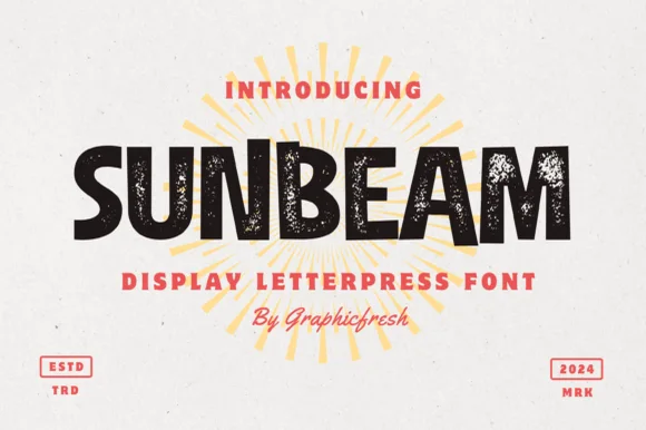
Chunky hand-cut vintage letterpress sans display
Sunbeam is a bold, wide-stance vintage sans display typeface pairing hand-carved organic contours with subtle letterpress speckle texture.
Ideas for this font
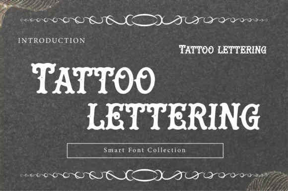
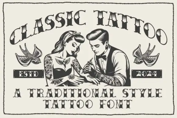
Letterpress tattoo lettering
Tattoo Lettering is a decorative plate in cream on charcoal: a swollen display alphabet with notched spurs and heavy serifs, set in two lines with a thin ornamental rule above and below, a small tracked label at the left and a boxed note at the foot naming the collection.
Ideas for this font

Carved Southeast-Asian temple & batik ornamental serif
Nusantara Heritage is an ornate cultural display serif inspired by Indonesian archipelago temple carvings, tropical flora, and traditional craft motifs.
Ideas for this font
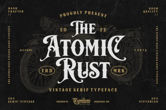
Victorian custom-motorcycle & heritage tattoo display serif
Atomic Rust is an all-caps Victorian heritage serif armed with median stem thorns, curled swash legs, and classic garage-emblem swagger.
Ideas for this font
Same independent foundry
Allow optional Google Analytics to measure visits and catalogue actions. Your search words and notes are not included. Privacy & storage