High-Contrast Display Serif

Prime Nordic + Resquel
Pairs sculptural editorial warmth with Prime Nordic's clean modern geometry.
Inspect Resquel specimenDisclosure: MakerFileHub may earn a commission from qualifying purchases via paid links on this page. How our links work.
Geometric sans with a variable weight range
Prime Nordic is a geometric sans in white on charcoal, set as two lines of the same name: the first in a light cut and the second in a heavy one, with a small badge tucked at the shoulder stating nine weights and two notes in the corners about the variable file and the language support.
Paid link
Get this fontProject & layout blueprintsAt-a-glance maker compatibility
Sturdy stroke walls and open counters weed cleanly on adhesive vinyl, HTV apparel film, and cut cardstock.
Visual anatomy & craft review
The plate does the one thing a variable family has to do, which is to show both ends of the range in a single look, and it does it without a slider or a specimen grid: the same word is set light above and heavy below, so the buyer judges the extremes side by side. The drawing is a geometric sans with near-circular bowls and flat terminals, and both cuts hold their geometry, which is the test that a wide weight range has to pass. The badges and the corner notes are plain product copy that name the count, the variable file and the language support. Because the light end is fine and the heavy end closes its counters, the family needs a size check at both ends before a layout is committed.
Sans serif, geometric, variable, corporate
Two-font hierarchy recipes
Tested contrast partners — pairing Prime Nordic with grounded secondary typography.
Prime Nordic + Resquel
Pairs sculptural editorial warmth with Prime Nordic's clean modern geometry.
Inspect Resquel specimen
Prime Nordic + Hello Honey
Introduces organic movement on pull-quotes, signatures and gift tags.
Inspect Hello Honey specimenPractical applications
Concrete hierarchy, scale and production guidance tailored to Prime Nordic’s stroke geometry.
A variable geometric family covers a mark, a heading and a caption from one licence, which is what a consultancy needs when it prints a report and a sign from the same file.
Hierarchy & layout recipe
Set the mark at 18 pt heavy on a card, 100 mm on a wall and 10 pt light in a footer, and keep the light cut only above 11 pt. Keep one colour and clear space equal to the cap height on all four sides.
Pre-production check
Check the 10 pt footer in the light cut on uncoated paper, where a fine stroke can fill; move to the regular there. Confirm the wall mark reads at ten metres and that the heavy counters stay open at 100 mm.
A heavy geometric title gives a report presence, and the light instance sets a long subtitle without a second typeface being licensed.
Hierarchy & layout recipe
Set the title at 90 mm cap height across 200 mm in the heavy cut, the subtitle in the light cut at 10 pt, and the year at 8 pt. Print one ink on a matte stock and keep 22 mm margins at the head and foot.
Pre-production check
Check the title at 90 mm, where a heavy stroke can clot on a matte sheet; proof the print. Confirm the 10 pt light subtitle holds on the stock and that the title clears the trim at both ends.
A neutral geometric family reads as institutional without looking dated, and the heavy end holds a long institution name on a fascia seen from a car park.
Hierarchy & layout recipe
Fabricate a 900 by 300 mm panel: the school at 95 mm cap height in the heavy cut, the floor in the regular at 22 mm, and a 4 mm rule. Keep 22 mm margins and specify a matte finish on the panel.
Pre-production check
Check the panel at 95 mm, where a heavy counter can fill in metal; keep it above 8 mm. Confirm the 22 mm floor reads at three metres and that the rule clears the fixings on both sides.
Technical & licence verification
Confirm included OTF/TTF/WOFF formats, full glyph tables and licence coverage on the live store page before batch production.
Closest visual alternatives
Matched across letterform anatomy, stroke behaviour and craft applications.

Heavy rounded school sans
School Bold shows heavy upright sans capitals with rounded corners and tall oval counters: the C opening stays broad and the B closes two small rounded bowls, while the cover adds a white edge and a deep offset shadow.
Ideas for this font
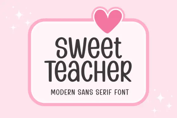
Tall informal rounded sans
Sweet Teacher is a tall informal sans in charcoal on a white rounded panel: narrow uprights with rounded terminals, uneven body widths, a large x-height and a light bounce, with a drawn heart above the panel and sparkles at the corners.
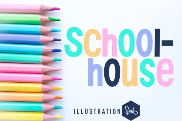
Heavy narrow rounded sans
Schoolhouse is a heavy narrow sans shown in pastel lilac, navy, pink and mint on white: mixed case with long oval bowls, softly uneven rounded shoulders and a slightly loose rhythm, set in two lines beside a fan of coloured pencils and a small studio badge.
Ideas for this font
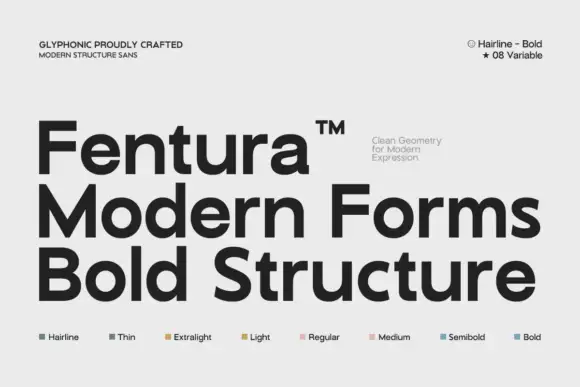
Substantial plain mixed case with broad bowls and open horizontal e bars
Fentura presents three black lines on light grey, the name above Modern Forms and Bold Structure, where straight substantial stems meet broad rounded bowls, the e opens wide, the a keeps a double storey and the crossbars stay flat and plain.
Ideas for this font
Same independent foundry
Allow optional Google Analytics to measure visits and catalogue actions. Your search words and notes are not included. Privacy & storage