Neutral Sans Workhorse

Creepy Spooky + Monure
Lets Creepy Spooky own the focal silhouette while handling secondary copy, sizing and subheads cleanly.
Inspect Monure specimenDisclosure: MakerFileHub may earn a commission from qualifying purchases via paid links on this page. How our links work.
2-version zombie-slime dripping horror display (Regular + Outline)
Creepy Spooky is a bold B-movie slime-dripping display font shipping with BOTH Regular and Outline versions for layered monster graphics!
Paid link
Get this fontProject & layout blueprintsAt-a-glance maker compatibility
Fine grain and micro-texture excel in 300 DPI print, sublimation, and screen print rather than small vinyl weeding.
Visual anatomy & craft review
Creepy Spooky is a heavy block display drawn with long slime drips hanging from the baseline, and it ships in two versions, a filled Regular and an Outline, so a designer can layer one over the other for a two-colour effect. The capitals are wide and chunky, which keeps the word readable even when the drips are long, and the outline version has enough separation to hold a second ink. The drips are part of the anatomy rather than an add-on, so the face needs vertical room below the baseline; cropping close will sever them and make the word look damaged rather than gooey.
Zombie-green-ooze · Regular-and-Outline · Horror-pulp
Two-font hierarchy recipes
Tested contrast partners — pairing Creepy Spooky with grounded secondary typography.
Creepy Spooky + Monure
Lets Creepy Spooky own the focal silhouette while handling secondary copy, sizing and subheads cleanly.
Inspect Monure specimen
Creepy Spooky + Cronelo
Grounds bold display lettering with classic typographic authority on posters, badges and apparel.
Inspect Cronelo specimenPractical applications
Concrete hierarchy, scale and production guidance tailored to Creepy Spooky’s stroke geometry.
Long baseline drips read as movement at a distance, which is exactly what a fun-run shirt needs across a crowd, and the chunky capitals stay legible when the shirt is moving. The two versions let a single screen print carry a shadow layer without extra artwork.
Hierarchy & layout recipe
Shirt print 280 x 380 mm, title 90 mm with 30 mm allocated below the baseline for drips, 30 mm margins. Trail sign 600 x 400 mm, title 80 mm, direction 30 mm. Jar label 70 x 50 mm, word 10 mm, 4 mm top arc clearance.
Pre-production check
The drips extend the artwork's bounding box; many shirt printers auto-crop to the visual box and will clip them. Supply the file with an explicit 30 mm margin below the baseline and confirm the print size in writing before the run.
Gooey drips set the theme in a single word, so a party cup reads as a science-mess party before a child can read the detail. Wide capitals survive as a vinyl cut on a curved cup, where a thin novelty face would lift.
Hierarchy & layout recipe
Cup wrap 200 x 90 mm, word 18 mm, 8 mm from the rim. Sticker sheet A6, six 35 mm dies, word 9 mm, 2 mm die margin. Invite A6, title 24 mm, details 4.5 mm, 10 mm margins.
Pre-production check
Vinyl on a plastic cup is applied to a curved, slightly textured surface and long drips under 1 mm will not adhere at the tips. Keep drips to 2 mm minimum, add a clear laminate border, and wash one cup by hand before ordering the batch.
The outline version gives a small brand a ready-made two-colour identity that reads at a glance on a shelf, which is what a novelty shop needs without a design budget. Chunky letterforms stay readable inside a small circular die where detailed faces fail.
Hierarchy & layout recipe
Logo 90 mm wide, word 20 mm, drips included in the 90 mm width. Box label 80 x 60 mm, word 12 mm, 4 mm die margin. Pin card 75 x 100 mm, word 10 mm, 8 mm margins.
Pre-production check
Inside an 80 mm label the drips plus a 4 mm die margin leave very little air, and a misregistered die clips the longest drip. Reduce the word to 10 mm or ask the die-cutter for the minimum safe distance before finalising the artwork.
Technical & licence verification
Confirm included OTF/TTF/WOFF formats, full glyph tables and licence coverage on the live store page before batch production.
Closest visual alternatives
Matched across letterform anatomy, stroke behaviour and craft applications.
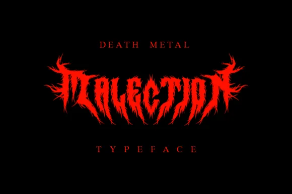
Symmetrical flame-thorned underground death-metal logo font
Malection is a ferocious underground death-metal display font sculpting jagged flame-like thorns into symmetrical band-logo arches.
Ideas for this font
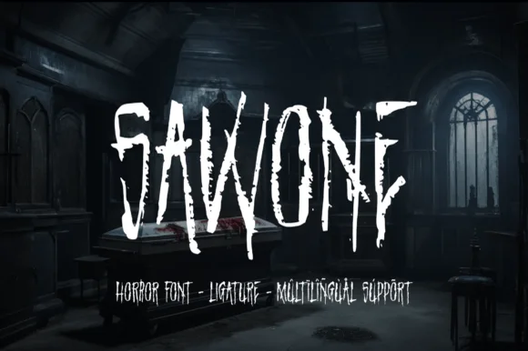
Splintered dry-brush slasher horror display
Sawone is a tall, jagged horror display font drawn with dry Procreate brush strokes, splintered vertical drips, and nervous angular tension.
Ideas for this font
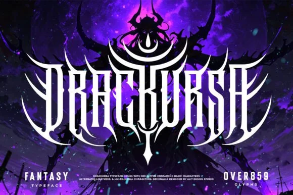
Symmetrical dark-fantasy & death-metal crest font (859+ glyphs)
Drackursa is a monumental 859-glyph dark-fantasy & death-metal typeface engineered with tall vertical blade stems and sweeping wing ligatures.
Ideas for this font
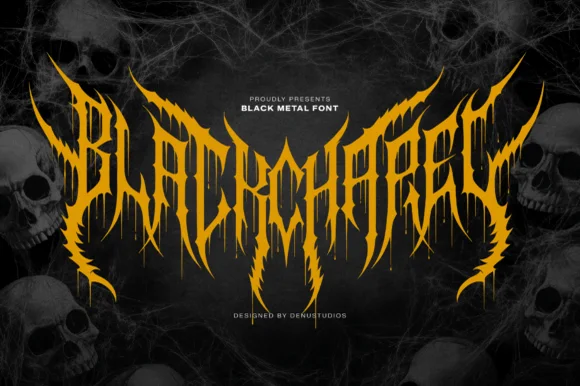
Spiked black-metal sigil lettering with ragged edges and dripping points
Blackchapel is an extreme-metal sigil face in which the letters merge into a spiked mass, the stems split into thorns and the bottoms run into drips, so a word reads as a band logo rather than as readable type.
Ideas for this font
Same independent foundry
Allow optional Google Analytics to measure visits and catalogue actions. Your search words and notes are not included. Privacy & storage