Neutral Sans Workhorse

Ravenmoor + Saltriver Grotesk
Lets Ravenmoor own the focal silhouette while handling secondary copy, sizing and subheads cleanly.
Inspect Saltriver Grotesk specimenDisclosure: MakerFileHub may earn a commission from qualifying purchases via paid links on this page. How our links work.
Dripping gothic horror display
Ravenmoor is a gothic horror display in bone white on a crimson moonlit graveyard: jagged stems, drips falling from every baseline, points that extend into long spikes, with a tracked subtitle and a specification line beneath in small caps.
Paid link
Get this fontProject & layout blueprintsAt-a-glance maker compatibility
Sturdy stroke walls and open counters weed cleanly on adhesive vinyl, HTV apparel film, and cut cardstock.
Visual anatomy & craft review
The word is set once, wide, and each letter is drawn with a broken silhouette: the stems carry spikes, the joins carry thorns, and the drips fall from the baseline at irregular lengths, which turns the words into an image of the scene behind them. Because the drips and spikes are structural, the face needs a large size and a dark ground, and the specimen supplies both with a graveyard scene under a red moon. The tracked subtitle and the specification line beneath sit in small caps with ornaments between them, which is how this kind of product lists its features, and the type there stays calm so the display keeps the weight. The palette is bone on crimson, and the ornament set mentioned in the copy is not shown, which is honest enough for a sheet this size.
Gothic, horror, dripping, dramatic
Two-font hierarchy recipes
Tested contrast partners — pairing Ravenmoor with grounded secondary typography.
Ravenmoor + Saltriver Grotesk
Lets Ravenmoor own the focal silhouette while handling secondary copy, sizing and subheads cleanly.
Inspect Saltriver Grotesk specimen
Ravenmoor + Mewah
Grounds bold display lettering with classic typographic authority on posters, badges and apparel.
Inspect Mewah specimenPractical applications
Concrete hierarchy, scale and production guidance tailored to Ravenmoor’s stroke geometry.
A dripping gothic display reads across a venue and sets the genre in one line, and the structural drips survive a single-colour print where a textured face would clog.
Hierarchy & layout recipe
A2 portrait: the event at 120 mm cap height, the doors time in a 20 mm serif, and the venue at 14 mm. Keep 30 mm margins, print bone on a dark ground, and keep the drips out of the small type block.
Pre-production check
Check the poster at five metres, where a spike can read as damage; keep the spikes above 5 mm. Confirm the 14 mm venue reads at three metres and that the drips do not cross the details.
A horror display frames a gothic title as part of the scene, and the broken silhouette holds at thumbnail size where a photographic cover would lose its subject.
Hierarchy & layout recipe
Set the title at 90 mm cap height across 220 mm, the author in a 12 pt serif, and the imprint at 8 pt caps. Print bone on a dark matte stock and run the illustration behind the title at low contrast.
Pre-production check
Check the title at thumbnail size, where the spikes can blur into the illustration; keep the contrast high. Confirm the 8 pt imprint survives lamination and that the title clears the trim by 12 mm.
A horror display gives a seasonal bottle a shelf presence, and the single-colour version keeps a small run affordable on a dark label.
Hierarchy & layout recipe
Print a 70 by 100 mm label: the product at 16 pt, the volume in a 7 pt serif, and a 5 mm rule. Keep 5 mm inside the die and print bone on a dark stock so the drips read as ink on glass.
Pre-production check
Check the 16 pt product on a curved bottle, where the outer letters distort; reduce the width. Confirm the 7 pt volume reads in the chiller and that the drips clear the die.
Technical & licence verification
Confirm included OTF/TTF/WOFF formats, full glyph tables and licence coverage on the live store page before batch production.
Closest visual alternatives
Matched across letterform anatomy, stroke behaviour and craft applications.
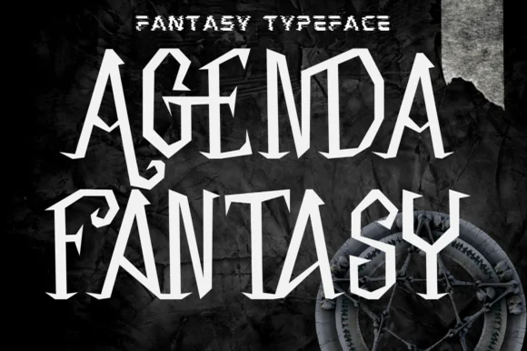
Angular blade-hooked dark-fantasy & Halloween display
Agenda Fantasy is a creepy, razor-angled dark-fantasy display font hooking jagged scythe spurs onto tall Gothic-inspired capitals.
Ideas for this font
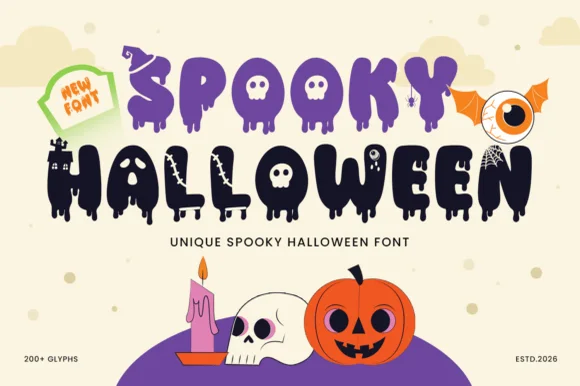
200+ glyph melting-ooze, witch-hat & haunted-castle horror alphabet
Spooky Halloween (by Umitype) is a loaded 200+ glyph Halloween display font crowning melting slime letters with witch hats, haunted castles, skulls & eyeballs!
Ideas for this font
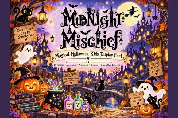
Whimsical witchy storybook Halloween font with curls, stars & spiders
Midnight Mischief is an enchanted children's Halloween display font curling fairy-tale serif stems with hanging spiders, stars, and moons! (Full charset + elements).
Ideas for this font
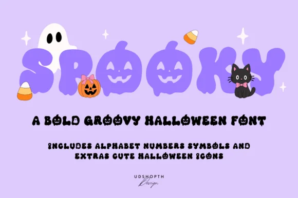
Bold groovy bubble display with faces
Spooky is a bold groovy display in lilac-purple on a pale lavender ground: fat rounded letters that swell and narrow, jack-o-lantern faces cut into three of them, and a bounce that lifts alternate characters, so the word reads as a seventies novelty rather than as a horror face.
Ideas for this font
Same independent foundry
Allow optional Google Analytics to measure visits and catalogue actions. Your search words and notes are not included. Privacy & storage