 #1 · Best Overall
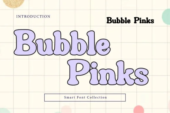
Bubble Pinks
Outlined bubble letters with soft uniform contours in solid and hollow cuts
Get fontPaid link
Read review ↓Disclosure: MakerFileHub may earn a commission from qualifying purchases via paid links on this page. How our links work.
Colour, gradient & outlined sticker lettering
Sublimation and print-then-cut reward a different anatomy than vinyl: rounded outer silhouettes that take a clean offset border, open counters that survive a bleed, and shapes that look deliberate in two or three flat colours. Bubble Pinks and Chubby Bubbles print as one crisp outline ring, and Bouncy Block Deluxe fills a whole sheet on its own.
Quick verdict
Bubble Pinks is the most reliable outlined bubble for a first print-then-cut sheet, Chubby Bubbles suits nursery and pastel ranges, and Bouncy Block Deluxe carries a full sheet on its own. Maple Mingle adds a script voice when every sticker cannot be a bubble.
Quick answer
Short on time? Start with our three highest-rated sublimation, sticker & Print-Then-Cut standouts before scrolling the full breakdown.
#1 · Best OverallOutlined bubble letters with soft uniform contours in solid and hollow cuts
 #2 · Runner-Up Pick
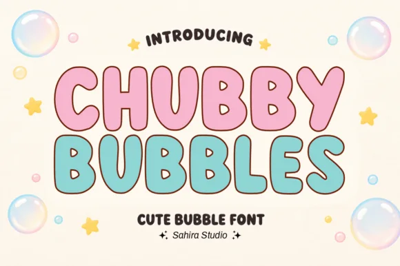
Outlined pastel nursery bubble capitals with a thick rounded contour
 #3 · Editor's Choice
We kept 29 of 769 candidates after excluding anything whose look depends on colour bitmap glyphs that fail on single-colour printing. Scored on outer silhouette smoothness, whether an offset border can be added without touching the letter, and how the shapes hold below 1.5 inches wide.
Side-by-side summary
Compare specimens, OpenType/PUA traits and primary project roles side by side.
| Rank & Font | Style & File Specs | Best Project Fit | Store Listing |
|---|---|---|---|
| DisplayBubbly | Digital planner header, binder sticker or birthday banner | Get fontPaid link | |
| DisplayBubbly | First-birthday highchair banner, bath-bomb label or party cup | Get fontPaid link | |
| DisplayPUA encoded · Language support · File formats | Back-to-school tote, water-bottle sticker & kids' tee | Get fontPaid link | |
| DisplayPUA encoded · Ligatures | Daycare cubby nameplates, teacher shirts & backpack tags | Get fontPaid link | |
| DisplayPUA encoded · File formats | Die-cut laptop sticker, planner cover & iced-latte cup | Get fontPaid link |
#1 · Best OverallBubble Pinks is a bubble display in both solid and hollow cuts in which the counters stay generous, the contours run smooth and the outline keeps an even weight, so a multi-word title stays light and legible rather than turning into a solid mass.
The B stacks two round bowls, the p opens a large counter, the k splays two rounded arms and the S holds a soft spine, all at a heavy bubble weight with a uniform outline and fully rounded ends. The even outline is the character: it lets a hollow cut hold a long phrase where a filled bubble face would clot, which is why the sample sets letters in outline with a pale shadow. Because the outline is one weight throughout, the hollow cut needs 40 pt before the contour reads as intended and the solid cut holds from 30 pt. The pastel ground, the shadow layer and the small caption are presentation; the outlined letters are the face.
Digital planner header, binder sticker or birthday banner — Layer pastel colour behind the outline style or cut the solid style in vinyl.
Smooth rounded vector contours cut and weed easily on craft vinyl.
#2 · Runner-Up PickChubby Bubbles is a bubble capital alphabet in which the letters are fat and round, the contour is thick and open and the inner space is left hollow, so a word reads as a set of pastel letter stickers for a nursery.
The C opens a wide crescent, the H keeps two fat stems and a low bar, the U holds a deep bowl and the B closes two even lobes, all at a maximal weight with fully rounded ends and a contour drawn as a separate line rather than a shadow. Because the letters are hollow, they can carry a pastel fill inside a dark contour, which is how the sample builds two colourways on one sheet. The rounded ends and the wide fit make the face read as foam letters at 30 mm, and the hollow construction keeps it legible on a busy nursery wall. Counters close below 20 pt. The cream ground, the pink and mint fills, the bubbles and the two caption lines are presentation; the display face is the two words.
First-birthday highchair banner, bath-bomb label or party cup — Fill with pastel pink, mint or sky blue inside a dark brown or navy outline.
Smooth outer contours cut cleanly on cardstock, HTV and permanent vinyl.
#3 · Editor's ChoiceBouncy Block Deluxe is a thick, solid-filled bubble display font with pillowy rounded terminals, playful tilt, and tiny counter pinholes.
Bouncy Block Deluxe is a heavy rounded chunky bubble display: fat even-width letters with fully rounded corners, tight counters that almost close and a baseline that lifts a few letters so the word looks stacked and bouncing. It is a signage face, so it wants size and a single flat colour rather than fine detail. The counters are the finest element and they plug as soon as the face is reduced or cut in vinyl. It needs roughly 30 mm for the counter and the corner radius to read, and it is best as one flat ink on a light ground.
Back-to-school tote, water-bottle sticker & kids' tee — Stack 2 or 3 short punchy words ('STAY COOL', 'DREAM BIG') at tight 0.88 line-height inside a contoured die-cut sticker shape.
When weeding small decals under 1 inch, use a fine pin pen solely to pop out the tiny teardrop counters inside 'B', 'o', 'a', and 'e'.
 #4 · Top Maker Utility
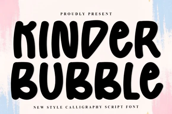
Kinder Bubble is a bold, solid-black hand-drawn block display font with soft organic edges and playful mixed-case letterforms.
Kinder Bubble is a heavy hand-cut playroom block display: fat squared letters with visible scissor-cut edges, slightly mismatched heights and blunt corners, drawn to look as if cut from coloured card and pinned to a playroom wall. The cut edges are the design and they silt when the face is reduced. It needs roughly 26 mm for the cut edge and the height mismatch to read, and it is best as a one-colour vinyl or paper cut on a light ground, or one ink print where the cut edge reads as a shadow.
Daycare cubby nameplates, teacher shirts & backpack tags — Center a child's name or grade level in 1.5–2.5 in solid letters, pairing classroom room numbers in the same bold face.
Weeds cleanly on both permanent vinyl and puff HTV; just watch the compact double counters inside 'B' below 0.8 inches.
 #5 · Standout Silhouette
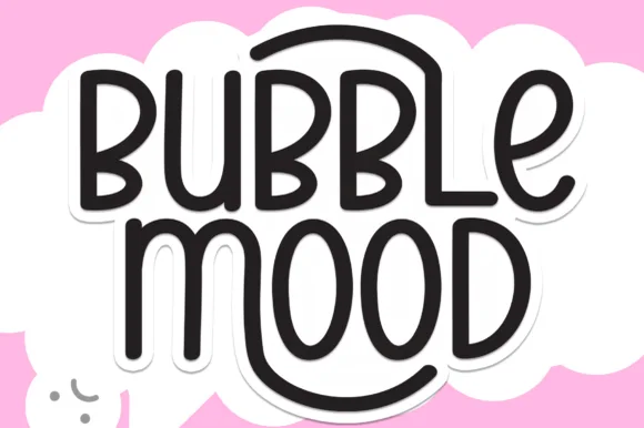
Bubble Mood is a tall, medium-weight rounded marker display font where curved outer stems wrap playfully around neighboring vowels.
Bubble Mood is a tall rounded monoline marker display with nesting arches: narrow upright letters drawn with an even round-tipped stroke, where each word sits under a shallow arch that nests inside the next line's arch. The arch grows the word vertically and the monoline keeps it honest at small sizes. It needs roughly 22 mm for the arch and the rounded end to read, and it is best in one bright ink on white, or a single dark colour on a pale board.
Die-cut laptop sticker, planner cover & iced-latte cup — Stack two short words centered and add a 0.12 in white offset contour in Cricut Design Space for an instant die-cut sticker silhouette.
Clean medium-weight strokes and wide open 'O' and 'D' counters make adhesive vinyl weeding quick even at 0.75 in height.
 #6
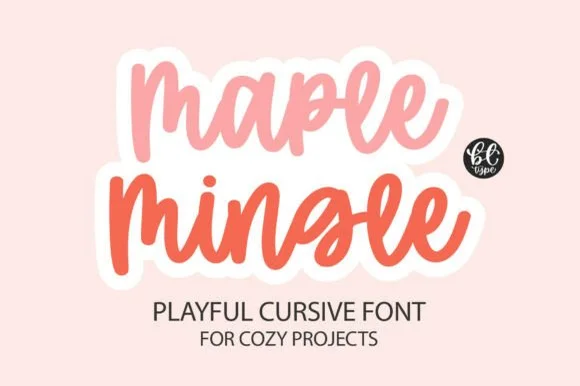
Maple Mingle is a playful cursive face in which the letters run together in a marker hand and a heavy white outline wraps each word, so a short phrase reads as a cut sticker rather than as handwriting.
The m keeps three uneven arches, the a closes a round bowl, the p drops a wide bowl, the l rises on a slanted stem, the e turns a light eye and the n repeats the arch, all at a marker weight with rounded ends, a bouncy baseline and a contour drawn around the whole word. The contour is the character: it treats the phrase as one object, which is why the sample sets two stacked words in two colours with a cut edge. Because the shapes are solid, the face holds from 26 pt and cuts cleanly in card. The pink ground, the small monogram badge and the two caption lines are presentation; the two coloured phrases are the face.
Friendsgiving tumbler, fall doormat or sticker pack — Add an offset white sticker contour for print-then-cut planner and laptop decals.
Weld cursive joins before cutting — one of the easiest scripts to weed.
 #7
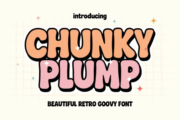
Chunky Plump is a bubbly retro-groovy display font wrapped in bold black comic outlines and extruded 3D drop shadows!
Chunky Plump is an inflated retro-groovy display with a groovy waist pinch, heavy black comic outlines and an extruded 3D drop shadow baked into the glyph, so a word reads as a screen-printed poster sticker rather than a flat letter. The extrusion always falls to one side, which fixes the light direction and means the word cannot be flipped without looking wrong. It needs roughly 32 mm for the extrusion to read as depth, and it is best in peach or pink with a black shadow on a pale grid ground.
Retro sticker-shop logo, iced-coffee wrap & graphic tee — Stack 2 tight uppercase words at 68–130 pt so black 3D shadows lock into one cohesive retro badge.
Shines on Print-Then-Cut vinyl stickers, DTF tees, and sublimation wraps—or cut solid single-layer shapes on 0.8 in+ HTV!
 #8
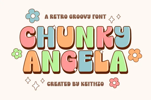
Chunky Angela is a punchy 90s/70s uppercase retro bubble font pairing groovy waist curves with crisp dark cartoon outlines!
Chunky Angela is a comic-outlined retro uppercase display that sits between the nineties and the seventies: fat rounded letters with a thick black keyline, a white inner gap and a bold fill, plus a small counter squiggle that reads as a comic sound effect. The keyline is the design and it merges with the fill when the face is reduced. It needs roughly 32 mm for the keyline and the gap to read, and it is best in three flat inks on white, or two inks where the gap is the paper itself.
'90s BABY' / 'IN MY GROOVY ERA' birthday shirt & banner — Stack 2 centered uppercase lines at 64–120 pt in vibrant 6-color retro palettes with dark brown outlines.
100% smooth solid bubble cores cut and weed in seconds on Cricut cardstock, HTV, and Print-Then-Cut stickers down to 0.65 in!
 #9
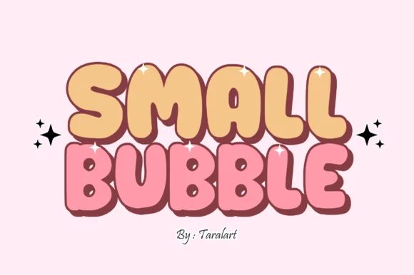
Small Bubble is a cozy, hand-drawn cartoon bubble display font with chubby rounded capitals and sweet comic-sticker personality.
Small Bubble is a hand-outlined comic display face: each chubby capital is drawn with a warm, slightly irregular contour and a heavier outline than fill, so the letters read as stickers peeled off a sheet. Bowls are nearly circular and counters stay open, which keeps small sizes friendly rather than muddy. Because the outline is part of the glyph rather than a stroke applied in software, it reproduces predictably on a cutting machine and on a heat transfer, and the face carries short phrases at tag scale without the visual noise of a distressed texture.
Kawaii sticker-shop logo, crochet tag & mailer seal — Stack 2 short uppercase words centered at 60–110 pt flanked by sparkle stars.
Clean solid bubble shapes cut and weed in seconds on Cricut HTV, permanent vinyl, and Print-Then-Cut stickers down to 0.65 in!
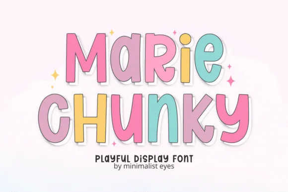 #10
Marie Chunky is a tall, lively cartoon display font mixing uppercase and lowercase bubble shapes inside crisp outline borders!
Marie Chunky is a tall cartoon display that mixes uppercase and lowercase bubble shapes inside thin dark outlines with a white die-cut sticker shadow behind each letter, so a word reads as a sticker sheet rather than as type. The mixed case is what keeps it lively, and the sticker shadow means the letters should not be re-exported on a coloured ground without it. It needs roughly 26 mm for the die-cut edge to read, and it is best in pastel fills with a white border on a soft grey or cream ground.
Die-cut name sticker, kid's notebook cover & party favor — Stack 2 centered words at 64–120 pt in soft pastel hues wrapped in one unified 0.14 in white sticker offset.
100% smooth solid cores cut and weed in seconds on Cricut cardstock, HTV, and Print-Then-Cut sticker vinyl down to 0.65 in!
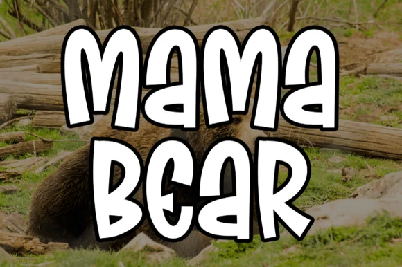 #11
Mama Bear is actually a chunky, bouncy cartoon block display font (NOT a delicate wedding script!) built for bold family camp tees and decals.
Mama Bear is a chunky cartoon block display with a thick black comic outline, puffy rounded strokes and a bouncy baseline, sold for family camp tees and decals rather than for delicate stationery. The outline is the fill boundary, so the word prints as a white or pastel shape inside a heavy keyline, and the bounce keeps a two-word phrase from looking like a rigid block. It needs roughly 28 mm for the keyline to stay even, and it is best in white inside black on a saturated garment, or in two pastels on cream.
'MAMA BEAR / PAPA BEAR / BABY BEAR' family camp shirts & mugs — Stack 2 uppercase words big (64–120 pt) in stark white wrapped in a 0.10 in black outline.
100% smooth, fat, single-layer shapes cut and weed in seconds on Cricut HTV and car-window vinyl down to 0.6 inches!
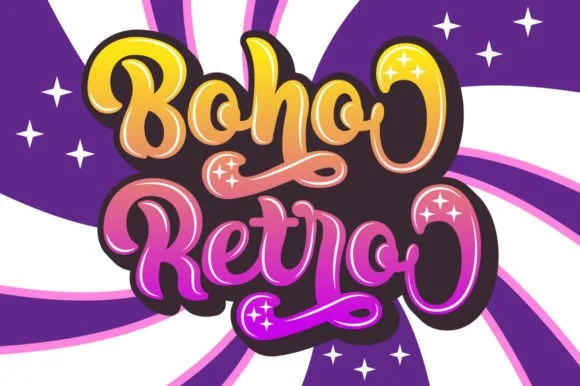 #12
Boho Retro is a plump, heavy-looped 1970s groovy display script with curled swash caps and pillowy connected lowercase bowls.
Boho Retro is a swirled nineteen-seventies psychedelic bubble script-display: fat rounded letters that swell at the waist, joins drawn as spirals and terminals that curl back into the letter like smoke. It is a poster face, so it wants size, two flat inks and a pale ground rather than a busy photograph. The spirals are the finest element and they fill into solid blobs as soon as the face is reduced. It needs roughly 44 mm for the spiral and the swell to read, and it is best two warm flat inks on a light stock.
Retro festival ringer tee & iced-coffee glass wrap — Stack a two-word phrase at a slight upward 6-degree angle and add a contoured offset shadow layer in Cricut or Illustrator if you want the sticker look.
Weld connected lowercase letters before cutting vinyl, and check the tight interior spiral holes inside 'B', 'o', and 'e' when weeding.
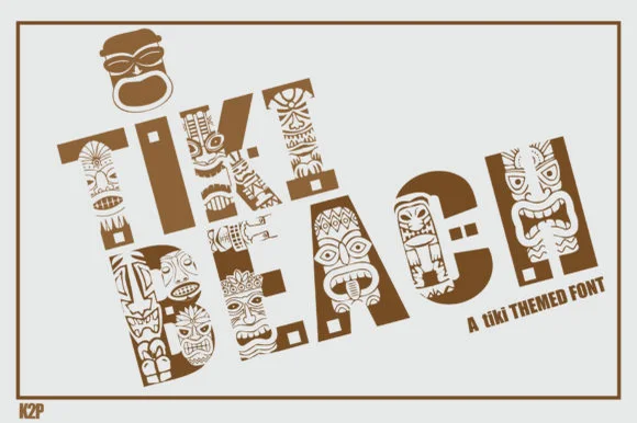 #13
Tiki Beach is an illustrated tropical display font whose chunky block capitals are filled with carved tiki faces, palm-frond chevrons, and tribal motifs.
Tiki Beach is a Polynesian carved-totem and tiki mask display: heavy block letters carved with stacked horizontal grooves, small mask faces set into some counters and a rounded top edge that reads as a carved post. The mask faces are the design and they fill into the stroke once the face is reduced, and the grooves add a carved texture. It needs roughly 34 mm for the mask and the groove to read, and it is best in one dense ink on timber-toned stock, or a routed cut where the grooves become real channels.
Luau party invitation, tiki-bar menu & pool-deck poster — Set 1 or 2 short words large (64–110 pt) in warm teak brown, terracotta, or teal on clean sand-cream cardstock.
Contains dozens of tiny interior pattern cutouts per letter—use Print-Then-Cut, sublimation, or flat print, NOT blade-cut vinyl weeding.
 #14
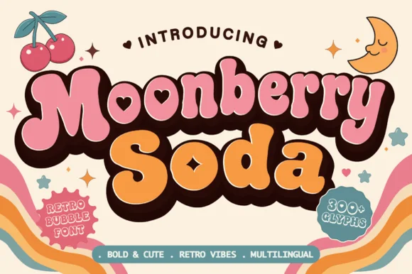
Moonberry Soda is a plump retro bubble display in which the round bowls hide heart-shaped counters, the silhouettes stay thick and soft and the alternates add playful variants, so a short word reads as a kawaii sticker.
The B closes two round bowls with a heart cut inside one, the o keeps a small heart counter, the S swells through a soft spine and the lowercase m sits low under round shoulders, all at a bubble weight with thick sticker-ready outlines. The heart counters are the character: they sit inside the letter rather than beside it, which is why the sample sets a two-word phrase with air around it. Because the hearts are small, the face wants 34 pt before they read and the alternates should be checked for the shapes a project prefers. The pastel ground and the small caption are presentation; the dark bubble letters are the face.
Boba cup decal, kawaii sticker shop logo or party tee — Layer a deep brown drop-shadow offset behind pastel pink and orange fills.
Keep cut height above 1.2 inches on vinyl so the tiny heart counters weed cleanly.
 #15
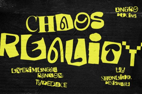
Chaos Reality is an experimental brutalist ransom display font mixing chunky blocks, coiled spirals, and warped mixed-weight letterforms.
Chaos Reality is an experimental ransom display in which each glyph is warped on a different axis, cases are mismatched within a single word, weights jump between characters and baselines tilt independently. The deliberate inconsistency means a word cannot be tracked or aligned normally, and the tallest and shortest glyphs set the line box. It needs roughly 26 mm for the warp to read as intent rather than error, and it is best in flat black on cheap white and newsprint, where the mixed weights stay legible.
Underground rave poster, experimental zine & album sleeve — Set 2 bold lines in acid lime or stark white on black concrete textures with +5 tracking.
Solid vector edges (no grunge dust) cut cleanly on 1.25 in+ streetwear HTV and laptop slaps—watch the thinner 'C/H' stems.
 #16
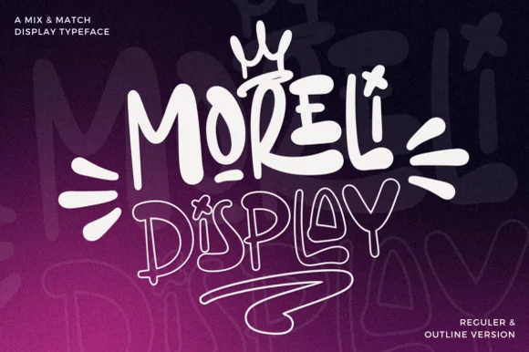
Moreli is a playful mix-and-match street-bubble display typeface shipped in both solid Regular and matching hollow Outline versions.
Moreli is a street-art bubble and outline graffiti display duo: the fill cut is a fat rounded bubble with a wide flare and a slight lean, while the outline cut traces the same shapes as a hollow keyline for a second colour behind or in front. The pair is designed to be layered, so the outline only makes sense when it is registered against the fill. The keyline is the finest element and it closes first when the face is reduced. The fill needs roughly 36 mm and the outline 44 mm for their detail to read.
Streetwear drop tee, skate sticker & podcast cover — Stack the solid Regular style on line one at 110% scale above the Outline style on line two, tilting the whole lockup 5 degrees.
Use the solid Regular cut for vinyl decals; reserve the fine double-wall Outline version for screen printing, DTF, or large posters.
 #17
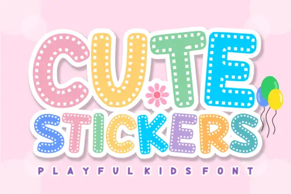
Cute Stickers shows thick rounded capitals with short white dash marks following the inner contours. The C curves broadly, the T carries a soft wide top, the strokes stay even and heavy, and the smaller line beneath repeats the same dashed decoration.
The bodies stay thick and round, the dashes run parallel inside the stroke, the counters stay open and the decoration repeats on the second line. That inset dash is the character: the letters look die-cut from a sticker sheet rather than printed, which is why the sample repeats the same treatment twice. The dashes are the whole effect, so keep them at a printable weight, avoid adding a second outline and test the smallest size before you promise a sticker look.
A personalised party label — Keep the title above a plain name line and allow an even clear border outside the letters.
Print a sample to see whether the small dashes remain separate.
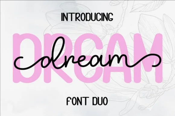 #18
Dream Duo combines a plump, soft-cornered uppercase sans-serif with a fluid monoline script that threads cleanly across wide titles.
Dream Duo pairs a chunky pastel rounded sans with a smooth monoline cursive: the sans is a fat even-width block with fully rounded corners and tight spacing for headlines, while the cursive is a soft even stroke with open loops and a gentle slant. The pair is built for a soft palette, so it loses its character when printed in a single harsh black. The monoline hairline is the finest element and it breaks first. The sans needs roughly 26 mm and the cursive 28 mm for their detail to read.
Nursery wall name sign & sweet-sixteen acrylic backdrop — Scale the background sans to 3.5 inches tall in soft pastel and center the dark monoline script across the middle 60% height.
Weld all cursive joins before cutting vinyl, and use Cricut's Slice or a 0.07 in offset knockout if avoiding two-layer vinyl overlap.
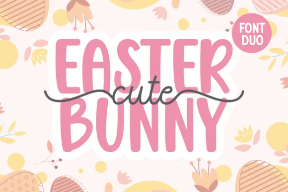 #19
Cute Easter Bunny combines a tall, chunky hand-cut uppercase sans with a sweet monoline cursive accented by long side tails.
Cute Easter Bunny is a playful pair of a tall pastel sans with a tailed monoline script: the sans is a soft narrow block whose counters stay open, while the script finishes every word with a small bunny tail that lifts off the baseline. The pair is built for a soft spring palette, so it loses its charm in a single harsh ink. The tail is the finest element and it closes into a dot once the face is reduced. The sans needs roughly 22 mm and the script 26 mm for their detail to read.
Personalized Easter basket tag & egg-hunt tote — Place two stacked uppercase words in pastel vinyl and overlay the dark tailed script across the seam between rows.
Use Print-Then-Cut with an offset white sticker border for multi-color tags, or layer smooth HTV pressing the chunky sans base first.
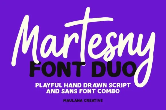 #20
Martesny combines a lively, tall-crossed hand-drawn marker script with a solid, rounded geometric uppercase sans partner.
Martesny is a duo of an energetic marker brush script and a chunky rounded sans: the script runs a wet loaded stroke with small flicks and joined letters, while the sans is a fat rounded block with tight counters for badges and prices. The pair carries a loud card in one ink, and the marker edge is the finest element. The script needs roughly 24 mm and the chunky sans 26 mm for their detail to read, and both work in one bright ink on white.
Podcast cover, YouTube thumbnail & custom party hoodie — Let the script's descending 'y' or 'g' overlap slightly across the corner of the bold uppercase sans line beneath it.
Both the chunky sans and medium-thick marker script weed reliably on HTV and decal vinyl at 1 inch+ scale.
 #21
Brown Carolina Duo contrasts broad high-contrast capitals with a much finer narrow slanted script, set dark on a plain cream field, where the capital R legs sweep below the neighbouring letters and the script carries long tails that run past the ends of both words.
The caps keep thin cross strokes and heavy uprights, the script keeps one fine weight, and the two voices sit in a strict stack: script, two cap rows, script. That alternating order is the character, because the fine lines frame the heavy block like a rule above and below. Both treatments appear on a plain light field, so the cover gives no clue about texture or shadow. Keep 34 pt for the caps before the thin strokes break up, keep 20 pt as the floor for the script and check the R leg before setting a line of capitals.
A boutique stationery front — Use the capital name centrally and a small script descriptor below, leaving the R sweep clear of contact information in a plain footer.
Confirm both styles and the actual capital alternates.
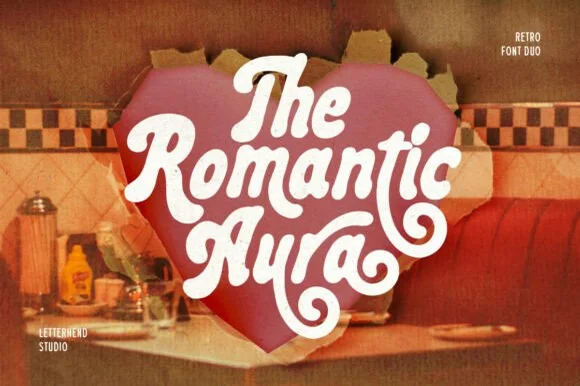 #22
Romantic Aura Duo pairs a thick, velvety 1970s swash script with a clean companion voice for nostalgic love notes and merch.
Romantic Aura Duo pairs a nineteen-seventies swashed retro script with a rounded sans: the script runs a high-contrast stroke with wide swelling swashes that lift above and below the line, while the sans is a soft rounded block for details and lists. The pair is a period look, so it works best in two warm flat inks on a light ground rather than in photographic tints. The swash thins are the finest element and they break first. The script needs roughly 32 mm and the sans 20 mm for their detail to read.
Retro Valentine sweatshirt, mug wrap & galentine card — Stack 2 to 3 centered words tightly inside a heart or arch silhouette so rising ascenders nest into the gaps of the line above.
Weld all overlapping script letters before cutting HTV, and keep total lockup width at 3.5 in+ so tight inner 'e' and 'a' counters weed cleanly.
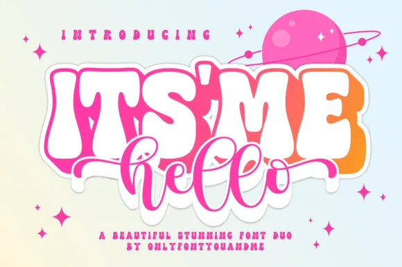 #23
Itsmehello Regular pairs a fat rounded seventies display face with a smooth monoline script, where the wide white caps sit as a background block with a soft outline and the connected cursive threads across their lower half in a flat pink.
The display row stays wide and inflated, the script stays one thin weight, the script crosses the caps rather than sitting below them, and the outline lifts the block off the pale ground. That crossing is the character, because the two voices occupy the same space and the eye reads one shape rather than two rows. The pink planet and the sparkles are cover artwork. Keep 46 pt for the caps, keep 22 pt for the script, and check that the script colour holds enough contrast over the pale caps.
Small-shop thank-you card or sticker duo — Set the main punchword in chunky caps and overlap a short lowercase script accent below.
If layering HTV, slice/knockout the script shadow from the base bubble layer.
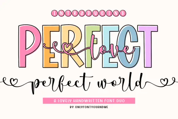 #24
Perfect Love Perfect World places fine script across tall outlined capitals, where small hearts extend the script ends and the lower world line carries deep p and d strokes.
The caps stay tall and open, the outline runs thin, the script threads across them and the ends finish in small hearts. That layering is the character: one line sits over another instead of beside it, which is why the sample reads as a single romantic composition. Small hearts may be artwork rather than glyphs, and overlapping two members invites collisions, so test your own phrase and keep 18 mm of clear ground below from 26 pt. The overlap is the only real risk: the script has to cross the outline without touching it, so keep 20 mm of clear ground between the layers and test one phrase before a run of cards.
A welcome-sign direction — Place a short script line in the gap, then keep names on a separate baseline.
Check overlap at the capital counters.
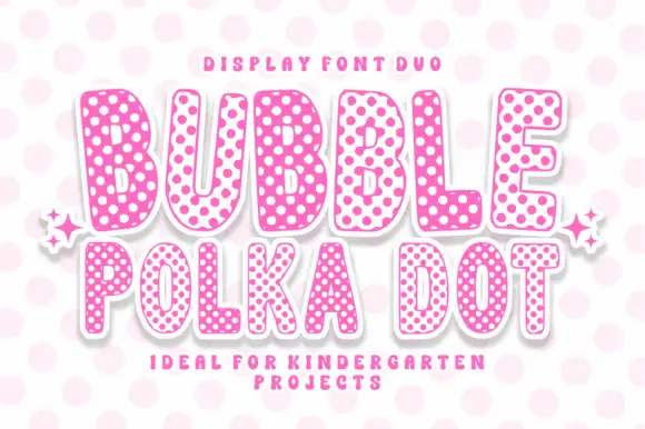 #25
Bubble Polka Dot is a duo of rounded bubble capitals supplied in two dotted colourways, one pale letters on a pink dot field and one pink letters on a pale field, so a poster can alternate letters for contrast.
The B closes two plump lobes, the U holds a deep bowl, the L turns with a rounded foot and the E carries three even arms, all at a maximal weight with fully rounded ends. The dots are the character: each letter's fill is a regular dot grid at a fixed interval, and the two colourways invert the same grid, which is what lets a designer alternate letters in one line without changing the silhouette. Because the dots are fine, the face needs 30 pt minimum and works best at sticker or poster scale. The pale ground, the pink and white fills, the small sparkles and the two caption lines are presentation; the duo is the two words.
A two-treatment party title — Set PARTY in two verified treatments on equal white invitation proofs with the same plain date footer.
Confirm members and compare dot density at final size.
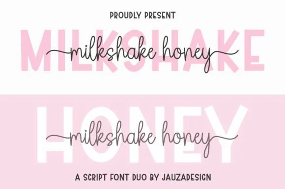 #26
Milkshakehoney pairs a crisp, wide-stance uppercase sans-serif with a tall, narrow-looped monoline cursive accented by straight side tails.
Milkshakehoney pairs a clean geometric uppercase sans with a tall-looped monoline script: the sans is a wide, even-width capital set for signage and labels, while the script is a thin monoline with high loops that rise well above the x-height and joins that stay open. The pair gives one card a printed voice and a hand-written line and works from a single ink. The monoline hairline is the finest element and it breaks first. The sans needs roughly 20 mm and the script 30 mm for their detail to read.
Bridesmaid proposal box lid & satin robe chest print — Track the uppercase sans role title ('BRIDESMAID') wide in pale pink or gold behind the recipient's cursive first name.
Size HTV chest names at 4 inches wide or larger so the tall narrow 'k' and 'h' loops weed cleanly without stretching.
 #27
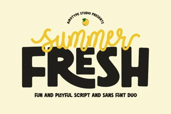
Summer Fresh is a high-energy font duo contrasting a smooth, short-tailed monoline script against a massive, bouncy block sans.
Summer Fresh is a duo of a sunny monoline script and an ultra-chunky playful sans: the script runs an even light stroke with wide loops and joined letters, while the sans is a fat rounded block with tight counters for large words. The contrast between light and heavy lets one card carry a title and a badge, and the monoline is the weaker element in print. The script needs roughly 24 mm and the chunky sans 26 mm for their detail to read, and both work in one bright ink on white.
Lemonade-stand cup, farmers-market tote & popsicle box — Set the chunky sans word huge (84 pt) and drape the contrasting script word right across its upper edge.
Both the fat block sans and medium monoline script cut and weed cleanly on Cricut HTV and cup vinyl (weld script first!).
 #28
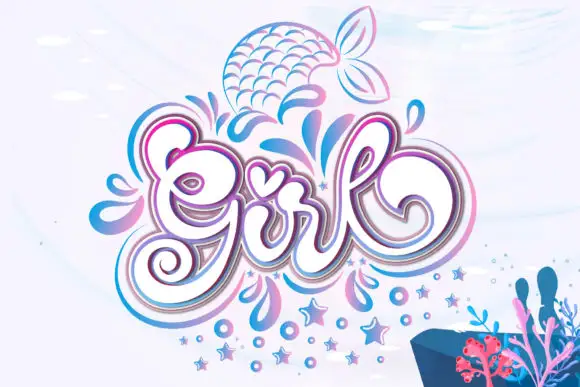
Girl builds a large curled capital G, a tall looped l and a heart-shaped accent over the central letters, with layered pink and blue outlines around the word and droplets, stars and a mermaid tail drawn beside it.
The script bodies stay round and full, the outlines stack in two colours around every stroke and the small motifs sit outside the lettering. The layered outline is the character: the word reads as a decorated sticker rather than a written line, which is why the sample surrounds it with droplets and stars. Because the outline doubles each stroke, keep 30 pt before the inner and outer lines merge, and treat the motifs as artwork rather than encoded glyphs. The doubled outline is the fragile part: below 30 pt the inner and outer lines merge into one thick edge, and a vinyl cut of two colours traps air between them.
A party-name centrepiece — Keep the lettering on a clear central panel and limit surrounding motifs to the corners.
Confirm the desired dingbats and inspect counters after outlining.
 #29
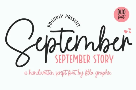
September Story is a sweet handwritten font duo pairing a thick, looped monoline cord script (with swash alternates) and a tall narrow uppercase sans!
September Story is a duo of a bouncy monoline cord script and a tall skinny farmhouse sans, both with alternates: the script carries a light even stroke with joined letters and a soft bounce, and the sans is narrow with blunt terminals for the information. The pairing lets a card use two voices from one family, and the script's bounce grows the word vertically. The script needs roughly 22 mm and the sans 18 mm for their detail to read.
Teacher planner cover, back-to-school shirt & classroom bin — Tuck a row of tall uppercase Sans (36 pt) snugly into the pocket beneath the hero Script word (88 pt)!
Weld overlapping cursive joins on the Script—cuts and weeds smoothly on Oracal 651 and HTV down to 0.85 inches!
Practical buyer checklist
Key cutting, printing and pairing answers before choosing a sublimation, sticker & Print-Then-Cut typeface.
They can print, but only if your design software reads the built-in colour glyphs correctly. Many print-then-cut workflows flatten them to black. Use a single-colour outline font when you need guaranteed results on a mixed set of machines.
Between 1.5 and 2.5 mm is typical for a 3 inch sticker. Smaller offsets leave no room for the calibration cut, and anything wider than 3 mm starts to look like a badge rather than a sticker.
The laminate adds stiffness but the cut follows the letter outline, so a thin stroke becomes a thin strip that snaps at the bends. Choose lettering with strokes at least 1 mm wide at final size, or drop the laminate on matte stock.
Yes, and that is a real advantage over vinyl. Build the gradient in your design app rather than relying on a font's built-in colour layer, so the transition follows the letter's own stress and prints predictably on polyester.
Keep exploring
Explore adjacent maker roundups or check our practical pre-production checklists.
30 curated fonts · Previews & pairings
33 curated fonts · Previews & pairings
31 curated fonts · Previews & pairings
38 curated fonts · Previews & pairings
Guides: Invitation font checklist · Vinyl & cutting checklist · How to pair script & sans fonts
Allow optional Google Analytics to measure visits and catalogue actions. Your search words and notes are not included. Privacy & storage