Neutral Sans Workhorse

Spiderweb Army + Mango Dream
Lets Spiderweb Army own the focal silhouette while handling secondary copy, sizing and subheads cleanly.
Inspect Mango Dream specimenDisclosure: MakerFileHub may earn a commission from qualifying purchases via paid links on this page. How our links work.
Broad glossy capitals split into red webs and blue fields
Spiderweb Army draws fat comic capitals, splits each letter into two colour fields and covers the halves with drawn spiderwebs, then hangs a small spider from a thread inside the counters.
Paid link
Get this fontProject & layout blueprintsAt-a-glance maker compatibility
Sturdy stroke walls and open counters weed cleanly on adhesive vinyl, HTV apparel film, and cut cardstock.
Visual anatomy & craft review
The alphabet fills the card in red and blue, every letter glossed with a white highlight and edged in a thick outline, and the webs are drawn across both fields so the join reads as a broken pane. Small spiders dangle into the counters from the top of each glyph, and a separate small word sits below in the same build at a smaller size. A web pattern spreads across the pale background. The face is a colour font with dense interior detail, so it holds as a comic shape at poster size and shows the webs only when it is printed large, and single-colour setting loses the split entirely.
Broad glossy capitals split into red webs and blue fields
Two-font hierarchy recipes
Tested contrast partners — pairing Spiderweb Army with grounded secondary typography.
Spiderweb Army + Mango Dream
Lets Spiderweb Army own the focal silhouette while handling secondary copy, sizing and subheads cleanly.
Inspect Mango Dream specimen
Spiderweb Army + Evoire
Grounds bold display lettering with classic typographic authority on posters, badges and apparel.
Inspect Evoire specimenPractical applications
Concrete hierarchy, scale and production guidance tailored to Spiderweb Army’s stroke geometry.
The comic split and the drawn webs carry the theme without a licensed character, and the fat letters read on a small card.
Hierarchy & layout recipe
Print a 105 by 148 mm invitation: set the name at 34 pt across one row, keep 14 mm of clear ground beneath before the time at 9 pt, and keep 12 mm of margin so the hanging spiders stay inside the card.
Pre-production check
Interior webs close below 20 pt; check the printed card before the batch. Test it on the real material before the run is booked.
The webs and the contrast colours suit a seasonal screening, and the heavy letters read from across a room in low light.
Hierarchy & layout recipe
Print an A2 poster: set the title at 110 pt on one row, keep 30 mm of clear ground beneath before the start time at 18 pt, and keep 28 mm of border so no spider is cut off.
Pre-production check
Colour split needs registration; check the proof before a two-colour print of the poster. Verify the result on the printed piece, then approve.
The comic build speaks to a drawing club, and the fat shapes stay clear on a folder that travels in a school bag all term.
Hierarchy & layout recipe
Print an A4 cover: set the club name at 44 pt on one row, keep 16 mm of clear ground beneath before the pupil name at 12 pt, and keep 18 mm of margin from the trim on all sides.
Pre-production check
Gloss highlights print grey on matte paper; check a copy before the class set. Print a sample and re-check it at final size.
Technical & licence verification
Confirm included OTF/TTF/WOFF formats, full glyph tables and licence coverage on the live store page before batch production.
Closest visual alternatives
Matched across letterform anatomy, stroke behaviour and craft applications.
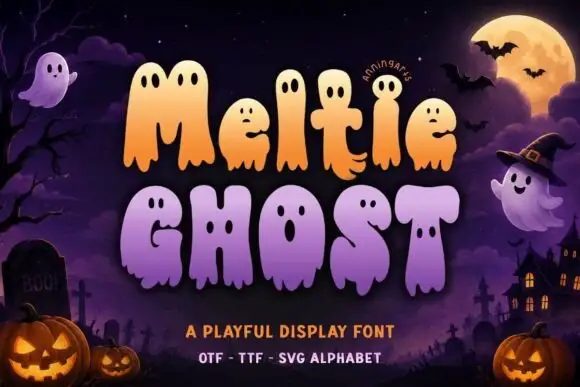
Ghost-bodied melting display
Meltie Ghost is a playful display on a night scene: soft ghost-bodied letters in orange and lavender with small facial holes and scalloped melting lower edges, set in two lines between a small curved introducing note and two plain lines naming the formats, over a graveyard, a moon and a haunted house.
Ideas for this font
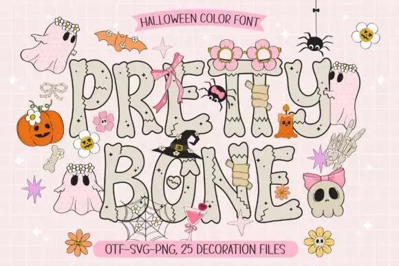
Bone-like colour display
Pretty Bone is a colour display on a pale pink ground: fat capitals drawn as bone with dark outlines, small crack marks and pale grey fills, decorated with ghosts, skulls, spiders and bows, with a label at the head and a format list along the foot.
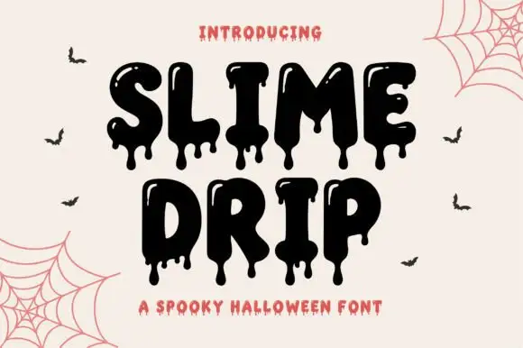
Dripping slime display
Slime Drip is a dripping display in black on a cream ground: fat rounded letters with long viscous drips running from the baseline and from inside the counters, a bouncy baseline, and a tracked caption beneath in a rough sans, with bats and cobwebs in the corners.
Ideas for this font
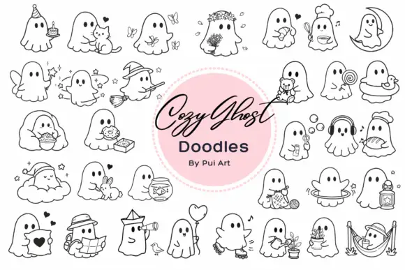
Rounded ghost outlines performing cosy everyday activities
Cozy Ghost Doodles is a typable set of about thirty small ghosts, each doing something domestic — reading in a hammock, holding a cat, drinking tea, tending a plant, fishing, knitting, sleeping on a cloud.
Ideas for this font
Same independent foundry
Allow optional Google Analytics to measure visits and catalogue actions. Your search words and notes are not included. Privacy & storage