High-Contrast Display Serif

Spooky Treats + Things
Pairs sculptural editorial warmth with Spooky Treats's clean modern geometry.
Inspect Things specimenDisclosure: MakerFileHub may earn a commission from qualifying purchases via paid links on this page. How our links work.
Chunky rounded block capitals paired with a loose monoline script
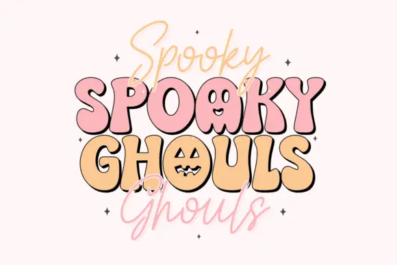
Spooky Treats pairs a chunky rounded block alphabet with a loose monoline script, so one design can carry a heavy lettered word and a light handwritten second line.
Paid link
Get this fontProject & layout blueprintsAt-a-glance maker compatibility
Weld or Unite overlapping script joins into one continuous vector path before sending to the blade.
Visual anatomy & craft review
The block half is built from fat rounded strokes: the S reverses through two soft curves, the P holds a wide bowl, the K splays from a single stem and the Y ends in a shallow fork, with fully rounded corners and no contrast anywhere. The script half is a loose monoline with tall narrow loops, a light even stroke and letters that lean slightly back, which gives the pair its contrast in weight rather than in style. Used together they reproduce the look of a printed poster: one word shouting in blocks, the second whispering in pen. Counters in the blocks stay open at 20 pt, which makes the pair usable on a card as well as a banner. The cream ground, the orange inks, the small sparkles and the two tracked captions are presentation; the duo is the two words.
Chunky · Rounded · Paired
Two-font hierarchy recipes
Tested contrast partners — pairing Spooky Treats with grounded secondary typography.
Spooky Treats + Things
Pairs sculptural editorial warmth with Spooky Treats's clean modern geometry.
Inspect Things specimen
Spooky Treats + Thick Black
Introduces organic movement on pull-quotes, signatures and gift tags.
Inspect Thick Black specimenPractical applications
Concrete hierarchy, scale and production guidance tailored to Spooky Treats’s stroke geometry.
The block word reads from the pavement while the light script carries the date, so one poster covers both jobs without a second family on the page.
Hierarchy & layout recipe
Set the block word at 100 pt on an A3 poster, set the date line in the script at 30 pt beneath it, and hold 30 mm between the two so the loops stay clear.
Pre-production check
A light monoline under 0.3 mm reads thin at 30 pt on newsprint; check the proof and thicken the script rather than the blocks.
The chunky blocks cut cleanly in acrylic and read against a dark cake, while the script supplies a smaller second line that still cuts.
Hierarchy & layout recipe
Set the block word at 45 mm tall on a 140 mm acrylic topper, set the script at 20 mm, and leave 6 mm of material around the thinnest part of each letter.
Pre-production check
A script join under 2 mm snaps in acrylic; check the vector at full size and break the join rather than thickening the whole line.
The pair fits a round sticker where the blocks name the product and the script adds a note, and both hold at 10 pt and 8 pt inside a 50 mm die.
Hierarchy & layout recipe
Set the product in the blocks at 10 pt on a 50 mm round sticker, set the note in the script at 8 pt beneath it, and leave 5 mm inside the die so nothing is clipped.
Pre-production check
Two faces inside a small die crowd each other; check the artwork at final size and drop the script line if the blocks need more room.
Technical & licence verification
Confirm included OTF/TTF/WOFF formats, full glyph tables and licence coverage on the live store page before batch production.
Closest visual alternatives
Matched across letterform anatomy, stroke behaviour and craft applications.
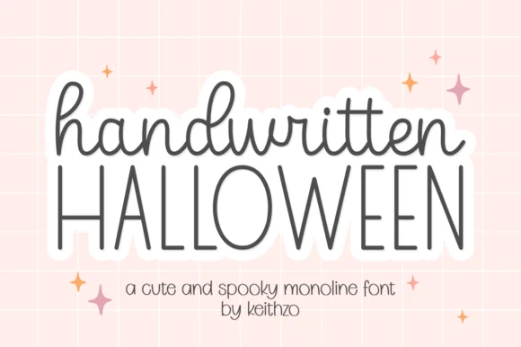
Cute monoline cursive script & tall skinny Halloween print duo
Handwritten Halloween combines a sweet rounded monoline cursive lowercase script with tall, airy disconnected uppercase print.
Ideas for this font
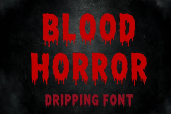
Dripping horror capitals with ragged edges and hanging tails
Blood Horror is a dripping horror capital alphabet in which the strokes stay chunky, the bottoms melt into hanging tails and the edges stay ragged, so a word reads as something painted in a hurry on a wall.
Ideas for this font
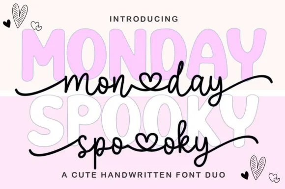
Pastel spooky-cute bubble sans & heart-connected script duo
Monday Spooky Script is a two-font 'Pasteloween' duo pairing a chunky rounded uppercase bubble display with a heart-connected monoline script.
Ideas for this font
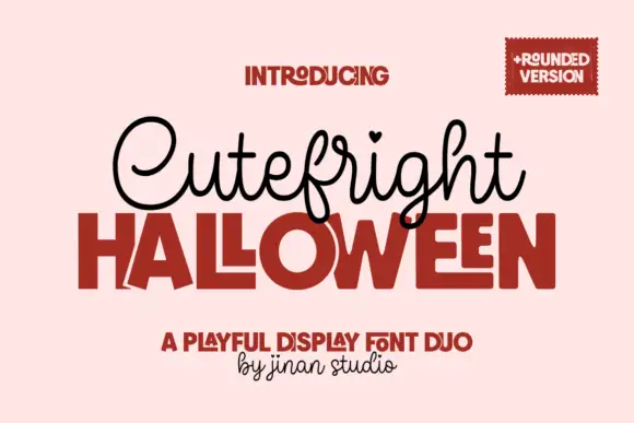
Looped script with heart tittles paired with a heavy rounded display
Cutefright Halloween is a duo that pairs a fine looping script, dotted with small hearts, against a very heavy rounded display face whose counters close into narrow slits.
Ideas for this font
Same independent foundry
Allow optional Google Analytics to measure visits and catalogue actions. Your search words and notes are not included. Privacy & storage