High-Contrast Display Serif

Halloween Wish + Flowsky Editorial
Pairs sculptural editorial warmth with Halloween Wish's clean modern geometry.
Inspect Flowsky Editorial specimenDisclosure: MakerFileHub may earn a commission from qualifying purchases via paid links on this page. How our links work.
Chunky hand-drawn display paired with a curly script
Halloween Wish pairs a big hand-drawn block word with a curly script that stretches beside it, so a short line gains a strong silhouette without losing the friendly spooky tone.
Paid link
Get this fontProject & layout blueprintsAt-a-glance maker compatibility
Weld or Unite overlapping script joins into one continuous vector path before sending to the blade.
Visual anatomy & craft review
The display cut keeps thick uneven edges and a bold outline, the script curls its capitals and sends terminals past the word, and the two members sit at very different scales. The scale contrast is the character: one member shouts and the other whispers, which is why the pair suits a few words rather than a paragraph. Set the blocks at 48 pt and the script at 30 pt with 16 mm between them, and keep the script's stretch inside the trim.
Duo · Chunky · Curly script
Two-font hierarchy recipes
Tested contrast partners — pairing Halloween Wish with grounded secondary typography.
Halloween Wish + Flowsky Editorial
Pairs sculptural editorial warmth with Halloween Wish's clean modern geometry.
Inspect Flowsky Editorial specimen
Halloween Wish + Simple Handwriting
Introduces organic movement on pull-quotes, signatures and gift tags.
Inspect Simple Handwriting specimenPractical applications
Concrete hierarchy, scale and production guidance tailored to Halloween Wish’s stroke geometry.
The pair gives a party card its loud word and a curling line, and both voices fit at 48 pt and 30 pt on an A6 sheet, so the scale contrast survives even on a small printed card.
Hierarchy & layout recipe
Print an A6 card: set the block word at 48 pt, set the invitation at 30 pt in the script beneath with 16 mm of clear ground, and keep 14 mm of margin so the stretched terminals stay inside.
Pre-production check
A curly script printed over a busy illustration closes up; check the card and keep the script on a plain area.
The chunky word reads on a small bag, and the uneven edges hold at 26 pt on a 50 mm label, which is the smallest size where the drawn outline still looks drawn.
Hierarchy & layout recipe
Print a 50 by 35 mm label: set the block word at 26 pt across the top, set the phrase at 16 pt in the script below it, keep 5 mm of clear ground between the two rows, and keep 4 mm of border so neither the outline nor a curled terminal is trimmed.
Pre-production check
The bold outline fills in under 20 pt; check the plate proof and hold the block word at 24 pt or above.
The scale contrast sets a seasonal title, and the block word holds at 56 pt across a page, where the script must stay under sixty percent of that height or the contrast collapses.
Hierarchy & layout recipe
Print a 210 mm page: set the block word at 56 pt, set the script at 32 pt beside or beneath with 18 mm of clear ground, and keep 20 mm of margin for the terminals.
Pre-production check
Two loud members set at the same size lose the contrast; check the page and keep the script under 60 percent of the block height.
Technical & licence verification
Confirm included OTF/TTF/WOFF formats, full glyph tables and licence coverage on the live store page before batch production.
Closest visual alternatives
Matched across letterform anatomy, stroke behaviour and craft applications.
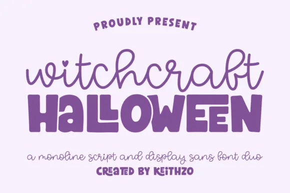
Monoline script paired with a fat rounded sans
Witchcraft Halloween is a duo in purple on pale lilac: a monoline script with open loops and a heart tittle for the first word, and a very fat rounded sans with quirky joins for the second, sold as one pair.
Ideas for this font
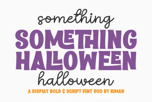
Chunky uneven blocks with monoline handwriting
Something Halloween is a duo in purple and black on white: fat display capitals with slightly hand-drawn edges and a stepped baseline for the headline, and a monoline script in lowercase above and below it, with a tracked orange line at the foot.
Ideas for this font
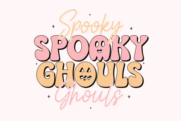
Bouncy rounded Halloween caps with thin casual script
Spooky Ghouls Duo pairs fat rounded Halloween capitals on a bouncing baseline with a hairline casual script above and below them, and turns two counters into faces.
Ideas for this font
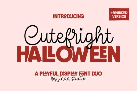
Looped script with heart tittles paired with a heavy rounded display
Cutefright Halloween is a duo that pairs a fine looping script, dotted with small hearts, against a very heavy rounded display face whose counters close into narrow slits.
Ideas for this font
Same independent foundry
Allow optional Google Analytics to measure visits and catalogue actions. Your search words and notes are not included. Privacy & storage