Neutral Sans Workhorse

Spooky Memories + Bielchon
Lets Spooky Memories own the focal silhouette while handling secondary copy, sizing and subheads cleanly.
Inspect Bielchon specimenDisclosure: MakerFileHub may earn a commission from qualifying purchases via paid links on this page. How our links work.
Flared spooky capitals with detached bars and uneven heights
Spooky Memories is a capital alphabet in which the stems flare at the ends, some crossbars detach from their letters and the heights shift, so a word reads as lettering drawn by hand for a folk tale.
Paid link
Get this fontProject & layout blueprintsAt-a-glance maker compatibility
Sturdy stroke walls and open counters weed cleanly on adhesive vinyl, HTV apparel film, and cut cardstock.
Visual anatomy & craft review
The S swells at both ends and finishes in a flare, the p holds a small bowl with a detached bar, the k splays into two flared arms and the y drops a hooked tail, all at a heavy even weight with terminals that widen rather than taper. The detachment is the character: the crossbar of the t and the bar of the e float a millimetre clear of the stem, which is what keeps the face from reading as a plain display serif and gives it a hand-cut look at 40 pt. Heights vary by a few millimetres, so it belongs on headings rather than on aligned lists. The white ground, the dark grey ink, the sparkles and the two caption lines are presentation; the display face is the two words.
Flared · Detached · Spooky
Two-font hierarchy recipes
Tested contrast partners — pairing Spooky Memories with grounded secondary typography.
Spooky Memories + Bielchon
Lets Spooky Memories own the focal silhouette while handling secondary copy, sizing and subheads cleanly.
Inspect Bielchon specimen
Spooky Memories + Vanielst Elegant Serif Display Stylistic
Grounds bold display lettering with classic typographic authority on posters, badges and apparel.
Inspect Vanielst Elegant Serif Display Stylistic specimenPractical applications
Concrete hierarchy, scale and production guidance tailored to Spooky Memories’s stroke geometry.
The flared terminals and detached bars give a seasonal invitation its folk-tale voice, and the heavy weight keeps the title readable at 30 pt.
Hierarchy & layout recipe
Print a 148 by 105 mm card: set the title at 30 pt across the upper half, set the time and place in an 9 pt sans beneath, and keep 15 mm of margin so the flared ends stay inside the trim.
Pre-production check
A detached bar under 1 mm reads as a printing fault at small sizes; check the card at final size and close the gap below 24 pt.
The uneven heights give a painted sign movement, and the flared stems read at 10 cm through glass where an even face would look flat.
Hierarchy & layout recipe
Cut a 600 by 350 mm window decal: set the greeting at 10 cm, set the opening hours in a 3.5 cm sans below, and keep 7 cm from the glass edge so the flares are not trimmed by the frame.
Pre-production check
A window decal seen from outside reverses the uneven heights into a wobble; check a mirrored proof and keep the variation under 4 mm.
The flared letters read on a small wrapper at 12 pt, and the detached bars give a plain sweet a drawn detail without an illustration.
Hierarchy & layout recipe
Print a 45 by 45 mm label: set the product at 12 pt, set the weight in a 5 pt caps sans beneath, and keep 4 mm of margin so the flared terminals are not cut by the square die.
Pre-production check
A flare under 0.5 mm closes on a small die; check the printed label and keep the face above 11 pt on wrappers.
Technical & licence verification
Confirm included OTF/TTF/WOFF formats, full glyph tables and licence coverage on the live store page before batch production.
Closest visual alternatives
Matched across letterform anatomy, stroke behaviour and craft applications.
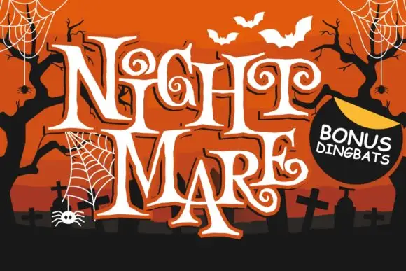
Angular spiral-terminal horror serif
Night Mare is an angular decorative serif in which the letters stay uneven, the feet come to points and the terminals coil inward in tight spirals, so a stacked title reads as gothic horror lettering rather than a clean historical blackletter.
Ideas for this font
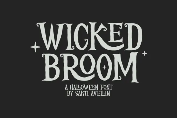
Curled narrow Halloween capitals
Wicked Broom shows tall narrow serif capitals with irregular pointed ends and tiny spiral terminals, where the R leg curls broadly beneath its neighbour and the O stays a long oval rather than rounding out.
Ideas for this font
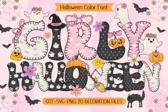
Rounded patchwork letters with pink motifs and small Halloween figures
Girly Halloween sets fat colour capitals in two treatments — cream with tiny black ghosts, and black with white dots — and dresses every letter with a bow, a flower, a pumpkin or a friendly ghost.
Ideas for this font
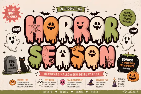
Bubble horror letters with faces and webs
Horror Season mixes puffy capitals with melting lower edges and face-shaped counters, where webs, cracks and small creature details appear inside selected letter bodies and the title is multicoloured with a heavy outline.
Ideas for this font
Same independent foundry
Allow optional Google Analytics to measure visits and catalogue actions. Your search words and notes are not included. Privacy & storage



