Editorial Serif Anchor

Gita Lian + Papillon Serif – Elegant Modern Luxury
Anchors Gita Lian's fluid strokes with crisp Roman proportions on wedding suites, headers and packaging.
Inspect Papillon Serif – Elegant Modern Luxury specimenDisclosure: MakerFileHub may earn a commission from qualifying purchases via paid links on this page. How our links work.
Elegant script with long entry swashes and drawn connectors
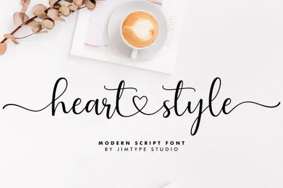
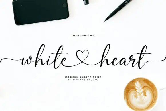
Gita Lian is an elegant script in which long swashes enter and leave the word and a drawn connector ties two names together, so a two-name lockup reads as a single written gesture rather than as two separate words.
Paid link
Get this fontProject & layout blueprintsAt-a-glance maker compatibility
Weld or Unite overlapping script joins into one continuous vector path before sending to the blade.
Visual anatomy & craft review
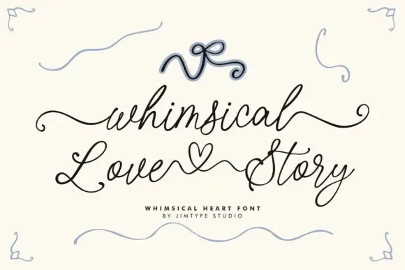
The g drops a wide bowl, the i carries a light dot, the t crosses a high bar, the a closes a round eye, the l rises into a tall loop and the n turns a soft shoulder, all at a moderate brush contrast with long entry and exit swashes that carry the eye across the line. The connectors are the character: the pair is drawn as one path with a butterfly or a heart in the gap, which is why the sample sets two versions of the same lockup. Because the swashes are thin, the face needs 26 pt upward and a smooth stock. The pale watercolour cards, the sprig and the small caps lines are presentation; the black script lockups are the face.
Elegant script · Swash · Connectors
Two-font hierarchy recipes
Tested contrast partners — pairing Gita Lian with grounded secondary typography.
Gita Lian + Papillon Serif – Elegant Modern Luxury
Anchors Gita Lian's fluid strokes with crisp Roman proportions on wedding suites, headers and packaging.
Inspect Papillon Serif – Elegant Modern Luxury specimen
Gita Lian + Olline
Keeps small-scale dates, URLs, nutrition facts and care instructions crisp and legible below script titles.
Inspect Olline specimenPractical applications
Concrete hierarchy, scale and production guidance tailored to Gita Lian’s stroke geometry.
The drawn connector turns two names into one gesture, and the moderate contrast keeps the lockup readable at 30 pt on a heavy card without a second font.
Hierarchy & layout recipe
Print a 130 by 180 mm card: set both names at 30 pt with the connector between them, set the date in an 8 pt caps serif 20 mm beneath, and keep 18 mm of margin for the entry swash.
Pre-production check
A connector printed too narrow reads as a mistake; check the proof at full size and keep at least 18 mm between the two names.
The swash pair suits a printed table sign, and the long entry stroke fills the width of a wide panel at 50 mm without extra ornament.
Hierarchy & layout recipe
Print an A4 sign: set the lockup at 50 mm across the panel, set the table number in a 14 pt caps sans beneath, and keep 25 mm of border so both swashes finish inside the frame.
Pre-production check
An exit swash printed to the frame edge looks cut; check the imposed sign and pull the lockup inward by 8 mm.
The written connector gives a studio a mark that reads as one drawn object, and the moderate weight holds at 22 pt on a coated card in one ink.
Hierarchy & layout recipe
Print an 85 by 55 mm card: set the studio name at 22 pt with the connector inside it, set the contact block in a 6 pt sans at the foot, and keep 10 mm of white so the swash is not crowded.
Pre-production check
A hairline swash printed on an uncoated card loses its tail; check the card and specify a coated stock.
Technical & licence verification
Confirm included OTF/TTF/WOFF formats, full glyph tables and licence coverage on the live store page before batch production.
Closest visual alternatives
Matched across letterform anatomy, stroke behaviour and craft applications.
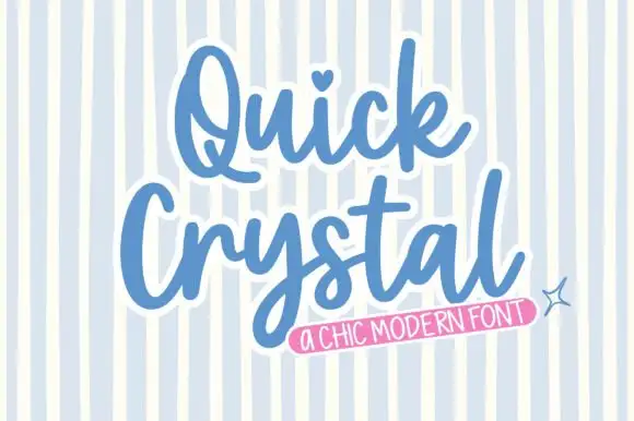
Rounded bold script with a keyline
Quick Crystal is a rounded bold script in blue with a white keyline on a pale striped ground: fat even strokes, a capital Q with a curled tail, and a final l that lifts into a short exit as the word ends.
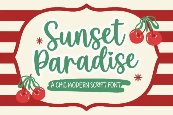
Chic script with cherries and a badge
Sunset Paradise is a chic script in green on cream: rounded strokes with a slight taper, tall narrow letters, a bouncy baseline and a heart in place of the dot on the i, set inside a drawn shield panel over red stripes.
Ideas for this font

Heavy lowercase calligraphy with heart dots and a mirrored entrance
Abigail is heavy lowercase calligraphy in which the i dots are small hearts, the entry curls in from the left and the letter bodies carry a real shaded weight.
Ideas for this font
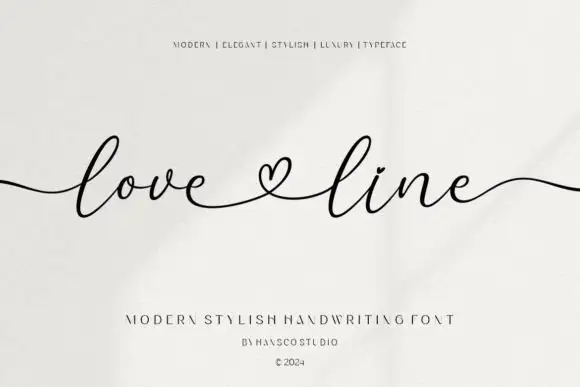
Fine heart-linked extended script
Love Line is a fine handwriting in black on textured cream: small bowls, a level baseline, a heart drawn on the baseline between the two words, and long tails that run out to both margins.
Ideas for this font
Same independent foundry
Allow optional Google Analytics to measure visits and catalogue actions. Your search words and notes are not included. Privacy & storage