High-Contrast Display Serif

Bielchon + Marquis - Elegant Modern Serif
Pairs sculptural editorial warmth with Bielchon's clean modern geometry.
Inspect Marquis - Elegant Modern Serif specimenDisclosure: MakerFileHub may earn a commission from qualifying purchases via paid links on this page. How our links work.
Slim contemporary geometric sans with architectural cuts
Bielchon is a crisp, light-to-regular modern sans-serif featuring tall x-height, circular bowls, and subtle stencil-like notched joins.
Paid link
Get this fontProject & layout blueprintsAt-a-glance maker compatibility
Open counter bridges hold interior islands intact on laser-cut wood, acrylic, and mylar stencils.
Visual anatomy & craft review
Bielchon is a slim contemporary geometric sans with architectural cuts: narrow even stems, perfectly circular bowls, sharp mitred cuts where two strokes meet instead of a curve and a level baseline that reads as gallery signage. The mitres are the design and they round off once the face is reduced or printed with a coarse screen. It needs roughly 22 mm for the mitre and the counter to read, and it is best in one fine ink on a pale ground, or a single white on a dark ground where the cuts print as sharp joints.
Clean · Architectural · Minimal
Two-font hierarchy recipes
Tested contrast partners — pairing Bielchon with grounded secondary typography.
Bielchon + Marquis - Elegant Modern Serif
Pairs sculptural editorial warmth with Bielchon's clean modern geometry.
Inspect Marquis - Elegant Modern Serif specimen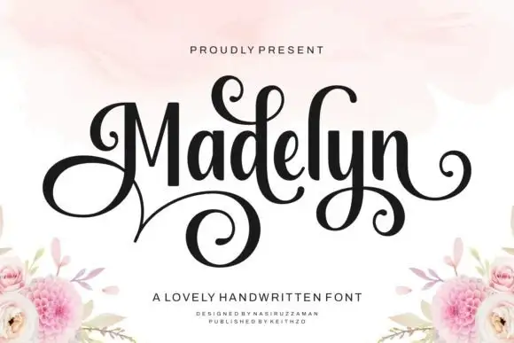
Bielchon + Madelyn
Introduces organic movement on pull-quotes, signatures and gift tags.
Inspect Madelyn specimenPractical applications
Concrete hierarchy, scale and production guidance tailored to Bielchon’s stroke geometry.
A geometric sans with mitred cuts reads as gallery signage rather than a corporate logo. The mitres hold at 34 mm on a card, and one ink prints the card and the plate in one order.
Hierarchy & layout recipe
Card 85 x 55 mm, word 34 mm with 8 mm mitre clearance, details 7/9 pt, 8 mm margins. Door plate 300 x 80 mm, word 44 mm, 10 mm margins. Letterhead 210 x 297 mm, word 30 mm, 20 mm margins.
Pre-production check
On an 85 x 55 mm card the mitres round off and the name reads as a plain grotesk. Raise the card word to 40 mm, and check one card before the run.
An architectural sans turns a feature into exhibition signage rather than a styled headline. The mitres hold at 44 pt on coated stock, and the circular bowls keep a long title crisp.
Hierarchy & layout recipe
Header 44 pt with 8 mm mitre clearance, body 9/13 pt over two columns of 82 mm, 18 mm margins and a 12 mm head. Opener 36 pt with 10 mm of clear ground beside the image. Caption 8/11 pt in a 40 mm outer-margin rail.
Pre-production check
At 36 pt on the opener the mitres silt into curves and the header reads as a soft grotesk. Keep the face at 44 pt and above, and proof one spread at 1:1.
A slim geometric sans reads as a gallery board rather than a shop sign, which is right for a winter exhibition. The mitres hold at 90 mm on a board, and one ink prints the board and the price cards in one pass.
Hierarchy & layout recipe
Board 600 x 900 mm, word 100 mm with 12 mm mitre clearance, items 26 mm, 30 mm margins. Price card 105 x 75 mm, item 18 mm, price 24 mm. Bag print 200 x 250 mm, word 50 mm, 15 mm margins.
Pre-production check
A 105 x 75 mm price card at 18 mm rounds the mitres and the item reads as a bar in low winter light. Raise the item to 24 mm, and check one card in the actual light.
Technical & licence verification
Confirm included OTF/TTF/WOFF formats, full glyph tables and licence coverage on the live store page before batch production.
Closest visual alternatives
Matched across letterform anatomy, stroke behaviour and craft applications.
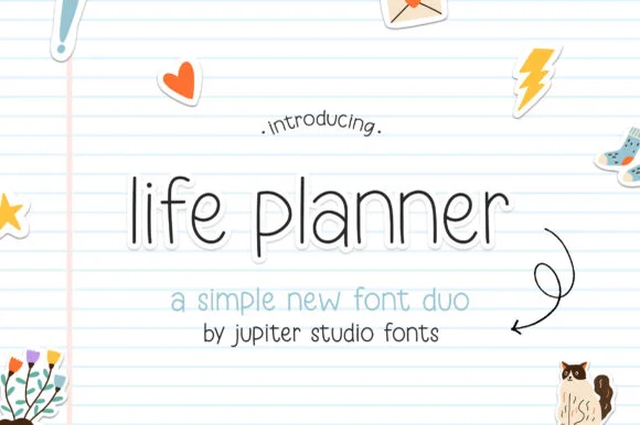
Planner duo pairing a thin rounded sans with a bolder cut
Life Planner is a two-cut family in which a thin rounded sans carries the headline and a bolder cut sets the supporting line, so a simple layout gets hierarchy from one family.
Ideas for this font
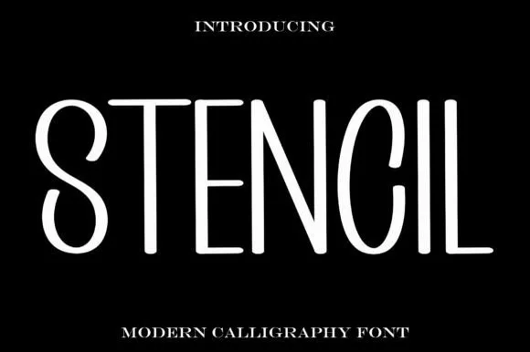
Tall thin modern stencil
Stencil is a tall thin display in white on black: elongated letters with hairline strokes, wide open counters, a high waist and a generally stencil-like separation at the joins, so the word reads as contemporary signage rather than as a military stencil.

Heavy geometric condensed display grotesk
Helina is a clean, heavy-weight condensed sans serif with flat-cut terminals, tight vertical rhythm, and bold magazine-masthead authority.
Ideas for this font
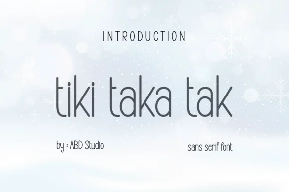
Tall slender minimalist geometric hairline sans serif
Tiki Taka Tak is actually a sleek, minimalist tall geometric sans serif (zero tropical tiki motifs!) built for clean modern branding.
Ideas for this font
Same independent foundry
Allow optional Google Analytics to measure visits and catalogue actions. Your search words and notes are not included. Privacy & storage