Modern Grotesque Body

Cervelique + One More
Creates crisp high-hierarchy contrast beneath Cervelique headlines across menus, websites and labels.
Inspect One More specimenDisclosure: MakerFileHub may earn a commission from qualifying purchases via paid links on this page. How our links work.
Very tall condensed fashion serif with hairline serifs and a tight fit
Cervelique is a tall condensed serif in which the stems stretch upward, the serifs thin to hairlines and the letters sit almost shoulder to shoulder, so a word reads as a magazine masthead rather than as text.
Paid link
Get this fontProject & layout blueprintsAt-a-glance maker compatibility
Set Cricut or Silhouette operation to Pen, Foil Quill, or Laser Score — not Basic Blade Cut.
Visual anatomy & craft review
The C curls a narrow crescent, the e keeps a small closed eye, the r holds a short arm, the l rises a full ascender with a hairline foot and the q drops a straight tail, all at a fashion contrast with a very tight sidebearing. The proportion is the character: at the same cap height the face covers two thirds of the width of a normal serif, which is how the sample fits a long word on one line without shrinking it. Because the stems are hairline, it needs 40 pt on a screen and a coated stock in print, and it should never be set in a paragraph. The cream ground, the small rules, the star and the category line are presentation; the tall serif word is the face.
Condensed · Fashion · Elegant
Two-font hierarchy recipes
Tested contrast partners — pairing Cervelique with grounded secondary typography.
Cervelique + One More
Creates crisp high-hierarchy contrast beneath Cervelique headlines across menus, websites and labels.
Inspect One More specimen
Cervelique + Silken Luxe
Adds a warm human signature touch for 1-to-3-word callouts without competing against structured serif capitals.
Inspect Silken Luxe specimenPractical applications
Concrete hierarchy, scale and production guidance tailored to Cervelique’s stroke geometry.
The condensed proportion fits a long publication name on one line, and the hairline serifs give the masthead a couture edge at 96 pt.
Hierarchy & layout recipe
Print an A3 cover: set the masthead at 96 pt with the baseline 60 mm from the top edge, add 1 percent tracking so the hairlines do not touch, and keep the cover line in a 10 pt sans below.
Pre-production check
Condensed serifs at tight tracking can collide on the e and the r; check the imposed page and add a hair of tracking rather than reducing the size.
The tall condensed shape fits a narrow jewellery box, and the hairline serifs give a small mark a precious look at 26 pt on a foil label.
Hierarchy & layout recipe
Print a 60 by 20 mm label: set the name at 26 pt, keep 3 mm of margin on each side, and match the foil to the hairline weight so the serifs do not fill in.
Pre-production check
Hot foil spreads about 0.1 mm and can close the hairlines; check a foil pull and open the counters before approving the die.
The condensed fit keeps a long dish name on one line, and the fashion contrast holds the elegance of a printed menu card at 20 pt.
Hierarchy & layout recipe
Print a 105 by 210 mm menu: set the dish names at 20 pt, keep the leader dots in a 7 pt light sans, and leave 12 mm between courses so the tall ascenders do not touch the rule above.
Pre-production check
Ascenders brushing a leader rule read as a printing fault; check the proof and drop the rule 2 mm rather than shortening the names.
Technical & licence verification
Confirm included OTF/TTF/WOFF formats, full glyph tables and licence coverage on the live store page before batch production.
Closest visual alternatives
Matched across letterform anatomy, stroke behaviour and craft applications.
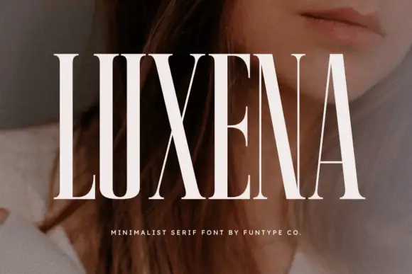
Minimalist high-contrast serif in tall capitals
Luxena is a minimalist serif in white over a portrait: tall condensed capitals with a very high contrast, fine flat serifs and narrow counters, set as one word across the page with a tracked line beneath.
Ideas for this font
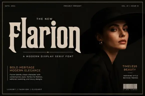
Heavy condensed mixed case with flared feet and a tall narrow l
Flarion is a heavy condensed serif in which the bodies compress tall, the counters stay compact, the feet finish in pointed flares and the ascenders rise high with an oversized round i dot, so a name reads as dense fashion lettering.
Ideas for this font
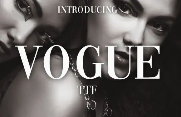
High-contrast didone with hairline serifs
Vogue is a high-contrast didone serif in white over a black-and-white beauty photograph: hairline serifs, a very thin crossbar on the A, a round O and a G with a fine spur, set in capitals as a magazine masthead.
Ideas for this font
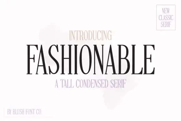
Tall condensed classic serif with narrow bowls and fine hairlines
Fashionable is a tall condensed serif in which the stems stretch upward, the bowls narrow and the hairlines stay fine, so a single word reads as a magazine masthead rather than as a title.
Ideas for this font
Same independent foundry
Allow optional Google Analytics to measure visits and catalogue actions. Your search words and notes are not included. Privacy & storage