High-Contrast Display Serif

Taught + Vanielst Elegant Serif Display Stylistic
Pairs sculptural editorial warmth with Taught's clean modern geometry.
Inspect Vanielst Elegant Serif Display Stylistic specimenDisclosure: MakerFileHub may earn a commission from qualifying purchases via paid links on this page. How our links work.
Bold flat-sided condensed poster grotesk
Taught is a heavy, flat-sided condensed sans-serif with tight interior counters and commanding vertical headline presence.
Paid link
Get this fontProject & layout blueprintsAt-a-glance maker compatibility
Sturdy stroke walls and open counters weed cleanly on adhesive vinyl, HTV apparel film, and cut cardstock.
Visual anatomy & craft review
Taught is a bold flat-sided condensed poster grotesk: narrow stems with completely flat sides, tight square counters, a bold weight that holds across a large format and a set of slightly odd terminals that give it a printed poster feel. The flat sides keep a word from looking hand-made, and the counters close when the face is scaled down. It needs roughly 22 mm for the counter and the flat side to read, and it is best in one dense ink on uncoated stock, or a single white on a dark ground.
Punchy · Compact · Poster-ready
Two-font hierarchy recipes
Tested contrast partners — pairing Taught with grounded secondary typography.
Taught + Vanielst Elegant Serif Display Stylistic
Pairs sculptural editorial warmth with Taught's clean modern geometry.
Inspect Vanielst Elegant Serif Display Stylistic specimen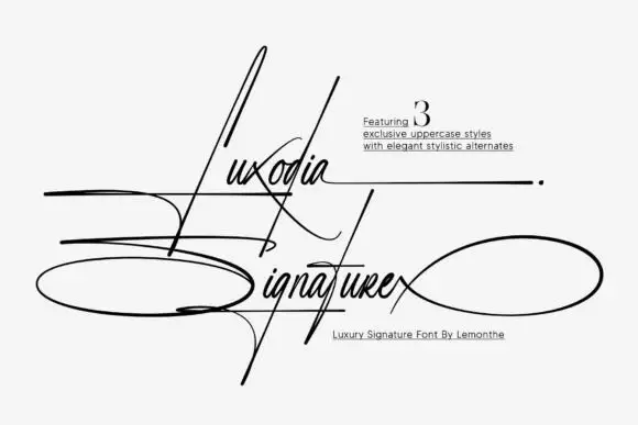
Taught + Luxodia Signature
Introduces organic movement on pull-quotes, signatures and gift tags.
Inspect Luxodia Signature specimenPractical applications
Concrete hierarchy, scale and production guidance tailored to Taught’s stroke geometry.
A condensed flat-sided grotesk sets a poster-style cover and a dense table in one voice. The bold holds at 84 pt on a cover, and the narrow stems set 8 pt figures without wrapping.
Hierarchy & layout recipe
Cover 210 x 297 mm, title 84 pt with 10 mm counter clearance, body 9/13 pt over two columns of 82 mm, 18 mm margins. Section head 22 pt. Data table 8/11 pt with 40 mm columns.
Pre-production check
At 8 pt in the data table the flat counters silt and the figures read as a solid column. Set tables at 8.5 pt with 3 mm padding, and proof one page at 1:1.
A condensed grotesk reads as a printed plate rather than a web logo. The stems hold at 40 mm on a plate, and one ink prints the plate and the cards in one order.
Hierarchy & layout recipe
Door plate 300 x 80 mm, word 40 mm with 8 mm counter clearance, 10 mm margins. Card 85 x 55 mm, word 20 mm, 5 mm margins. Letterhead 210 x 297 mm, word 28 mm, 20 mm margins.
Pre-production check
On an 85 x 55 mm card the counters close and the name reads as a barcode. Raise the card word to 26 mm, and check one card before the run.
A condensed grotesk carries a long stall name across a crowded hall. The bold holds at 100 mm on a board, and one white ink prints the board from a dark ground.
Hierarchy & layout recipe
Board 600 x 900 mm, word 100 mm with 12 mm counter clearance, items 26 mm, 30 mm margins. Price card 105 x 75 mm, item 18 mm, price 24 mm. Bag print 200 x 250 mm, word 50 mm, 15 mm margins.
Pre-production check
A 105 x 75 mm price card at 18 mm closes the counters and the item reads as a bar under the market lamp. Raise the item to 24 mm, and check one card in the actual light.
Technical & licence verification
Confirm included OTF/TTF/WOFF formats, full glyph tables and licence coverage on the live store page before batch production.
Closest visual alternatives
Matched across letterform anatomy, stroke behaviour and craft applications.
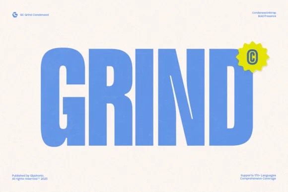
Heavy condensed inktrap display sans
Gc Grind is a bold condensed sans-serif engineered with subtle corner inktraps and flat industrial curves across 170+ languages.
Ideas for this font

Tall architectural condensed poster sans serif
Headline is a crisp, heavy condensed sans serif engineered with flat horizontal terminals, narrow counters, and clean newspaper-poster punch.
Ideas for this font
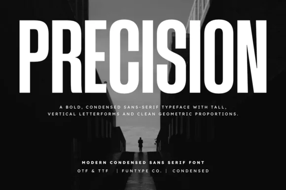
Tall ultra-condensed geometric headline grotesk
Precision is a bold, ultra-condensed sans serif typeface with tall vertical pillars, tight flat-sided counters, and clean modernist snap.
Ideas for this font
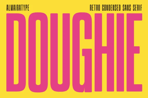
Ultra-tall 5:1 pillar-condensed retro poster sans
Doughie is an ultra-tall, compressed retro condensed sans stretching rounded-corner vertical pillars edge-to-edge across posters and packaging!
Ideas for this font
Same independent foundry
Allow optional Google Analytics to measure visits and catalogue actions. Your search words and notes are not included. Privacy & storage