Neutral Sans Workhorse

Modern Sans + Inkora
Lets Modern Sans own the focal silhouette while handling secondary copy, sizing and subheads cleanly.
Inspect Inkora specimenDisclosure: MakerFileHub may earn a commission from qualifying purchases via paid links on this page. How our links work.
Heavy rounded mixed case paired with a looped M and a fine sweeping S on a second line
Modern Sans is a wide sans family of eighteen fonts, shown with a heavy display cut, a hairline weight and a script alternate that replaces the first letter of a word.
Paid link
Get this fontProject & layout blueprintsAt-a-glance maker compatibility
Sturdy stroke walls and open counters weed cleanly on adhesive vinyl, HTV apparel film, and cut cardstock.
Visual anatomy & craft review
modern fills the middle of the card in a heavy sans with squared outer corners, and the first letter is a purple script m drawn at the same optical size, which shows the family's alternate set in one glance. Sans follows underneath in a hairline weight at four times the width, so the card demonstrates the range from heavy to thin without a second specimen. The palette is a soft lime ground with the lettering in dark grey and one accent, and a block of small type at the upper right lists the count of fonts, the upright and oblique sets and the studio. The face itself is a dynamic sans with slightly flared stems, which keeps the display weight from looking mechanical, and the wide spacing at the thin weights keeps the hairline readable at moderate sizes.
Heavy rounded mixed case paired with a looped M and a fine sweeping S on a second line
Two-font hierarchy recipes
Tested contrast partners — pairing Modern Sans with grounded secondary typography.
Modern Sans + Inkora
Lets Modern Sans own the focal silhouette while handling secondary copy, sizing and subheads cleanly.
Inspect Inkora specimen
Modern Sans + Mewah
Grounds bold display lettering with classic typographic authority on posters, badges and apparel.
Inspect Mewah specimenPractical applications
Concrete hierarchy, scale and production guidance tailored to Modern Sans’s stroke geometry.
One family covers a wordmark, a heading and a caption, and the script alternate gives a plain name a single personal detail to be recognised by.
Hierarchy & layout recipe
Print an A4 identity sheet: set the logotype at 34 pt with the script alternate on the first letter, keep 14 mm of clear ground beneath before the descriptor at 8 pt, and hold 18 mm of margin on all four sides.
Pre-production check
The hairline weight drops out on an office printer; print one sheet on the machine the studio uses and check the thin stems.
The range lets a spread use one voice from the headline down to the caption, and the alternate gives section openers a mark without a second typeface.
Hierarchy & layout recipe
Print a 210 by 297 mm spread: set the headline at 48 pt in the heavy cut and the captions at 9 pt in the light, keep 12 mm of clear ground beneath the headline before the deck, and hold 9 mm between the caption block and the image edge.
Pre-production check
Light captions over photographs disappear; print one spread and check the lightest weight against the busiest area of the image.
The family covers a building's worth of signs from a door plate to a wall graphic, and the alternate set gives each department a small variation.
Hierarchy & layout recipe
Print a 600 by 300 mm wall graphic and a 200 by 80 mm door plate from one family: set the wall text at 120 pt and the plate at 22 pt, keep 20 mm of clear ground around the wall graphic and 7 mm on the plate, and hold the same margin proportion on both.
Pre-production check
Vinyl wall graphics shrink the thin weights; print one graphic on the actual material and check the hairline at a distance.
Technical & licence verification
Confirm included OTF/TTF/WOFF formats, full glyph tables and licence coverage on the live store page before batch production.
Closest visual alternatives
Matched across letterform anatomy, stroke behaviour and craft applications.
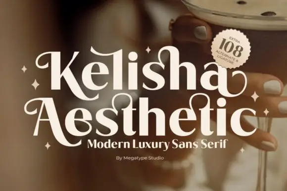
Heavy contrast mixed case with looped entry strokes and long curling capital legs
Kelisha Aesthetic is a modern luxury sans with high stroke contrast, tall narrow letters and a set of alternates in which an arm or an ascender curls into a loop.
Ideas for this font
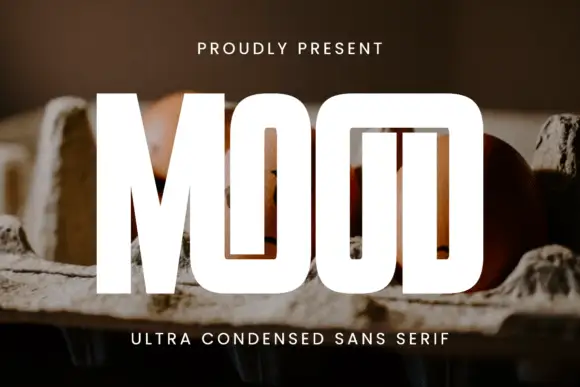
Ultra-tall slot display
Mood is an ultra-tall condensed display in white over a photograph of eggs in a carton: capitals set as narrow vertical slots with a shared top construction across the two O shapes and the D, a small tracked line above and a plain line beneath.
Ideas for this font
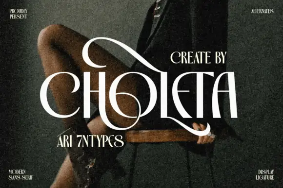
Contrasting capitals woven through a large upper loop and low circular sweep
Choleta builds tall white capitals and then lets thin strokes cross through them, so the counters open into slashes and the whole line reads as one sculpted ligature rather than six separate letters.
Ideas for this font
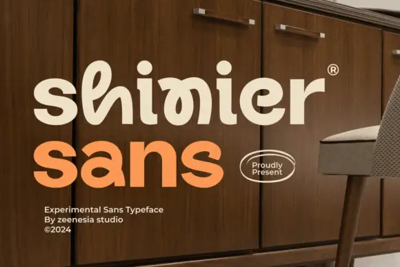
Experimental looped display
Shinier is an experimental display in cream and orange on a walnut cabinet: rounded mixed case in which tall loops are threaded through the letters, an interlocked final n and r, and a registered mark at the shoulder, with a plain sans caption at the foot.
Ideas for this font
Same independent foundry
Allow optional Google Analytics to measure visits and catalogue actions. Your search words and notes are not included. Privacy & storage