High-Contrast Display Serif

Corven + Mewah
Pairs sculptural editorial warmth with Corven's clean modern geometry.
Inspect Mewah specimenDisclosure: MakerFileHub may earn a commission from qualifying purchases via paid links on this page. How our links work.
Fine rounded lowercase with subtle hooks at the r and n shoulders
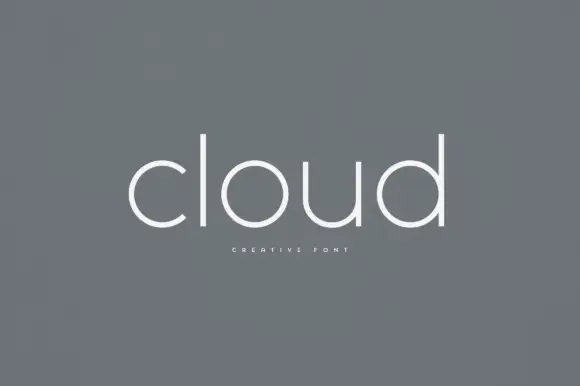
Corven draws a very light geometric sans in lowercase, its bowls almost circular, its joins thinned and its curves slightly open at the terminals, so a short word reads as a pencil line on paper.
Paid link
Get this fontProject & layout blueprintsAt-a-glance maker compatibility
Sturdy stroke walls and open counters weed cleanly on adhesive vinyl, HTV apparel film, and cut cardstock.
Visual anatomy & craft review
The name sits alone on a warm neutral ground, the c and the o nearly perfect circles, the r with a short arm and the v meeting at a fine point. Strokes are even and thin, and the terminals stop just short of closing, which gives the face its gentle tone without any contrast. Three small notes name the classification, the character and the language support, all in tracked capitals at the corners. This is a quiet identity face: it holds a wordmark, a caption and a menu heading, and it needs a clean ground and a decent size to survive print.
Fine rounded lowercase with subtle hooks at the r and n shoulders
Two-font hierarchy recipes
Tested contrast partners — pairing Corven with grounded secondary typography.
Corven + Mewah
Pairs sculptural editorial warmth with Corven's clean modern geometry.
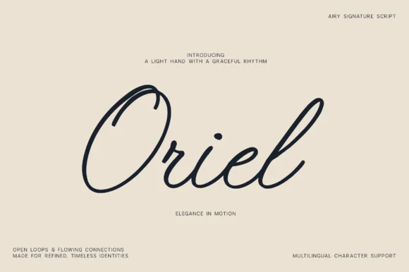
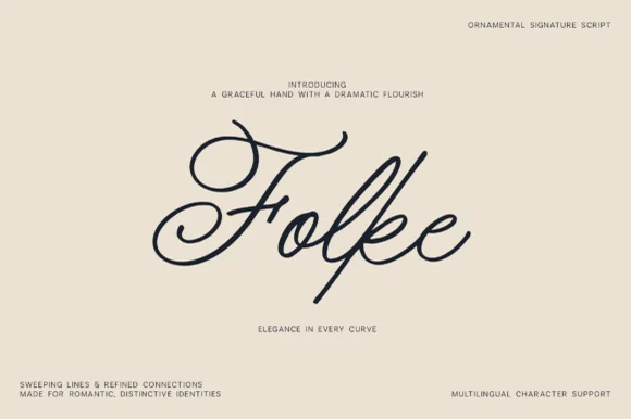
Inspect Mewah specimen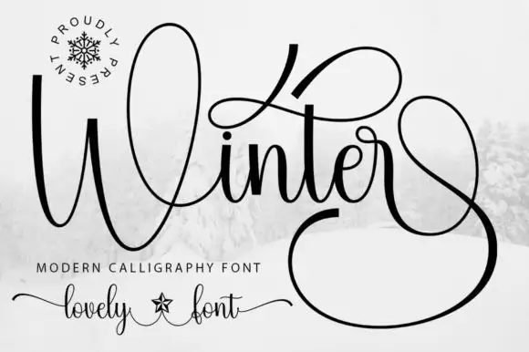
Corven + Winter
Introduces organic movement on pull-quotes, signatures and gift tags.
Inspect Winter specimenPractical applications
Concrete hierarchy, scale and production guidance tailored to Corven’s stroke geometry.
The light rounded forms suit handmade objects, and the open terminals keep the mark from feeling mechanical on a printed card.
Hierarchy & layout recipe
Print a 55 by 90 mm card: set the studio name at 12 pt with 2 mm of tracking, keep 7 mm of clear ground beneath before the address at 6 pt, and keep 6 mm of margin so the thin bowls are not clipped.
Pre-production check
Below 11 pt the hairlines can drop out on uncoated stock; test one card at the final size and adjust the weight before a full box is ordered.
The light line stays out of the way of photography, and the round forms read cleanly at the small size a running head uses.
Hierarchy & layout recipe
Print a 210 by 260 mm page: set the running head at 9 pt with 1.5 mm of tracking, keep 8 mm of clear ground beneath before the first line at 9 pt, and keep 14 mm of margin at the outer edge of the page.
Pre-production check
Thin strokes drop out on uncoated paper; check the proof on the chosen stock before the issue.
The quiet lowercase gives a modern ceremony a soft heading, and the light weight suits a minimal invitation rather than a formal one.
Hierarchy & layout recipe
Print a 120 by 170 mm invitation: set the names at 17 pt with 2.5 mm of tracking, leave 16 mm of open ground before the venue line at 9.5 pt, and hold 15 mm of margin left and right.
Pre-production check
Light type needs a coated card; check a printed sample before the suite is ordered. Order one sample before committing to the run.
Technical & licence verification
Confirm included OTF/TTF/WOFF formats, full glyph tables and licence coverage on the live store page before batch production.
Closest visual alternatives
Matched across letterform anatomy, stroke behaviour and craft applications.
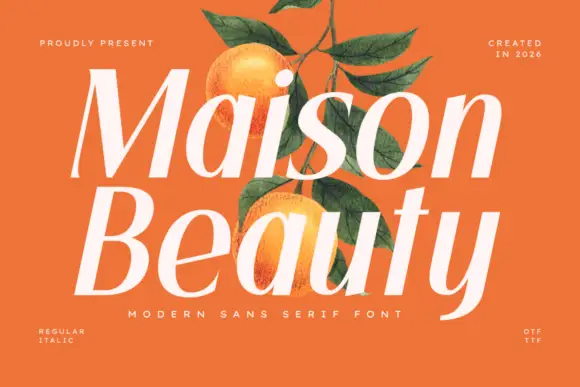
Sloping high-contrast display sans
Maison Beauty is a sloping high-contrast sans in cream over a flat orange ground: mixed case with deep oval bowls, a curved y tail, fine joins and a forward lean, set in two stacked lines with a tracked line beneath and small notes in the corners that name the cuts and the formats.
Ideas for this font

Broad geometric sans family
Noar is a broad geometric sans family in white over a still life of pears on a stoneware plate: wide capitals with a circular O, pointed N and A diagonals and an even stroke, set as one word with a tracked line beneath and shadow falling across the fruit.
Ideas for this font
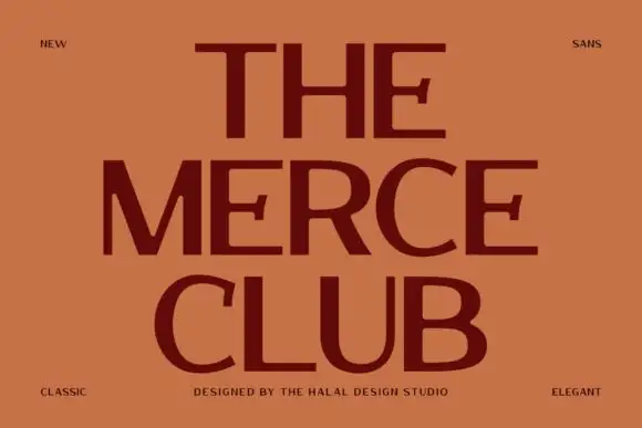
Broad contrast capitals
The Merce Club is a broad contrast sans in maroon on terracotta: wide capitals with heavy horizontal arms, thin uprights, flared arm ends and open curved bowls, set on three stacked lines with small tracked notes in the corners naming the style and the studio.
Ideas for this font
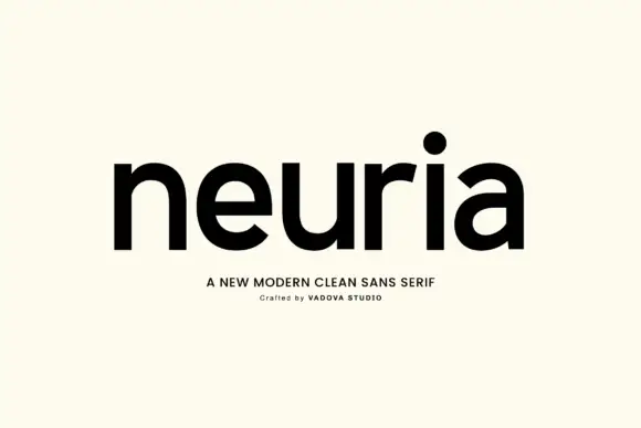
Modern clean sans
Neuria is a clean modern sans in near-black on a warm off-white sheet: lowercase with substantial rounded bowls, an open r shoulder, a circular o and flat terminals, set as one line with two small tracked lines beneath that name the style and the studio.
Ideas for this font
Same independent foundry
Allow optional Google Analytics to measure visits and catalogue actions. Your search words and notes are not included. Privacy & storage