High-Contrast Display Serif

Helina + Aureline
Pairs sculptural editorial warmth with Helina's clean modern geometry.
Inspect Aureline specimenDisclosure: MakerFileHub may earn a commission from qualifying purchases via paid links on this page. How our links work.
Heavy geometric condensed display grotesk
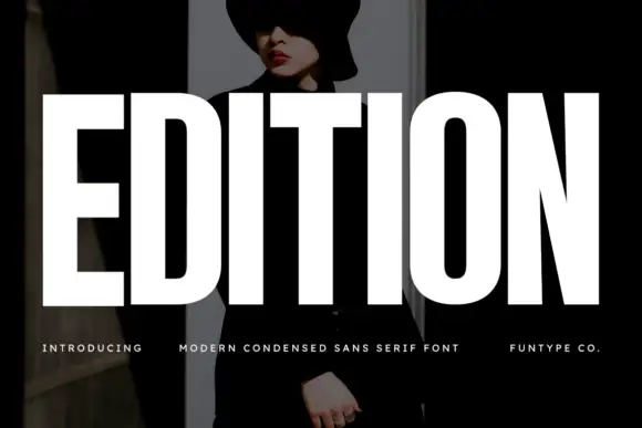
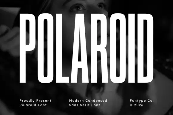
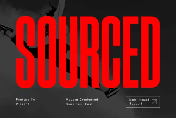
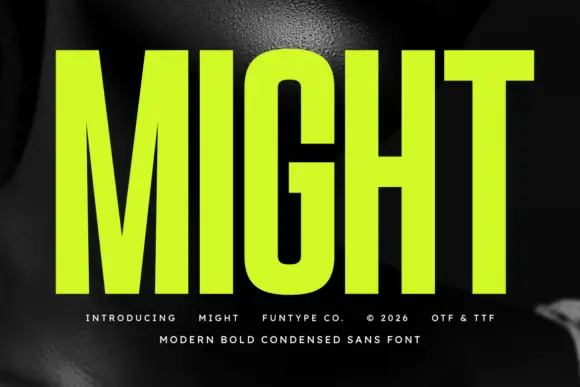
Helina is a clean, heavy-weight condensed sans serif with flat-cut terminals, tight vertical rhythm, and bold magazine-masthead authority.
Paid link
Get this fontProject & layout blueprintsAt-a-glance maker compatibility
Sturdy stroke walls and open counters weed cleanly on adhesive vinyl, HTV apparel film, and cut cardstock.
Visual anatomy & craft review
Helina is a heavy geometric condensed grotesk: very narrow stems with a uniform weight, squared shoulders, tight apertures and a level baseline that makes a column of type look like a printed rule. The condensation fits long words on a fascia, and the tight aperture is what closes first when the face is small. It needs roughly 24 mm for the aperture and the squared shoulder to read, and it is best in one dark ink on white and cream, or white on a dark ground where the narrow stems read as vertical lights.
Architectural · Punchy · Editorial
Two-font hierarchy recipes
Tested contrast partners — pairing Helina with grounded secondary typography.
Helina + Aureline
Pairs sculptural editorial warmth with Helina's clean modern geometry.
Inspect Aureline specimen
Helina + Hello Honey
Introduces organic movement on pull-quotes, signatures and gift tags.
Inspect Hello Honey specimenPractical applications
Concrete hierarchy, scale and production guidance tailored to Helina’s stroke geometry.
A heavy condensed grotesk is the lettering of a printed newspaper rather than a website, which is what a news feature wants across the top. The narrow stems stack a long headline in three lines at 64 pt, and one ink prints it on uncoated stock without losing the counters.
Hierarchy & layout recipe
Opener 210 x 297 mm, headline 64 pt with 6 mm aperture clearance, standfirst 11/15 pt, body 9/13 pt in three columns, 18 mm margins. Index column 40 mm wide, entries 8/10 pt.
Pre-production check
At 8 pt in the index column the tight aperture closes and the entries read as grey rules. Keep index text at 9.5 pt and above, and proof one page at 1:1 before the run.
A heavy condensed grotesk reads as a municipal sign rather than a studio logo, which is what an architecture practice wants on its fascia. The narrow stems fit a long practice name at 120 mm, and one ink prints the fascia and the folder from one separation.
Hierarchy & layout recipe
Fascia 2400 x 400 mm, word 160 mm with 20 mm edge clearance. Folder 240 x 320 mm, word 40 mm, 20 mm margins. Card 85 x 55 mm, name 12 pt, details 7/9 pt, 5 mm margins.
Pre-production check
On an 85 x 55 mm card the details at 7 pt lose the aperture and read as a solid grey line under the name. Raise details to 8.5 pt or drop them to the reverse, and check one card before the order.
A condensed grotesk fits a full festival schedule on one card where a normal-width face would need two. The heavy stems hold at 150 mm on a field sign, and one ink prints the card, the sign and the shirt in a single order.
Hierarchy & layout recipe
Schedule card 148 x 210 mm, header 30 mm, acts 10 mm, times 9 mm, 12 mm margins. Field sign 900 x 600 mm, word 120 mm, 25 mm margins. Shirt back 300 x 400 mm, word 90 mm, 20 mm margins.
Pre-production check
On a 148 x 210 mm schedule the 9 mm times print with clogged counters on an office laser and the set times become unreadable. Raise times to 10 mm or set them in a wider companion, and print one card on the actual printer.
Technical & licence verification
Confirm included OTF/TTF/WOFF formats, full glyph tables and licence coverage on the live store page before batch production.
Closest visual alternatives
Matched across letterform anatomy, stroke behaviour and craft applications.
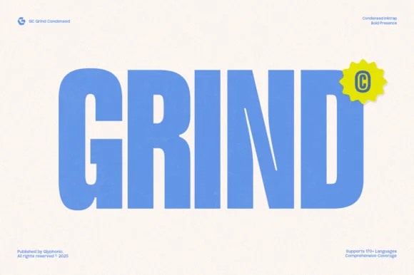
Heavy condensed inktrap display sans
Gc Grind is a bold condensed sans-serif engineered with subtle corner inktraps and flat industrial curves across 170+ languages.
Ideas for this font

Bold flat-sided condensed poster grotesk
Taught is a heavy, flat-sided condensed sans-serif with tight interior counters and commanding vertical headline presence.
Ideas for this font

Tall architectural condensed poster sans serif
Headline is a crisp, heavy condensed sans serif engineered with flat horizontal terminals, narrow counters, and clean newspaper-poster punch.
Ideas for this font
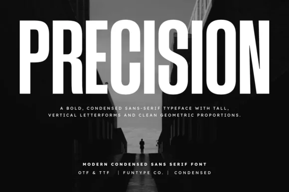
Tall ultra-condensed geometric headline grotesk
Precision is a bold, ultra-condensed sans serif typeface with tall vertical pillars, tight flat-sided counters, and clean modernist snap.
Ideas for this font
Same independent foundry
Allow optional Google Analytics to measure visits and catalogue actions. Your search words and notes are not included. Privacy & storage