Modern Grotesque Body

Sahron + Corven
Creates crisp high-hierarchy contrast beneath Sahron headlines across menus, websites and labels.
Inspect Corven specimenDisclosure: MakerFileHub may earn a commission from qualifying purchases via paid links on this page. How our links work.
Engraved inline luxury display serif (Regular & Alternate)
Sahron is an aristocratic high-contrast serif accented by fine interior inline grooves down its primary vertical and diagonal stems.
Paid link
Get this fontProject & layout blueprintsAt-a-glance maker compatibility
Crisp hairline serifs shine on stationery, foil stamping, and packaging; add slight offset for small decals.
Visual anatomy & craft review
Sahron is an engraved inline luxury display serif in a regular and an alternate cut: high-contrast stems with a fine white inline running down the middle of every thick stroke, sharp bracketed serifs and an alternate set that shifts the inlay to a double line. It is a banknote and a perfume-box face, so it wants size and precise registration rather than a soft ground. The inline is the finest element and it fills or breaks first in print and in foil. It needs roughly 40 mm for the inline to read, and it is best one dark ink on a bright coated stock.
Refined · Chiseled · Tailored
Two-font hierarchy recipes
Tested contrast partners — pairing Sahron with grounded secondary typography.
Sahron + Corven
Creates crisp high-hierarchy contrast beneath Sahron headlines across menus, websites and labels.
Inspect Corven specimen
Sahron + Rebel Marks
Adds a warm human signature touch for 1-to-3-word callouts without competing against structured serif capitals.
Inspect Rebel Marks specimenPractical applications
Concrete hierarchy, scale and production guidance tailored to Sahron’s stroke geometry.
An inline display serif gives a luxury cover the engraved look of a printed masthead. The inline holds at 90 pt on a cover, and the alternate cut carries the second line in the same ink.
Hierarchy & layout recipe
Cover 210 x 297 mm, title 90 pt with 16 mm inline clearance, 20 mm margins. Opener title 60 pt, standfirst 13/18 pt, body 9/13 pt over two columns of 82 mm, 18 mm margins. Folio 8 pt.
Pre-production check
At 30 pt the inline closes and the title prints as a solid stem. Keep the face above 48 pt, and proof one cover at 1:1 before the run.
An engraved inline serif reads as a struck hallmark rather than a modern logo. The inline holds at 34 mm on a box, and one dark ink prints the box and the card in one order.
Hierarchy & layout recipe
Box print 150 x 100 mm, word 34 mm with 10 mm inline clearance, 12 mm margins. Card 85 x 55 mm, word 24 mm, 6 mm margins. Foil block 40 x 20 mm, initial 10 mm, 3 mm margin.
Pre-production check
On a 40 x 20 mm foil block the inline bridges under heat and the mark prints as a filled shape. Keep foil blocks at 24 mm and above, and test one impression before the order.
An engraved inline serif gives a formal wedding the look of banknote stationery rather than a modern card. The inline holds at 36 pt on an invitation, and one ink prints the suite in one pass.
Hierarchy & layout recipe
Invitation 130 x 180 mm, names 36 pt with 12 mm inline clearance, details 9/13 pt, 18 mm margins. Menu 120 x 210 mm, head 20 pt, courses 9/12 pt. Monogram seal 40 mm round, initial 16 mm, 3 mm die margin.
Pre-production check
On a 40 mm seal the inline fills under wax and the monogram prints as a dot. Use the regular cut on the seal, and pour one seal before the batch.
Technical & licence verification
Confirm included OTF/TTF/WOFF formats, full glyph tables and licence coverage on the live store page before batch production.
Closest visual alternatives
Matched across letterform anatomy, stroke behaviour and craft applications.
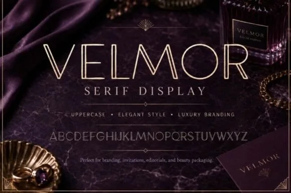
Slender open-inline luxury editorial & perfumery serif
Velmor is an ultra-refined uppercase luxury display serif carved down every primary vertical stem with a delicate open inline channel.
Ideas for this font
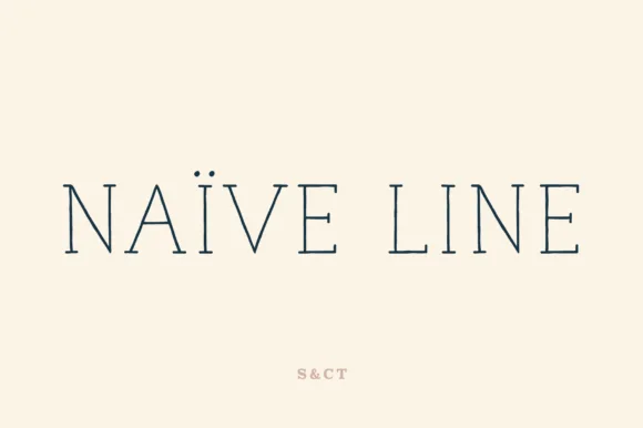
Thin monoline serif display
Naive Line is a skeletal monoline serif in navy on cream: hairline strokes of a single weight, serifs reduced to thin horizontal arms on the stems, and so much tracking between the letters that the word reads as two separated halves.
Ideas for this font
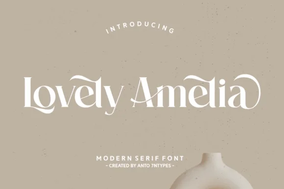
Curvaceous modern Art-Nouveau ligature & canopy serif
Lovely Amelia is a soft, high-contrast modern display serif featuring sweeping canopy arches over vowels and sculpted ligatures.
Ideas for this font
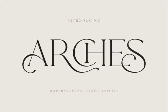
Decorative ligature serif
Arches sets one word in dark ink on a warm neutral field, where wide flat serifs sit on hairline cross strokes, the A climbs to a sharp apex, the R leg sweeps into a long horizontal tail that runs beneath the following letters and the S closes with an extended curl.
Ideas for this font
Same independent foundry
Allow optional Google Analytics to measure visits and catalogue actions. Your search words and notes are not included. Privacy & storage