 #1 · Best Overall
The Arkanes
Layered Victorian decorative lettering with ornamental inner lines
Get fontPaid link
Read review ↓Disclosure: MakerFileHub may earn a commission from qualifying purchases via paid links on this page. How our links work.
Victorian serum serifs & small-batch labels
A candle label is usually two inches wide, which makes it the most cramped canvas in this catalogue. The Arkanes and Siri carry Victorian ornament that still reads small, Apothecary and Elva supply the bracketed and high-contrast serif bases, and Alexander adds botanical engraving for a naturalist line. Tjiwidej Heritage and Modany cover the cottagecore and fountain-pen registers.
Quick verdict
The Arkanes is the strongest apothecary mood for a small label, Elva is the cleanest high-contrast serif for a modern skincare line, and Apothecary is the pick for a traditional serum bottle. Alexander suits botanical and herbal ranges.
Quick answer
Short on time? Start with our three highest-rated soy candles, apothecary & skincare standouts before scrolling the full breakdown.
#1 · Best OverallLayered Victorian decorative lettering with ornamental inner lines
 #2 · Runner-Up Pick
Inline-ornamented vintage Deco serif with bevel lines and a heavy contour
 #3 · Editor's Choice
We kept 29 of 502 candidates after rendering each on a simulated 2 inch label at 300 dpi. Weighted minimum stroke width, whether ornament survives at 6 pt, and how scent names and volume figures sit beside the brand line.
Side-by-side summary
Compare specimens, OpenType/PUA traits and primary project roles side by side.
| Rank & Font | Style & File Specs | Best Project Fit | Store Listing |
|---|---|---|---|
| DisplayMagical | Artisan candle label, craft cocktail menu or Halloween potion bottle | Get fontPaid link | |
| DecorativeFile formats | Perfume label, chocolate box or speakeasy event card | Get fontPaid link | |
| DecorativeNaturalist-engraving | Botanical garden wedding monogram, honey favor & menu | Get fontPaid link | |
| DecorativePUA encoded · Alternates & swashes | Celestial tarot box, apothecary candle & spooky-season mug | Get fontPaid link | |
| SerifPotion-label | Glass potion-bottle label ('Eye of Newt', 'Moon Water') & box | Get fontPaid link |
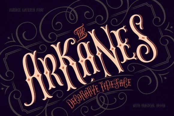
#1 · Best OverallThe Arkanes is a decorative Victorian alphabet in which the stems carry drawn ornament, the letters arch along a curve and two offset layers sit behind each word, so a title reads as a hand-painted fairground sign.
The A opens a tall arch with an ornamental spine, the r turns a curled arm, the k splays two decorated diagonals, the n keeps two stems with inner lines and the s holds a spiral spine, all at a display weight with drawn interior ornaments and a second offset layer in a warm tone. The ornament is the character: it is drawn inside the letter rather than added around it, which is why the sample arches the word and surrounds it with swirls. Because the inner lines are fine, the face needs 44 pt before they read, and the arched setting must be done in vector rather than by eye. The dark ground, the swirling frame and the small banner text are presentation; the cream ornamented word is the face.
Artisan candle label, craft cocktail menu or Halloween potion bottle — Arch 5–10 degrees across oval bottle labels above tracked serif small caps.
Use the base solid layer for vinyl decals or stack layered styles in print/Canva.
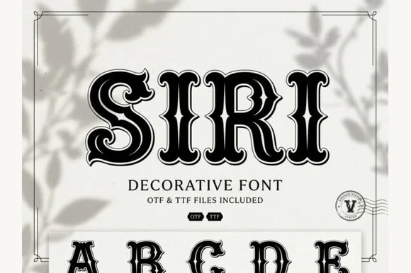
#2 · Runner-Up PickSiri is a vintage Deco serif in which every stem carries an inline bevel, the serifs curl and a heavy contour closes the shape, so a word reads as a painted shop window from the thirties.
The S opens with a curled terminal and an inner line, the I stands as a heavy stem with a double bevel, the R keeps a squared bowl with an inline and the full alphabet beneath shows the same treatment on every letter, all at a heavy weight with a high contrast and a contour that follows the outline. The inline is the character: it runs inside the stem and turns with the serif, which is what gives the face its boutique register at 60 pt and what fails first when it is reproduced small. Below 24 pt the inline fills with ink. The pale ground, the black ink, the botanical shadow and the small badges are presentation; the display face is the word shown.
Perfume label, chocolate box or speakeasy event card — Use at 32pt+ on smooth cream or pale pastel cardstock.
Fine internal contour lines are suited to print and digital design.
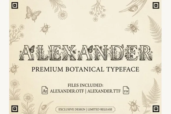
#3 · Editor's ChoiceAlexander is an intricate vintage naturalist's display serif filling hollowed Roman capitals with fine-line butterflies, honeybees, and wildflowers (OTF & TTF)!
Alexander is a naturalist's display serif whose hollowed Roman capitals are filled with fine botanical and entomological line work — butterflies, honeybees, wildflowers — so each letter reads as a specimen plate rather than a letter with an ornament. The interior detail is delicate, so the face needs roughly 40 mm before the insects read as drawn rather than as dirt, and the outline is what holds the shape at distance. It is a title and plate face, best in one ink on laid or cream stock, and it should never be used below about 18 mm.
Botanical garden wedding monogram, honey favor & menu — Set 1 full name at 64–130 pt or 1 giant 4-inch monogram initial on warm cotton rag cardstock.
Microscopic interior botanical line-art is strictly for high-res flat print (300 DPI+), stationery, DTF, and large CO2 laser wood engraving—never vinyl cutting!
 #4 · Top Maker Utility
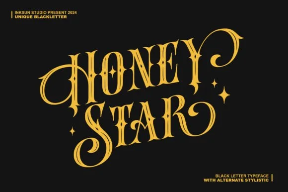
Honey Star is a whimsical, medium-bold ornamental blackletter blending diamond gothic stems with sweeping celestial spiral curls.
Honey Star is a Victorian ornamental blackletter crossed with psychedelic swashes: dense broken strokes with a heavy vertical rhythm, split serifs that curl into long spiral tails, small stars set into the counters and a warm wobble across the baseline. The spirals and the stars are the finest elements and both close first. It needs roughly 34 mm for the spiral and the star to read, and it is best in two warm inks on cream, or one dense ink on white where the spirals print as drawn lines.
Celestial tarot box, apothecary candle & spooky-season mug — Center a 2-word title in metallic gold over midnight black or deep plum, flanking outer curls with minimal star marks.
Main stems have decent body, while outer spiral tips taper fine—favor gold foil, sublimation, or 1.8 in+ vinyl decals.
 #5 · Standout Silhouette
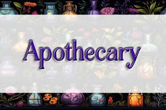
Apothecary (by Heidi Vargas-Smith) is a dignified, bracketed Victorian serif (compare with pinkmeca's brush script #1007!) built for potion jars & tea tins.
Apothecary is a dignified Victorian serif with sturdy vertical stems, bracketed feet and a moderate contrast that keeps it legible below display sizes. It reads as a label printed for a pharmacy rather than a fantasy prop, which is why it works on jars and tins without additional ornament. The faces are simple and the caps are slightly narrow, so a long product name fits a small label, and the face holds at 9 pt on an ingredients panel. It is a packaging and signage face, best in one deep ink on a warm ground.
Glass potion-bottle label ('Eye of Newt', 'Moon Water') & box — Center 1 mixed-case title (56–115 pt) inside an arched rectangular apothecary label border.
Clean, solid classical serifs print sharply on waterproof bottle labels and cut cleanly on 0.8 in+ Cricut vinyl!
 #6
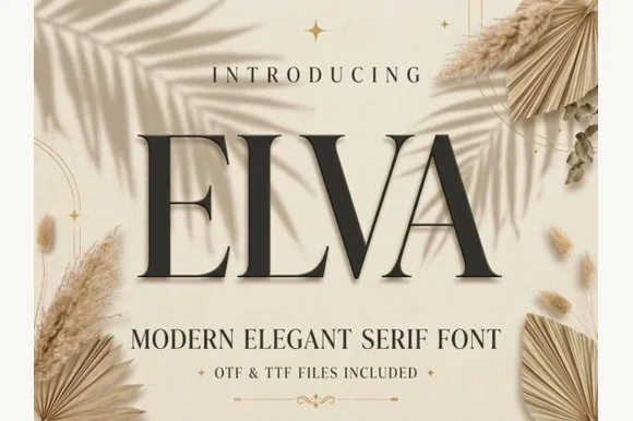
Elva is a poised, minimalist high-contrast editorial serif with wide classical Roman proportions and razor-crisp hairline brackets.
Elva is a minimalist high-contrast editorial serif in caps with wide classical Roman proportions, sharp symmetrical diagonals on the V and A, and razor-crisp hairline brackets. The caps are wide and open, so a short word becomes a graphic panel, and the hairlines are the design, which means the face needs roughly 30 mm before they hold in print. It is a title and label face for luxury and editorial work, best in one ink on smooth coated stock or as a foil on a matte board.
Mediterranean resort logo, linen homeware & skincare box — Set 1 short 4-to-6-letter brand name huge (64–120 pt) with +15 tracking over warm travertine, sand, or linen.
Clean straight geometry prints and foil-stamps sharply, and cuts on 1.25 in+ retail window vinyl.
 #7
De Rozzo balances wide classical roman bowls with crisp modern wedge serifs and alternates, built for luxury fashion, magazines and wine labels, where the expansive round O and C counters contrast with slender horizontal hairlines for a confident Mediterranean feel.
The bowls stay wide and round, the serifs cut as wedges, the hairlines thin out and the alternates sit outside the default set. That wedge is the character: a classical roman gains a modern edge, which is why the sample suits fashion and wine. Alternates need checking in your own file, so test the letters you need, keep 32 pt for the hairlines and print on coated stock where the thin strokes survive. The hairline thins are the risk: they silt below about 32 pt and they fill on an uncoated sheet, and the alternates sit outside the default set so they have to be switched on per letter.
Wine label, resort identity, fashion lookbook or masthead — Track all-caps wordmarks +15 and pair with minimalist grotesk body copy.
Best for print packaging, foil and web headers.
 #8
Orvelia is a high-contrast display serif in which the stems alternate thick and hairline weights, the R, V and A end in curved swash legs and the bowls stay sculpted, so a name reads as a crest for a perfume box or a masthead.
The R tucks its leg into a curve, the V splits into two swashed strokes, the A carries a curling leg and the bowls close against fine joins that thin to a hairline at every junction. The swash leg is the character: three capitals carry the ornament while the rest of the alphabet stays quiet, which is why the sample frames one word for formal stationery. Because the hairlines are fine, the face wants coated stock from 16 pt and gains from hot foil on signage; the display cut ships with swashes as separate glyphs. The pale ground and the small frame rules are presentation; the dark display word is the face.
Formal wedding suite monogram & header — Track supporting lines (FOREVER BEGINS HERE) wide in a simple roman serif beneath the main display name.
Delivered as OTF; best suited to print, foil stamping and digital branding due to fine serif hairlines.
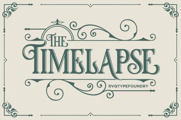 #9
Timelapse is an ornate Victorian display serif crowned with spiraling vine swashes, teardrop terminals, and vintage apothecary charm.
Timelapse is a Victorian storybook and apothecary display serif with swashes: fine bracketed serifs against heavy stems, a small ball terminal on the diagonals, swash capitals that curl off the first letter and a slightly condensed width that keeps a long label on one line. The hairlines are the design and the swashes need side clearance. It needs roughly 30 mm for the swash and the hairline to read, and it is best in one fine ink on smooth or coated stock, or a foil impression above 40 pt where the curls still turn.
Steampunk or historical novel cover, tea tin & poster — Center 1-to-2-word uppercase titles at 48–72 pt, activating upper flourishes on left initials and lower curls on middle/right stems.
Fine spiral tendrils and thin serif crossbars belong in print, foil, or laser wood engraving rather than small cut vinyl.
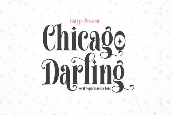 #10
Chicago Darling is a bold, condensed modern-vintage serif distinguished by curled spiral terminals, sparkling counters, and deep descender loops.
Chicago Darling is a high-contrast vintage display serif with curled ball terminals: hairline thins against swollen stems, a small x-height, a high waist and terminals that roll into small balls on the a, c and r. It is the lettering of a nineteen-twenties poster and a department-store sign, so it wants size and air. The hairline thins are the finest element and they break first in print and in vinyl. It needs roughly 34 mm for the contrast and the ball terminal to read, and it is best one dark ink on a cream ground.
Soy candle vessel label & apothecary box front — Stack a two-word scent or brand name tightly at 32–42 pt with tighter line-height, anchored by minimalist uppercase sans notes below.
Hairline crossbars and spiral tips shine in 300 DPI print and hot foil; avoid weeding small adhesive vinyl below 2 inches cap height.
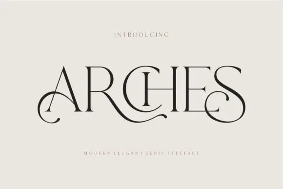 #11
Arches sets one word in dark ink on a warm neutral field, where wide flat serifs sit on hairline cross strokes, the A climbs to a sharp apex, the R leg sweeps into a long horizontal tail that runs beneath the following letters and the S closes with an extended curl.
The uprights stay thin, the serifs stay flat and wide, the contrast is extreme and two letters throw strokes sideways instead of down. Those sideways strokes are the character: the word reads as a piece of engraved editorial typography rather than a headline, which is why the sample leaves a wide cream margin around it. The small introduction line above and the caption below are separate cover text. Keep 44 pt before the hairlines vanish, allow 30 mm at each end for the sweep and check the R tail against any text you put underneath.
A beauty studio identity — Use a short studio name with a broad clear margin around its lower curls. Put the service descriptor and booking details beneath in plain type rather than threading them through the swashes.
Test the actual studio name; the preview’s “Arches” composition may not transfer to other letters.
 #12
Vanielst is a substantial, medium-high-contrast display serif highlighted by graceful overhead swash loops and crisp bracketed feet.
Vanielst Elegant Serif Display Stylistic is a bold transitional display serif with an overhead canopy swash: sturdy bracketed stems, a moderate contrast, crisp horizontal serifs and a capital set that carries a wide arc of swash above the word like an awning. The canopy is the design and it needs vertical room, so the face cannot be tucked under a fold. The canopy and the hairlines are the finest elements and they break first. It needs roughly 36 mm for the canopy and the serif to read, and it is best one dark ink on a bright stock.
Perfume carton, candle vessel & boutique wordmark — Set a single 5-to-8-letter brand name at 36–54 pt, activating only one canopy swash alternate so the silhouette stays clean and memorable.
Substantial main stems cut cleanly on sign vinyl down to 1 inch, though tapering overhead swash tips perform best in print, foil, or larger 2 in+ decals.
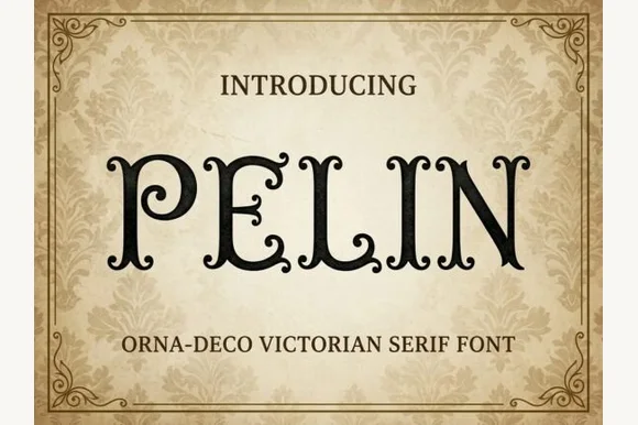 #13
Pelin is an Orna-Deco Victorian display serif blending classical Roman stems with inward-curled spiral hooks and diamond stem nodes.
Pelin is a Victorian Orna-Deco serif with curled inner terminals: high-contrast stems, thin slabbed serifs, a hairline inline and small curls that turn inward at the ends of some strokes instead of finishing flat. The curls are the design and they close first at small sizes, and the hairline inline silts on uncoated stock. It needs roughly 30 mm for the curl and the inline to read, and it is best in one fine ink on coated stock, or a foil impression above 40 pt where the curls still turn.
Gothic mystery book cover, tarot deck & theater playbill — Center 1-to-3-word uppercase titles at 48–72 pt inside thin double-line ornamental frames on cream or charcoal backgrounds.
Delicate spiral curl tips reproduce crisply in print and laser engraving on wood boxes; keep vinyl cuts at 1.5 in+ cap height.
 #14
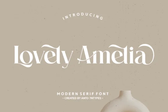
Lovely Amelia is a soft, high-contrast modern display serif featuring sweeping canopy arches over vowels and sculpted ligatures.
Lovely Amelia is a high-contrast display serif with Art-Nouveau canopy arches that spring from the vowels and a sculpted cradle tail that runs beneath a word. The arches sit above the x-height, so the layout needs headroom, and the tail occupies its own band below the baseline. Contrast is strong, so the face wants 22 mm and up before the hairlines hold, and it is a title and invitation face rather than a text face. Its natural home is an asymmetric composition where the canopy can echo a drawn frame.
Ceramic-studio mark, botanical skincare & boutique sign — Set 1 or 2 title-case words at 48–84 pt in warm cream or charcoal over earthy clay/sand tones.
High-contrast hairline transitions shine in print, foil, and web logos; scale vinyl above 1.75 in if cutting.
 #15
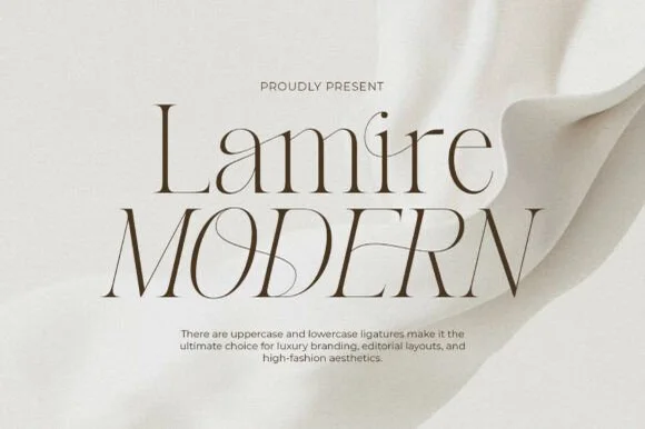
Lamire Modern is an ultra-light, tall-statured editorial serif featuring sweeping diagonal ligatures across both uppercase and lowercase.
Lamire Modern is an ultra-light editorial serif with tall stature, whisper hairlines and sweeping diagonal ligatures that cross from one letter to the next. The contrast is extreme, so the face needs roughly 30 mm before it survives in print, and the ligatures require the letters to be set as designed rather than adjusted with kerning. It reads as fashion typography rather than a book face, and it is at its best in one colour on a smooth coated stock where the hairlines stay continuous.
Bridal gown label, luxury skincare serum & candle carton — Stack mixed-case over all-caps at 48–84 pt with +10 tracking and wide ivory negative space.
Hairline strokes are strictly engineered for print, hot foil, and high-res web headers—never blade-cut vinyl.
 #16
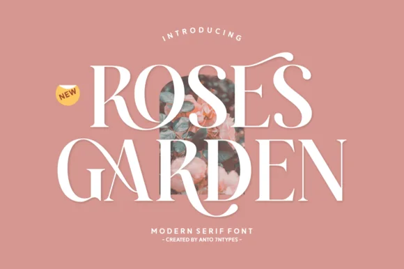
Roses Garden is a refined modern editorial serif crowned with graceful overhead S-swashes, looped ligatures, and multilingual support.
A high-contrast floral-editorial serif shown in snow white over dusty terracotta rose: a delicate ribbon flourish arches over the S, the R and G bowls curve with crisp Didone contrast, and the hairlines run thin against heavy stems, so the word reads as a fashion masthead rather than a book face. The flourishes are drawn to frame a photographic inset, which is why the composition leaves a window at the centre. The size floor is set by the hairline strokes, and the face needs a smooth stock to hold them. The floral framing is staging.
Rose-garden wedding invitation, bridal menu & perfume box — Stack 2 uppercase words at 54–90 pt with +10 tracking over dusty rose, sage, or ivory.
Ultra-thin horizontal hairlines belong in flat print, letterpress, and foil stamping rather than blade-cut vinyl.
 #17
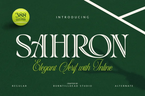
Sahron is an aristocratic high-contrast serif accented by fine interior inline grooves down its primary vertical and diagonal stems.
Sahron is an engraved inline luxury display serif in a regular and an alternate cut: high-contrast stems with a fine white inline running down the middle of every thick stroke, sharp bracketed serifs and an alternate set that shifts the inlay to a double line. It is a banknote and a perfume-box face, so it wants size and precise registration rather than a soft ground. The inline is the finest element and it fills or breaks first in print and in foil. It needs roughly 40 mm for the inline to read, and it is best one dark ink on a bright coated stock.
Emerald spirits label, bespoke tailoring seal & candle box — Set a single uppercase brand name at 42–64 pt with +35 tracking over rich hunter green, navy, or matte black stock.
Fine interior inline slots shine in 300+ DPI offset/digital print and hot foil; avoid small blade-cut vinyl where narrow inline strips could lift.
 #18
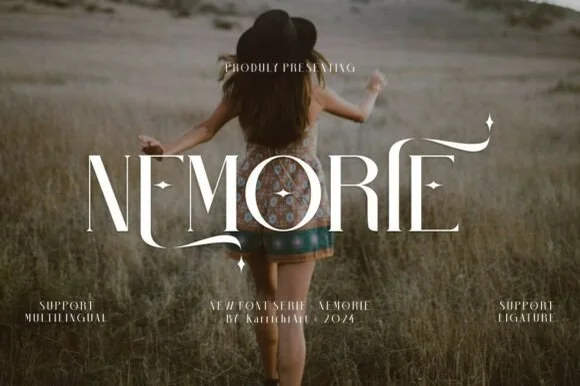
Nemorie is a refined high-contrast display serif featuring sweeping scythe-like swash bars, sculpted ligatures, and four-point star accents.
Nemorie is a high-contrast art-nouveau serif with celestial ligatures: a thin-thick stroke with hairline hairlines, tall whipped ascenders that rise into a small star or comet tail and ligature pairs that knit two letters into one drawn shape. The hairlines are the design and the first thing to break on textured stock, and the ligatures change the word's width as they engage. It needs roughly 28 mm for the hairline and the comet tail to read, and it is best in one fine ink on smooth or coated stock, or a foil impression above 40 pt where the hairlines still carry.
Fantasy novel cover, tarot guidebook & poetry anthology — Center 1-word titles at 56–90 pt with +15 tracking over moody photography, keeping author names clean below.
Ultra-fine hairlines require book printing, foil stamping, or high-res digital covers rather than small cut vinyl.
 #19
Majestic Letters is a vintage editorial serif in which the capitals carry curled swashes, the contrast runs high and a slanted italic companion is supplied, so a title page can mix upright and leaning forms from one family.
The capital M is drawn with splayed stems and a wide base serif, and the swashes leave the ends of several capitals and curl above the x-height, which is what gives the face its engraved, early-twentieth-century look. The lowercase keeps a moderate contrast with bracketed serifs and a generous x-height, so a phrase reads comfortably at 30 pt and above, while the italic companion leans forward and carries the same swash programme. Counters stay open, the fit is fairly generous and the serifs are fine enough to need a good stock at small sizes. The interior photograph, the cream ink, the sparkle ornament and the four small corner captions are presentation; the typeface is the two words.
Book cover title or candle label — Keep swashes on outer capitals and set scent notes or author names in clean tracked capitals.
Includes Regular and Italic; fine serifs perform best in print, packaging and web headers.
 #20
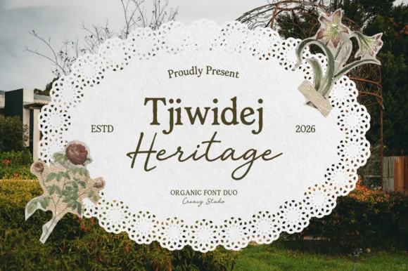
Tjiwidej Heritage is a sun-drenched cottagecore font duo pairing a warm, organic book serif with an unhurried botanical garden script.
Tjiwidej Heritage is a two-part family: a humanist book serif with a warm olive-brown cast, generous x-height and softly bracketed serifs, plus a slanted botanical script whose flourishes stay airy rather than dense. The serif carries names, headings and short body copy; the script carries one or two words only, because its connections are loose and its ascenders long. Together they set up a clear hierarchy without needing a third face, which is what a small producer wants on packaging. The serif is comfortable at 8 pt in print, while the script wants 14 mm or more before the ligatures resolve.
Botanical tea tin, artisanal honey jar, soap wrap & zine — Stack mixed-case Serif (64 pt) directly above overlapping Script (60 pt) flanked by 'ESTD / 2026'.
Clean solid strokes print razor-sharp on textured cotton paper and cut on 1.2 in+ Cricut vinyl (Weld script joins!).
 #21
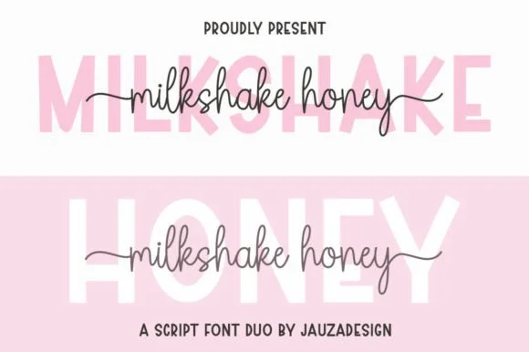
Milkshakehoney pairs a crisp, wide-stance uppercase sans-serif with a tall, narrow-looped monoline cursive accented by straight side tails.
Milkshakehoney pairs a clean geometric uppercase sans with a tall-looped monoline script: the sans is a wide, even-width capital set for signage and labels, while the script is a thin monoline with high loops that rise well above the x-height and joins that stay open. The pair gives one card a printed voice and a hand-written line and works from a single ink. The monoline hairline is the finest element and it breaks first. The sans needs roughly 20 mm and the script 30 mm for their detail to read.
Bridesmaid proposal box lid & satin robe chest print — Track the uppercase sans role title ('BRIDESMAID') wide in pale pink or gold behind the recipient's cursive first name.
Size HTV chest names at 4 inches wide or larger so the tall narrow 'k' and 'h' loops weed cleanly without stretching.
 #22
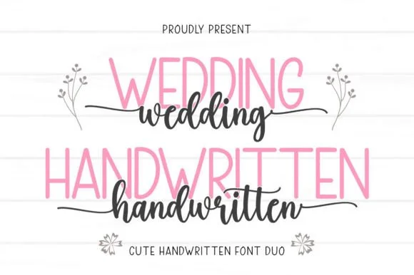
Wedding Handwritten pairs a tall, narrow rounded sans-serif with a lively thick-thin calligraphy script sporting symmetrical side tails.
Wedding Handwritten pairs a tall slender sans with a tailed calligraphy script: the sans is a narrow even-width capital set for details and directions, while the script runs a high-contrast stroke with long ascenders and a tail that lifts off the last letter. The pair is a stationery set, so both cuts have to survive one ink and a matte stock. The script tail is the finest element and it breaks first. The sans needs roughly 20 mm and the script 30 mm for their detail to read.
Save-the-date card, acrylic table sign & seating chart — Set table numbers or 'SAVE THE DATE' in 1.8 in blush or gold sans and center couple names across the lower half in charcoal script.
Weld the script letters before cutting vinyl for acrylic wedding signs, and handle the fine horizontal outer tails gently on transfer tape.
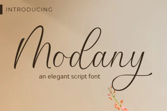 #23
Modany is a graceful, thin-to-medium handwritten cursive script with tall peaked arches on capitals and long, airy ascenders.
Modany is a slender upright fountain-pen cursive script: a fine even stroke on a nearly vertical axis, small loops, joined letters and a light ink swell where the pen pauses, with very little contrast between thin and thick. The monoline character makes it legible at small sizes, and the fine stroke is what fails first on textured stock. It needs roughly 24 mm for the pen swell and the join to read, and it is best in one dark ink on smooth card, or a single warm ink on cream where the swell prints as a soft edge.
Minimalist save-the-date, envelope calligraphy & menu — Set single or paired names at 38–54 pt on warm cotton cardstock with generous breathing room above the tall 'M/d' peaks.
Fine pen weight excels in flat print, letterpress, and Foil Quill pen drawing; keep adhesive vinyl cuts above 1.8 in tall.
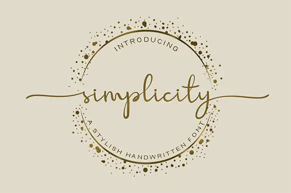 #24
Simplicity sets a fine lowercase word across an ornamental ring, with long swashes extending beyond the circle on either side. The l rises above a low lowercase body, the p drops below it, the final y carries a narrow descending loop and the long end strokes supply much of the width.
The body stays low and fine, the ascender rises, the descender loops and the end strokes travel far out. Those long exits are the character: the word reaches past its own bounding box, which is why the sample lets it cross a decorative ring. The ring is separate artwork rather than an included ornament, so plan the exits in your layout, keep 26 pt for the fine joins and give at least 24 mm of clear space at each end.
A botanical maker’s round seal — Keep the words across the circle’s centre. Break the ring where the letters or swashes cross it instead of running a line through the text.
Check the real phrase and ring clearance at seal size; the gold border is artwork, not a promised glyph.
 #25
Welcome features relaxed lowercase cursive with long level beginning and ending swash tails, tailored for round wood signs and entryways, where the smooth monoline-leaning strokes and open letter spacing keep words calm while the extended w and e tails span a circular blank.
The stroke stays one width, the spacing opens, the tails run level and the word sits calm. That level tail is the character: the greeting stretches to the width of a round board without a bigger point size, which is why the sample targets door signs. Plan the tails against the blank's curve, keep the stroke at 3 mm for cutting, and check the exits in your own word before committing the sign. The wide tail is also the weak point on a shaped blank: it has to end inside the panel, so a 12 mm tail on a 300 mm round board is safe and anything longer gets trimmed at the edge.
Round wood welcome sign or nursery plaque — Centre the tailed lowercase word across the middle third and tuck family names below in small caps.
PUA-encoded tails weld cleanly in Cricut/Silhouette; verify thin tail tips before weeding small decals.
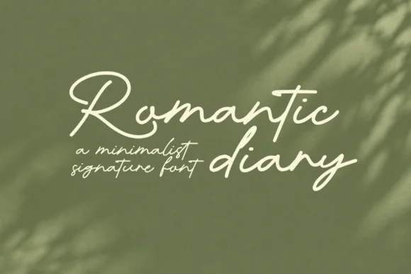 #26
Romantic Diary is a minimalist signature script in which the capitals rise into slender loops, the body stays narrow and the stroke keeps one light weight, so a name reads as a quick signing gesture rather than as calligraphy.
The R opens a tall loop that swings left of its stem, the o stays an open ring, the m keeps three even arches, the a closes a narrow bowl, the n turns a light shoulder and the d rises into a second loop, all at one even light weight with tall proportions and a narrow slope. The restraint is the character: there is no heavy downstroke anywhere, which is why the sample sets two words loosely over a leafy ground with no other ornament. Because the stroke is light, the face needs 24 pt upward and a smooth ground to survive in print. The olive leaves, the soft shadows and the small caption lines are presentation; the cream script words are the face.
Founder signature sign-off or minimalist candle label — Pair with clean geometric sans body text on textured cream stock.
Fine monoline stroke suits print, digital logos and larger (2.5"+) vinyl decals.
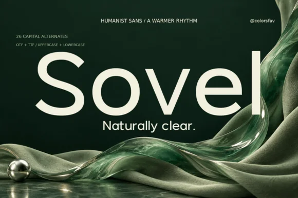 #27
Sovel is a poised humanist sans-serif combining clean open lowercase forms with subtly flared stroke terminals and 26 capital alternates.
Sovel is a warm humanist sans with twenty-six expressive capital alternates: open apertures, a soft stroke modulation, a tall x-height and a set of capitals whose terminals curl or flare so a headline can be tuned without changing the family. The alternates only appear through specific keystrokes, and the soft modulation disappears under a coarse screen. It needs roughly 20 mm for the aperture and the alternate to read, and it is best in one dark ink on uncoated stock.
Wellness skincare tube, candle jar & studio wordmark — Set a 4-to-7-letter brand wordmark in mixed-case at 42 pt, swapping in an alternate initial cap, and use standard Sovel at 10 pt for sublines.
Clean, open bowls cut crisply on matte label vinyl, frosted glass etch stencils, and precision cardstock.
 #28
Helina is a clean, heavy-weight condensed sans serif with flat-cut terminals, tight vertical rhythm, and bold magazine-masthead authority.
Helina is a heavy geometric condensed grotesk: very narrow stems with a uniform weight, squared shoulders, tight apertures and a level baseline that makes a column of type look like a printed rule. The condensation fits long words on a fascia, and the tight aperture is what closes first when the face is small. It needs roughly 24 mm for the aperture and the squared shoulder to read, and it is best in one dark ink on white and cream, or white on a dark ground where the narrow stems read as vertical lights.
Fashion lookbook masthead, fitness poster & reel cover — Set all-caps headlines at 72–140 pt with tight -15 tracking above wide-spaced (+250) micro subcaptions.
Straight, sharp-cornered vertical bars are super fast to weed on vinyl decals, gym wall graphics, and HTV.
 #29
Bielchon is a crisp, light-to-regular modern sans-serif featuring tall x-height, circular bowls, and subtle stencil-like notched joins.
Bielchon is a slim contemporary geometric sans with architectural cuts: narrow even stems, perfectly circular bowls, sharp mitred cuts where two strokes meet instead of a curve and a level baseline that reads as gallery signage. The mitres are the design and they round off once the face is reduced or printed with a coarse screen. It needs roughly 22 mm for the mitre and the counter to read, and it is best in one fine ink on a pale ground, or a single white on a dark ground where the cuts print as sharp joints.
Architectural studio, skincare box & minimalist identity — Set brand wordmarks in mixed-case at 36–60 pt with +15 tracking, leaving generous negative space across matte white or stone stock.
At small label sizes below 12 pt, print at 300+ DPI so the delicate notch gaps at 'h' and 'n' shoulders remain crisp rather than filling in.
Practical buyer checklist
Key cutting, printing and pairing answers before choosing a soy candles, apothecary & skincare typeface.
The brand name at 7 to 9 pt, the scent at 5.5 to 6.5 pt, and the volume line at 5 pt. Anything smaller than 5 pt will not be legible on a matte label after printing, regardless of how good the proof looks zoomed in.
It works for short single words such as Ember or Fig, but not for two-word scent descriptions. Scripts at 6 pt close their counters and the name stops being readable on a shelf, which defeats the purpose.
Use a plain, high-legibility sans that meets the required minimum size for your market. Decorative faces and fine serifs are inappropriate for warnings, and some jurisdictions set explicit size floors that ornamental type cannot meet.
Stack three short lines rather than running one long one, keep the brand name alone on the top line, and remove any ornament that competes with the lettering. White space is what makes a small label look expensive.
Keep exploring
Explore adjacent maker roundups or check our practical pre-production checklists.
39 curated fonts · Previews & pairings
34 curated fonts · Previews & pairings
24 curated fonts · Previews & pairings
31 curated fonts · Previews & pairings
Guides: Invitation font checklist · Vinyl & cutting checklist · How to pair script & sans fonts
Allow optional Google Analytics to measure visits and catalogue actions. Your search words and notes are not included. Privacy & storage