High-Contrast Display Serif

Sovel + Evoire
Pairs sculptural editorial warmth with Sovel's clean modern geometry.
Inspect Evoire specimenDisclosure: MakerFileHub may earn a commission from qualifying purchases via paid links on this page. How our links work.
Warm humanist sans-serif with 26 expressive capital alternates
Sovel is a poised humanist sans-serif combining clean open lowercase forms with subtly flared stroke terminals and 26 capital alternates.
Paid link
Get this fontProject & layout blueprintsAt-a-glance maker compatibility
Sturdy stroke walls and open counters weed cleanly on adhesive vinyl, HTV apparel film, and cut cardstock.
Visual anatomy & craft review
Sovel is a warm humanist sans with twenty-six expressive capital alternates: open apertures, a soft stroke modulation, a tall x-height and a set of capitals whose terminals curl or flare so a headline can be tuned without changing the family. The alternates only appear through specific keystrokes, and the soft modulation disappears under a coarse screen. It needs roughly 20 mm for the aperture and the alternate to read, and it is best in one dark ink on uncoated stock.
Clear · Organic · Contemporary
Two-font hierarchy recipes
Tested contrast partners — pairing Sovel with grounded secondary typography.
Sovel + Evoire
Pairs sculptural editorial warmth with Sovel's clean modern geometry.
Inspect Evoire specimen
Sovel + Handmade Calligraphy
Introduces organic movement on pull-quotes, signatures and gift tags.
Inspect Handmade Calligraphy specimenPractical applications
Concrete hierarchy, scale and production guidance tailored to Sovel’s stroke geometry.
A humanist sans with expressive capitals reads as a considered wordmark rather than a corporate logo. The alternates give the mark a small curl that a plain grotesk cannot, and the text weight sets the address honestly.
Hierarchy & layout recipe
Card 85 x 55 mm, word 26 mm with 6 mm aperture clearance, details 7/9 pt, 8 mm margins. Letterhead 210 x 297 mm, word 30 mm, 20 mm margins. Colophon 105 x 148 mm, text 9/12 pt, 12 mm margins.
Pre-production check
On an 85 x 55 mm card the open apertures close and the name reads as a plain bar. Raise the card word to 32 mm, and check one card before the run.
A humanist sans sets long body text warmly without the coldness of a grotesk, and the capital alternates give the opener a voice. The text cut holds 9 pt honestly, and the alternates carry the standfirst.
Hierarchy & layout recipe
Body 9/13.5 pt over two columns of 82 mm, 18 mm margins and a 12 mm head. Standfirst 13/18 pt with expressive capitals. Caption 8/11 pt in a 40 mm rail.
Pre-production check
At 9 pt over a full page the open apertures silt and the column reads as a grey field. Raise the body to 9.5 pt with 14 pt leading, and proof one signature at 1:1.
A warm humanist sans reads as a school prospectus rather than a corporate brochure, which is what a small school wants. The capitals carry the cover at 40 pt, and the text cut sets a timetable at 9 pt.
Hierarchy & layout recipe
Cover 210 x 297 mm, title 40 pt with 8 mm aperture clearance, 20 mm margins. Timetable A4, header 16 mm, entries 9/12 pt, 12 mm margins. Notice 210 x 297 mm, head 24 pt, items 9/12 pt.
Pre-production check
At 9 pt in the timetable the open apertures close and the entries read as a grey grid. Raise the entries to 10 pt with 3 mm row padding, and print one sheet before the run.
Technical & licence verification
Confirm included OTF/TTF/WOFF formats, full glyph tables and licence coverage on the live store page before batch production.
Closest visual alternatives
Matched across letterform anatomy, stroke behaviour and craft applications.
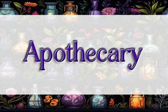
Classic Victorian potion-bottle bracketed serif
Apothecary (by Heidi Vargas-Smith) is a dignified, bracketed Victorian serif (compare with pinkmeca's brush script #1007!) built for potion jars & tea tins.
Ideas for this font
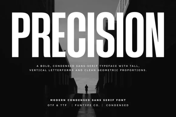
Tall ultra-condensed geometric headline grotesk
Precision is a bold, ultra-condensed sans serif typeface with tall vertical pillars, tight flat-sided counters, and clean modernist snap.
Ideas for this font

Slim contemporary geometric sans with architectural cuts
Bielchon is a crisp, light-to-regular modern sans-serif featuring tall x-height, circular bowls, and subtle stencil-like notched joins.
Ideas for this font

Bold neo-grotesk display sans with hooked double-story g
Memoir Slang is a heavy, tight-set modern sans-serif distinguished by crisp neo-grotesk geometry and sharp, horned ear details.
Ideas for this font
Allow optional Google Analytics to measure visits and catalogue actions. Your search words and notes are not included. Privacy & storage