Modern Grotesque Body

Hermione Modern Serif + Cenura
Creates crisp high-hierarchy contrast beneath Hermione Modern Serif headlines across menus, websites and labels.
Inspect Cenura specimenDisclosure: MakerFileHub may earn a commission from qualifying purchases via paid links on this page. How our links work.
High-contrast capitals with long crossing strokes and a sweeping central tail
Hermione is a modern elegant serif in caps with very fine hairlines, tall proportions and a set of display ligatures, shown over an editorial portrait and set with a slight arch.
Paid link
Get this fontProject & layout blueprintsAt-a-glance maker compatibility
Weld or Unite overlapping script joins into one continuous vector path before sending to the blade.
Visual anatomy & craft review
HERMIONE spans the card in white over a close portrait in warm light, and the letters are tall and narrow with hairlines at the joins and sharp wedge serifs; the I and the O are drawn to touch, and the custom ligatures give the word a rhythm that a standard setting would not have. The baseline lifts slightly across the centre, which is a display treatment rather than a feature of the font, and a caption at the foot names the family and credits the foundry. The sample is a fashion layout: type over a photograph, wide spacing in small caps, one ornament. What it tells a buyer is that the face is for titles and mastheads at a large size, and that the hairlines need a good press or a screen, never a cheap photocopy.
High-contrast capitals with long crossing strokes and a sweeping central tail
Two-font hierarchy recipes
Tested contrast partners — pairing Hermione Modern Serif with grounded secondary typography.
Hermione Modern Serif + Cenura
Creates crisp high-hierarchy contrast beneath Hermione Modern Serif headlines across menus, websites and labels.
Inspect Cenura specimen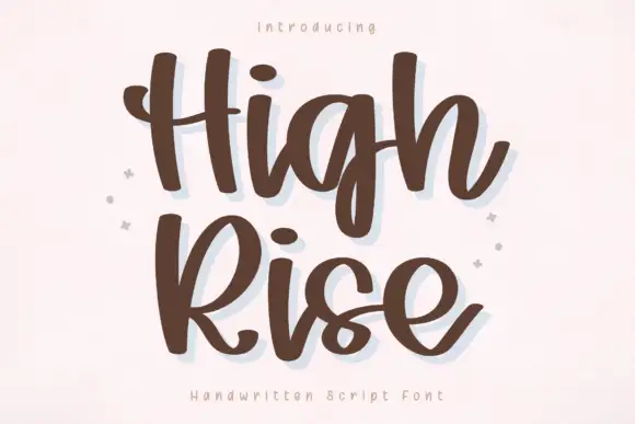
Hermione Modern Serif + High Rise
Adds a warm human signature touch for 1-to-3-word callouts without competing against structured serif capitals.
Inspect High Rise specimenPractical applications
Concrete hierarchy, scale and production guidance tailored to Hermione Modern Serif’s stroke geometry.
The tall caps with their ligatures give a masthead a mark that survives being set in one word, and the thin joins read as editorial rather than decorative.
Hierarchy & layout recipe
Print a 230 by 300 mm cover: set the masthead at 140 pt on one row, keep 30 mm of clear ground beneath before the cover lines at 12 pt, and hold 18 mm from the last letter to the trim.
Pre-production check
Hairline joins break at large sizes on newsprint; print one cover on the intended paper and check the O before the run.
The face is formal without being traditional, which is what a couple planning a modern ceremony usually want, and the ligatures give a short surname presence.
Hierarchy & layout recipe
Print a 148 by 210 mm invitation: set the names at 28 pt on one row, keep 20 mm of clear ground beneath before the venue at 9.5 pt, and hold 16 mm of margin from the widest letter to the card edge.
Pre-production check
Thin serifs break in foil; print one invitation in the intended process and check the joins before the suite.
The fine joins suggest metal rather than ink, which suits a product built on thin forms, and one wordmark carries a shop window without a symbol.
Hierarchy & layout recipe
Print a 90 by 55 mm card: set the wordmark at 16 pt on one row, keep 6 mm of clear ground beneath before the contact block at 6 pt, and hold 5 mm from the wordmark to the card edge.
Pre-production check
At card size the hairlines grey out; print one card at the final size and check the W before the order.
Technical & licence verification
Confirm included OTF/TTF/WOFF formats, full glyph tables and licence coverage on the live store page before batch production.
Closest visual alternatives
Matched across letterform anatomy, stroke behaviour and craft applications.

High-contrast display serif with sculpted curves and tucked swash legs
Orvelia is a high-contrast display serif in which the stems alternate thick and hairline weights, the R, V and A end in curved swash legs and the bowls stay sculpted, so a name reads as a crest for a perfume box or a masthead.
Ideas for this font
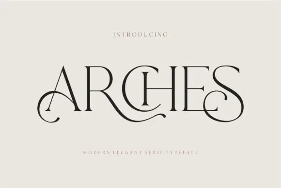
Decorative ligature serif
Arches sets one word in dark ink on a warm neutral field, where wide flat serifs sit on hairline cross strokes, the A climbs to a sharp apex, the R leg sweeps into a long horizontal tail that runs beneath the following letters and the S closes with an extended curl.
Ideas for this font
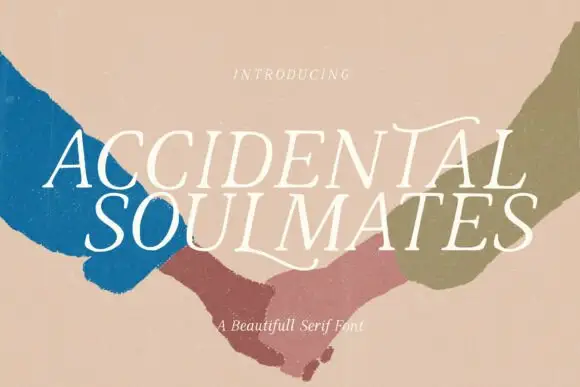
Slanted light capitals with fine serifs and selective curling extensions
Accidental Soulmates is a slanted light serif in which the capitals lean together, the serifs stay fine and two long extensions curl above the first row and sweep below the second, so a two-line title reads as a romantic editorial head.
Ideas for this font
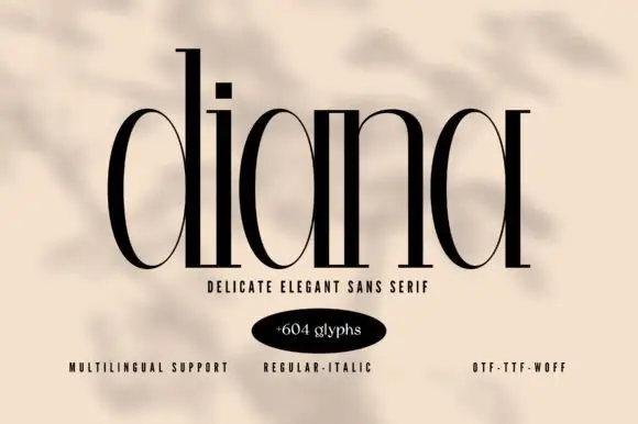
Very tall fine-contrast lowercase with hairline joins and long uprights
Diana shows black lowercase with dramatically tall ascenders and narrow rounded bowls: heavy vertical strokes contrast with hairline curves and tiny baseline projections, and the i dot is a small square.
Ideas for this font
Same independent foundry
Allow optional Google Analytics to measure visits and catalogue actions. Your search words and notes are not included. Privacy & storage