Modern Grotesque Body

Braventro + Prime Nordic
Creates crisp high-hierarchy contrast beneath Braventro headlines across menus, websites and labels.
Inspect Prime Nordic specimenDisclosure: MakerFileHub may earn a commission from qualifying purchases via paid links on this page. How our links work.
Heavy heritage slab with broad brackets and compact counters
Braventro is a heavy heritage slab in which the brackets run broad, the counters stay compact and the stems carry sign-letter weight, so a two-word heading reads as a stencilled tin sign for an outdoor brand.
Paid link
Get this fontProject & layout blueprintsAt-a-glance maker compatibility
Sturdy stroke walls and open counters weed cleanly on adhesive vinyl, HTV apparel film, and cut cardstock.
Visual anatomy & craft review
The B stacks two dense bowls, the R keeps a compact bowl over a heavy leg, the A carries a wide apex with a low crossbar and the V drops two thick diagonals into a narrow point, all at a sign weight with bracketed serifs and small counters. The density is the character: the letters sit close and the ink covers most of the box, which is why the sample sets a short phrase on a plain tin ground. Because the counters are small, the face wants 30 pt before they stay open, and it holds from three quarters of an inch of cap height on wood, acrylic or vinyl. The rivets, the rust texture and the small subline are presentation; the heavy slab words are the face.
Rugged · Heavy slab · Heritage
Two-font hierarchy recipes
Tested contrast partners — pairing Braventro with grounded secondary typography.
Braventro + Prime Nordic
Creates crisp high-hierarchy contrast beneath Braventro headlines across menus, websites and labels.
Inspect Prime Nordic specimen
Braventro + I Heart You
Adds a warm human signature touch for 1-to-3-word callouts without competing against structured serif capitals.
Inspect I Heart You specimenPractical applications
Concrete hierarchy, scale and production guidance tailored to Braventro’s stroke geometry.
The heavy slabs read from the road, and the compact counters stay open at 80 mm on a painted wooden board in one colour.
Hierarchy & layout recipe
Paint a 700 by 350 mm board: set the heading at 80 mm, set the variety at 40 mm beneath with 24 mm of clear ground, and keep 35 mm of border so the brackets stay whole.
Pre-production check
Wood grain printed through small counters breaks them; check the board from five metres and keep the heading at 70 mm or above.
The heritage weight suits a brewery can, and the dense slabs stay solid at 22 pt on a 66 mm wrap panel where a fine serif would break in the print.
Hierarchy & layout recipe
Print a 66 by 100 mm can panel: set the brand at 22 pt, set the beer style at 9 pt in a caps beneath, and keep 6 mm from the wrap edge so the curves are not distorted.
Pre-production check
A wide slab wrapped past the can's shoulder distorts; check the mock and keep every letter on the straight wall.
The rugged tone suits a club badge, and the heavy forms hold at 34 mm inside a printed roundel while the subline stays plain beneath the slab feet.
Hierarchy & layout recipe
Print an 80 mm roundel: set the club name at 34 mm across the middle, set the year at 10 pt caps along the lower arc, and keep 7 mm between the letters and the circle.
Pre-production check
Slabs set against a circle edge look clipped; check the die and keep 6 mm of clear ground at the rim.
Technical & licence verification
Confirm included OTF/TTF/WOFF formats, full glyph tables and licence coverage on the live store page before batch production.
Closest visual alternatives
Matched across letterform anatomy, stroke behaviour and craft applications.
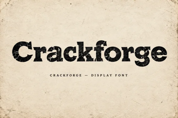
Heavy slab display with a cracked, weathered texture
Crackforge is a heavy slab display alphabet in which the stems stay thick, the serifs turn square and the surface breaks into fine cracks, so a word reads as a cast metal plate that has been outdoors for years.
Ideas for this font
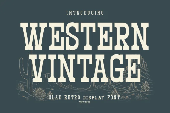
Tall condensed Western saloon slab serif
Western Vintage is a bold, condensed slab serif with crisp bracketed block feet and tall frontier poster proportions.
Ideas for this font
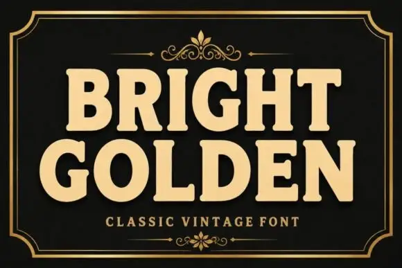
Heavy rounded slab capitals with softened corners
Bright Golden shows broad softly rounded slab capitals in a gold treatment on black, where the G opens a wide mouth and the R leg kicks outward so the dense words never settle into a plain rectangle.
Ideas for this font
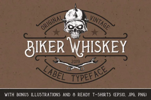
Spurred Victorian whiskey-label serif with bonus illustrations
Biker Whiskey is a clean, condensed Victorian label serif featuring hooked swash capitals, median thorns, and bonus skull/wrench shirt graphics.
Ideas for this font
Same independent foundry
Allow optional Google Analytics to measure visits and catalogue actions. Your search words and notes are not included. Privacy & storage