Editorial Serif Anchor

Aureline + Cervelique
Anchors Aureline's fluid strokes with crisp Roman proportions on wedding suites, headers and packaging.
Inspect Cervelique specimenDisclosure: MakerFileHub may earn a commission from qualifying purchases via paid links on this page. How our links work.
Rounded connected script with a curled capital entry and compact fit
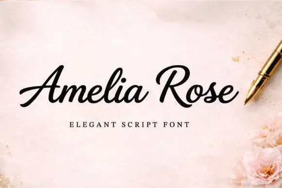
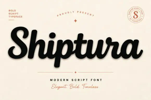
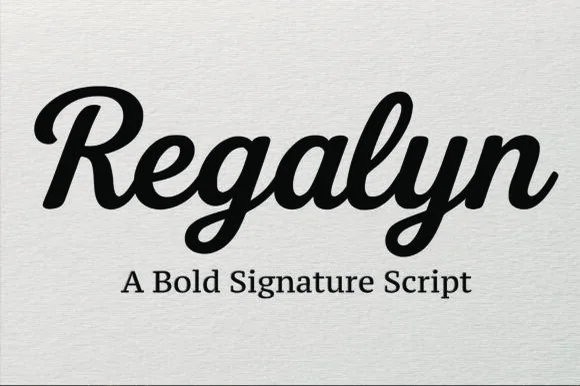
Aureline is a rounded connected script in which the capital opens with a curl, the letters stay compact and the stroke runs at an even weight, so a name reads as a confident signature rather than as a decorative flourish.
Paid link
Get this fontProject & layout blueprintsAt-a-glance maker compatibility
Weld or Unite overlapping script joins into one continuous vector path before sending to the blade.
Visual anatomy & craft review
The capital A enters with a curled stroke that loops back over the stem before the word continues: the u closes a small bowl, the r holds a short arm, the e loops back through its counter, the l rises into a narrow loop and the n keeps a full shoulder, all at an even medium weight with rounded ends. The compact fit is what makes the face practical — a long surname holds a single line at 24 pt on a card, which is where most scripts begin to wrap. Weight stays consistent through the joins, so the line reads as one movement rather than as separate letters. The cream ground, the black ink, the small heart rule and the tracked caption are presentation; the script is the word shown.
Rounded · Compact · Flowing
Two-font hierarchy recipes
Tested contrast partners — pairing Aureline with grounded secondary typography.
Aureline + Cervelique
Anchors Aureline's fluid strokes with crisp Roman proportions on wedding suites, headers and packaging.
Inspect Cervelique specimen
Aureline + Modern Limited
Keeps small-scale dates, URLs, nutrition facts and care instructions crisp and legible below script titles.
Inspect Modern Limited specimenPractical applications
Concrete hierarchy, scale and production guidance tailored to Aureline’s stroke geometry.
The compact fit lets a long surname hold one line at 24 pt, and the curled capital gives a small card one gesture without an ornament.
Hierarchy & layout recipe
Print a 148 by 105 mm card: set both names at 24 pt on the centre line, set the date in an 8 pt caps serif beneath, and keep 16 mm of margin so the curled entry and the exit tail both finish inside the trim.
Pre-production check
A long surname with a curled capital can reach the trim; check the longest name in the run and open the tracking slightly rather than reducing the size.
The rounded connected line works as a personal mark at 15 pt, and the compact fit keeps a full name on a single line on a narrow card.
Hierarchy & layout recipe
Print an 85 by 50 mm card: set the name at 15 pt across the upper third, set the services in a 6 pt caps sans at the foot, and keep 9 mm of clearance below the descender so the card stays balanced.
Pre-production check
A name set at 15 pt with wide tracking loses its flow; check the printed card and keep the tracking at the script's own spacing.
The compact script fits a small jar label at 11 pt, and the even weight reads through glass where a light script would fade.
Hierarchy & layout recipe
Print a 45 mm round label: set the names at 11 pt across the centre, set the date in a 5 pt sans beneath, and keep 5 mm inside the die so the curled entry is not clipped by the circle.
Pre-production check
Glass behind a small label lowers contrast; check one filled jar in daylight and use a lighter label stock if the line disappears.
Technical & licence verification
Confirm included OTF/TTF/WOFF formats, full glyph tables and licence coverage on the live store page before batch production.
Closest visual alternatives
Matched across letterform anatomy, stroke behaviour and craft applications.
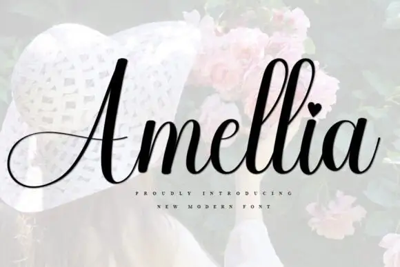
Slanted bridal script with heart tittle and long entry strokes
Amellia is a slanted cursive whose ascenders climb far above a small lowercase body, with a heart in place of the dot on the i and a capital that throws a long thin swash out to the left of the word.
Ideas for this font
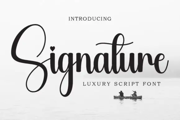
High-contrast heart-dotted calligraphy
Signature is a high-contrast calligraphy in black on a pale sea photograph: heavy shaded stems, hairline joins, an oversized capital S drawn as a single open loop and a heart set into the counter of the i.
Ideas for this font

Fine extended signature script
Lovely sets a fine signature script in a single dark weight over a pale city photograph, where a wide entry curve opens low at the left, the letters rise into tall slender loops through the middle and a large descending y plus an extended closing sweep make the lower right part of the footprint.
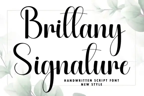
Heavy high-contrast script with very long descenders and narrow loops
Brittany Signature is a heavy high-contrast script in which the ascenders and descenders run far beyond the letter body, the loops stay narrow and the joins thin to hairline between thick stems.
Ideas for this font
Same independent foundry
Allow optional Google Analytics to measure visits and catalogue actions. Your search words and notes are not included. Privacy & storage