Modern Grotesque Body

De Rozzo + Taught
Creates crisp high-hierarchy contrast beneath De Rozzo headlines across menus, websites and labels.
Inspect Taught specimenDisclosure: MakerFileHub may earn a commission from qualifying purchases via paid links on this page. How our links work.
Sleek classic retro display serif
De Rozzo balances wide classical roman bowls with crisp modern wedge serifs and alternates, built for luxury fashion, magazines and wine labels, where the expansive round O and C counters contrast with slender horizontal hairlines for a confident Mediterranean feel.
Paid link
Get this fontProject & layout blueprintsAt-a-glance maker compatibility
Sturdy stroke walls and open counters weed cleanly on adhesive vinyl, HTV apparel film, and cut cardstock.
Visual anatomy & craft review
The bowls stay wide and round, the serifs cut as wedges, the hairlines thin out and the alternates sit outside the default set. That wedge is the character: a classical roman gains a modern edge, which is why the sample suits fashion and wine. Alternates need checking in your own file, so test the letters you need, keep 32 pt for the hairlines and print on coated stock where the thin strokes survive. The hairline thins are the risk: they silt below about 32 pt and they fill on an uncoated sheet, and the alternates sit outside the default set so they have to be switched on per letter.
Poised · High-contrast · Editorial
Two-font hierarchy recipes
Tested contrast partners — pairing De Rozzo with grounded secondary typography.
De Rozzo + Taught
Creates crisp high-hierarchy contrast beneath De Rozzo headlines across menus, websites and labels.
Inspect Taught specimen
De Rozzo + Honey and Lemon
Adds a warm human signature touch for 1-to-3-word callouts without competing against structured serif capitals.
Inspect Honey and Lemon specimenPractical applications
Concrete hierarchy, scale and production guidance tailored to De Rozzo’s stroke geometry.
The wedge serifs give a bottle confidence, and the wide bowls hold a two-word estate name at 24 pt on a 70 by 100 mm label, where the hairlines stay crisp on coated paper.
Hierarchy & layout recipe
Print a 70 by 100 mm wine label: set the estate name at 24 pt on one row, keep 12 mm of clear ground beneath before the vintage at 8 pt, and keep the label a light ground so the thin strokes read.
Pre-production check
Hairlines printed on textured stock break; check the proof and choose a smooth uncoated or coated sheet.
The retro serif carries a fashion cover, and the expansive O holds a one-word title at 72 pt on a coated cover, where the slender hairlines read as engraving.
Hierarchy & layout recipe
Print an A4 cover: set the title at 72 pt on one row, keep 28 mm of clear ground beneath before the cover lines at 9 pt, and keep the photograph behind the title light so the hairlines stay visible.
Pre-production check
A dark photograph hides the hairlines; check the cover and place the title on the palest area.
The classical bowls suit engraved stationery, and the wedge serifs hold a pair of names at 28 pt on heavy card, where the alternates can soften the row.
Hierarchy & layout recipe
Letterpress a 130 by 180 mm invitation: set the names at 28 pt on one row, keep 18 mm of clear ground beneath before the date at 10 pt, and ask for a light impression so the hairlines survive.
Pre-production check
A deep bite closes the thin strokes; check one sheet and reduce pressure for this face, asking for a light impression on the hairlines.
Technical & licence verification
Confirm included OTF/TTF/WOFF formats, full glyph tables and licence coverage on the live store page before batch production.
Closest visual alternatives
Matched across letterform anatomy, stroke behaviour and craft applications.
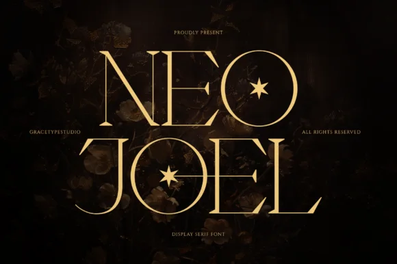
Elegant display serif with star counters
Neo Joel is an elegant display serif in gold on a dark floral ground: light thin stems, tall ascenders, wide open letters, and a four-point star set inside the counter of the O, which turns the letter into a small emblem.

High-contrast display serif with sculpted curves and tucked swash legs
Orvelia is a high-contrast display serif in which the stems alternate thick and hairline weights, the R, V and A end in curved swash legs and the bowls stay sculpted, so a name reads as a crest for a perfume box or a masthead.
Ideas for this font
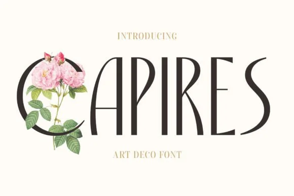
Tall slender Art-Nouveau & Art-Deco crossover serif
Capires is a tall, poised display serif fusing 1920s high-waisted Art Deco proportions with soft Art Nouveau curved tapers.
Ideas for this font
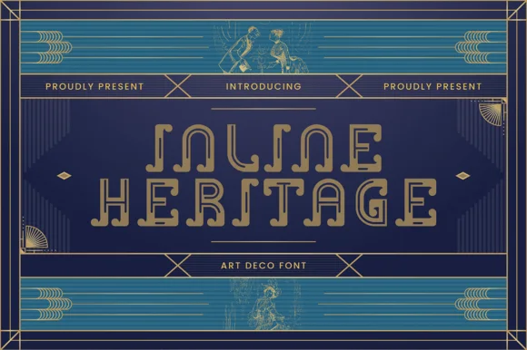
Open-inline 1920s Art Deco architectural display serif
Inline Heritage - Art Deco is a geometric 1920s Art Deco display typeface carved with continuous open inline channels and curled step terminals.
Ideas for this font
Same independent foundry
Allow optional Google Analytics to measure visits and catalogue actions. Your search words and notes are not included. Privacy & storage