High-Contrast Display Serif

Brown Carolina Duo + Majestic Letters
Pairs sculptural editorial warmth with Brown Carolina Duo's clean modern geometry.
Inspect Majestic Letters specimenDisclosure: MakerFileHub may earn a commission from qualifying purchases via paid links on this page. How our links work.
Contrasting sans capitals and fine signature duo
Brown Carolina Duo contrasts broad high-contrast capitals with a much finer narrow slanted script, set dark on a plain cream field, where the capital R legs sweep below the neighbouring letters and the script carries long tails that run past the ends of both words.
Paid link
Get this fontProject & layout blueprintsAt-a-glance maker compatibility
Sturdy stroke walls and open counters weed cleanly on adhesive vinyl, HTV apparel film, and cut cardstock.
Visual anatomy & craft review
The caps keep thin cross strokes and heavy uprights, the script keeps one fine weight, and the two voices sit in a strict stack: script, two cap rows, script. That alternating order is the character, because the fine lines frame the heavy block like a rule above and below. Both treatments appear on a plain light field, so the cover gives no clue about texture or shadow. Keep 34 pt for the caps before the thin strokes break up, keep 20 pt as the floor for the script and check the R leg before setting a line of capitals.
Contrasting · Fine · Paired
Two-font hierarchy recipes
Tested contrast partners — pairing Brown Carolina Duo with grounded secondary typography.
Brown Carolina Duo + Majestic Letters
Pairs sculptural editorial warmth with Brown Carolina Duo's clean modern geometry.
Inspect Majestic Letters specimen
Brown Carolina Duo + Handmade Calligraphy
Introduces organic movement on pull-quotes, signatures and gift tags.
Inspect Handmade Calligraphy specimenPractical applications
Concrete hierarchy, scale and production guidance tailored to Brown Carolina Duo’s stroke geometry.
The high-contrast caps set a calm pair of names while the fine script frames them top and bottom, which is the arrangement most formal suites need.
Hierarchy & layout recipe
Print a 130 by 180 mm invitation: set the names in the caps at 34 pt across two rows with 13 mm between baselines, run the script at 20 pt above and below, and keep 20 mm of clear ground at the outer edges.
Pre-production check
The script tails run past the caps; check the card and inset both script rows 10 mm from the trim.
The contrast gives a label a couture register, and the alternating rows let the studio name and the service sit in one block without a divider.
Hierarchy & layout recipe
Print a 55 by 85 mm label: set the atelier name in the caps at 22 pt across two rows with 8 mm between baselines, run the script at 12 pt under the block, and keep 6 mm to the die edge for the tails.
Pre-production check
Thin cross strokes drop out at 18 pt; check the plate proof and keep the caps at 20 pt or above.
The wide caps make a generous opener and the script supplies a single quiet line, so a spread reads as designed without a second typeface.
Hierarchy & layout recipe
Print a 210 by 280 mm spread: set the title in the caps at 60 pt across two rows with 20 mm between baselines, run the standfirst in the script at 20 pt beneath, and keep 26 mm of clear ground above the columns.
Pre-production check
Two heavy cap rows on one spread compete; check the layout and set the deck in a roman face instead.
Technical & licence verification
Confirm included OTF/TTF/WOFF formats, full glyph tables and licence coverage on the live store page before batch production.
Closest visual alternatives
Matched across letterform anatomy, stroke behaviour and craft applications.
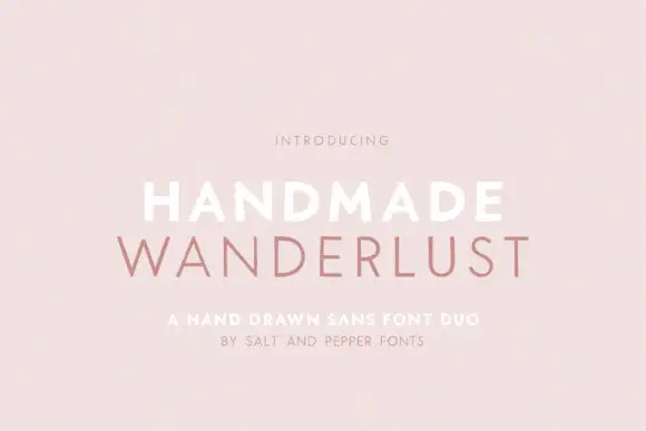
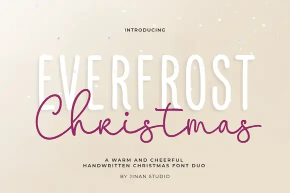
Spaced sans capitals shown in thick white and thin muted-pink lines
Handmade Wanderlust Duo shows two centred uppercase words on a soft pink background, where Handmade is white and noticeably heavier while Wanderlust beneath is thin, muted pink and more widely spaced, with slightly uneven edges and broad A and M diagonals.
Ideas for this font
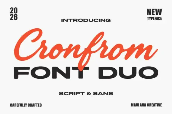
Slanted retro script paired with a wide bold sans in capitals
Cronfrom pairs a slanted retro script with a wide bold sans, so one lockup can carry a handwritten sign name and a hard-edged second line beneath it.
Ideas for this font
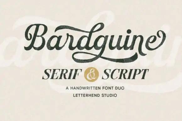
Textured brush script paired with an italic serif in caps
Bardguine pairs a textured brush script in mixed case with an italic serif in caps, so a label can carry a written name and a formal secondary line that share a slightly worn finish.
Ideas for this font
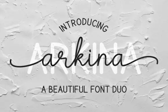
Tall sans capitals with a low looping script duo
Arkina Duo layers a very low looping connected script over tall narrow capitals that read as engraved lettering pressed into plaster, with entry strokes starting well left of the first letter.
Ideas for this font
Same independent foundry
Allow optional Google Analytics to measure visits and catalogue actions. Your search words and notes are not included. Privacy & storage