Modern Grotesque Body

Lovely Amelia + Modern Heritage
Creates crisp high-hierarchy contrast beneath Lovely Amelia headlines across menus, websites and labels.
Inspect Modern Heritage specimenDisclosure: MakerFileHub may earn a commission from qualifying purchases via paid links on this page. How our links work.
Curvaceous modern Art-Nouveau ligature & canopy serif
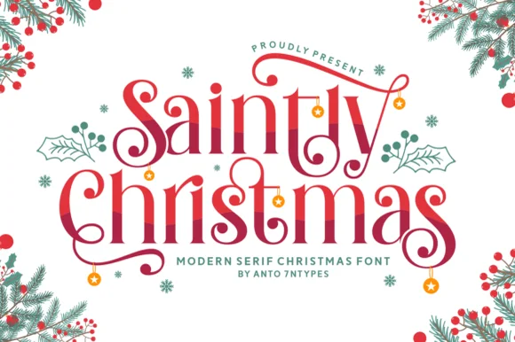
Lovely Amelia is a soft, high-contrast modern display serif featuring sweeping canopy arches over vowels and sculpted ligatures.
Paid link
Get this fontProject & layout blueprintsAt-a-glance maker compatibility
Crisp hairline serifs shine on stationery, foil stamping, and packaging; add slight offset for small decals.
Visual anatomy & craft review
Lovely Amelia is a high-contrast display serif with Art-Nouveau canopy arches that spring from the vowels and a sculpted cradle tail that runs beneath a word. The arches sit above the x-height, so the layout needs headroom, and the tail occupies its own band below the baseline. Contrast is strong, so the face wants 22 mm and up before the hairlines hold, and it is a title and invitation face rather than a text face. Its natural home is an asymmetric composition where the canopy can echo a drawn frame.
Romantic-modern · Canopy-swashed · Editorial
Two-font hierarchy recipes
Tested contrast partners — pairing Lovely Amelia with grounded secondary typography.
Lovely Amelia + Modern Heritage
Creates crisp high-hierarchy contrast beneath Lovely Amelia headlines across menus, websites and labels.
Inspect Modern Heritage specimen
Lovely Amelia + Silken Luxe
Adds a warm human signature touch for 1-to-3-word callouts without competing against structured serif capitals.
Inspect Silken Luxe specimenPractical applications
Concrete hierarchy, scale and production guidance tailored to Lovely Amelia’s stroke geometry.
Canopy arches read as Art-Nouveau ornament drawn into the letter, which suits makers whose work is curved and handmade. The cradle tail gives a small carton a graphic base without a rule.
Hierarchy & layout recipe
Label 70 x 45 mm, word 10 mm with 4 mm headroom and 4 mm below for the tail, 4 mm die margin. Carton 60 x 130 x 30 mm, word 16 mm. Card 55 x 85 mm, word 9 mm.
Pre-production check
At 10 mm the canopy arches collapse into a thick bar and the ornament disappears. Keep the word at 14 mm or larger, or use a plainer cut on labels that small and save the canopy for the carton.
Canopy arches give a Nouveau-themed wedding the correct 1900s vocabulary, and the cradle tail lets a couple's names sit above a decorative line without drawing one. Strong contrast separates the names from a photographic background.
Hierarchy & layout recipe
Invitation 148 x 210 mm, names 30 mm with 8 mm headroom and 8 mm for the tail, details 9/14 pt, 18 mm margins. Menu 120 x 210 mm, header 18 mm. Chart 600 x 400 mm, table names 22 mm, guests 9 pt on a 7 mm row.
Pre-production check
Names set over a photograph need real contrast, not just a thin scrim, and a hairline canopy over a mid-tone image vanishes. Convert one proof to greyscale and confirm the letters separate before printing.
Sculpted arches echo stems and trellis shapes, which is the reference a botanical workshop wants rather than a floral illustration. The cradle tail reads as a drawn frame base.
Hierarchy & layout recipe
Invite 105 x 148 mm, title 20 mm with headroom for arches, details 7/10 pt, 12 mm margins. Catalogue cover 170 x 240 mm, title 40 pt. Card 105 x 148 mm, heading 16 mm.
Pre-production check
Spring events print on textured card more often than not, and a high-contrast serif on a 300 gsm laid stock thickens. Print one proof on the actual card, and step down the contrast if the thin strokes fill.
Technical & licence verification
Confirm included OTF/TTF/WOFF formats, full glyph tables and licence coverage on the live store page before batch production.
Closest visual alternatives
Matched across letterform anatomy, stroke behaviour and craft applications.
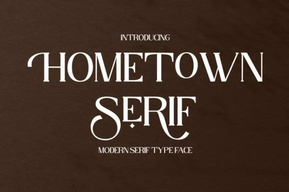
High-contrast modern display serif with curled swash stems
Hometown Serif is an elegant, high-contrast uppercase display serif accented by sweeping descender cradles and spiraled stem hooks.
Ideas for this font

Bold transitional display serif with overhead canopy swash
Vanielst is a substantial, medium-high-contrast display serif highlighted by graceful overhead swash loops and crisp bracketed feet.
Ideas for this font
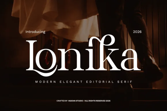
High-contrast romantic editorial serif with floral dot & swashes
Lonika is a refined, high-contrast modern editorial serif distinguished by cradle-looped capitals and curved calligraphy-style ascenders.
Ideas for this font
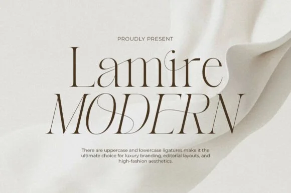
Whisper-thin high-fashion ligature & architectural serif
Lamire Modern is an ultra-light, tall-statured editorial serif featuring sweeping diagonal ligatures across both uppercase and lowercase.
Ideas for this font
Same independent foundry
Allow optional Google Analytics to measure visits and catalogue actions. Your search words and notes are not included. Privacy & storage