Editorial Serif Anchor

Welcome + Alerigue
Anchors Welcome's fluid strokes with crisp Roman proportions on wedding suites, headers and packaging.
Inspect Alerigue specimenDisclosure: MakerFileHub may earn a commission from qualifying purchases via paid links on this page. How our links work.
Wide-tailed monoline door-sign script
Welcome features relaxed lowercase cursive with long level beginning and ending swash tails, tailored for round wood signs and entryways, where the smooth monoline-leaning strokes and open letter spacing keep words calm while the extended w and e tails span a circular blank.
Paid link
Get this fontProject & layout blueprintsAt-a-glance maker compatibility
Weld or Unite overlapping script joins into one continuous vector path before sending to the blade.
Visual anatomy & craft review
The stroke stays one width, the spacing opens, the tails run level and the word sits calm. That level tail is the character: the greeting stretches to the width of a round board without a bigger point size, which is why the sample targets door signs. Plan the tails against the blank's curve, keep the stroke at 3 mm for cutting, and check the exits in your own word before committing the sign. The wide tail is also the weak point on a shaped blank: it has to end inside the panel, so a 12 mm tail on a 300 mm round board is safe and anything longer gets trimmed at the edge.
Welcoming · Extended-tail · Smooth
Two-font hierarchy recipes
Tested contrast partners — pairing Welcome with grounded secondary typography.
Welcome + Alerigue
Anchors Welcome's fluid strokes with crisp Roman proportions on wedding suites, headers and packaging.
Inspect Alerigue specimen
Welcome + Godthem
Keeps small-scale dates, URLs, nutrition facts and care instructions crisp and legible below script titles.
Inspect Godthem specimenPractical applications
Concrete hierarchy, scale and production guidance tailored to Welcome’s stroke geometry.
The level tails span a round board, and the monoline stroke holds a greeting at 60 mm on a 400 mm blank, where the exits reach the edges evenly.
Hierarchy & layout recipe
Paint a 400 mm round wooden blank: set the greeting at 60 mm on one line, keep the tails 24 mm from the rim, and keep the stroke at 8 mm so it reads from the path.
Pre-production check
Tails crossing the rim look cut; check the artwork against the blank diameter first and measure the board before drawing.
The calm script suits an entryway, and the open spacing holds a two-word greeting at 50 mm on a painted board, where the monoline weight stays even.
Hierarchy & layout recipe
Paint a 700 by 300 mm board: set the greeting at 50 mm on one line, keep 24 mm of clear ground beneath before the hours at 14 pt, and keep 26 mm of border so the tails are not cut.
Pre-production check
Monoline strokes painted by hand vary in width; check the mask and keep the brush loaded evenly.
The script keeps a note warm, and the open spacing holds a short line at 28 pt on an A6 card, where the level tails finish the message calmly.
Hierarchy & layout recipe
Print an A6 card: set the line at 28 pt across the upper half, keep 18 mm of clear ground beneath for the tail, and leave the lower third blank for handwriting.
Pre-production check
Vinyl weeding needs a 3 mm stroke; check the cut file before a physical sign is ordered and test one small cut first.
Technical & licence verification
Confirm included OTF/TTF/WOFF formats, full glyph tables and licence coverage on the live store page before batch production.
Closest visual alternatives
Matched across letterform anatomy, stroke behaviour and craft applications.

Smooth thick monoline cursive with a long entry and a lifted exit
Honey is a smooth thick monoline cursive in which every stroke is the same weight, the entry comes in from the left and the exit lifts at the tip to the right.
Ideas for this font
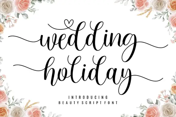
Brush script with a heart flourish
Wedding Holiday is a brush script in black on white: thick connected letters with high contrast at the joins, tall loops on the ascenders and a small heart drawn into the flourish above the first word, framed by peach roses.
Ideas for this font

Light lowercase script with long outer tails and a low even stroke
Abigail is a light lowercase-only script in which the word sits low on the line and both ends run out as long flat tails, so a name reads as a single signed line rather than as a set of letters.
Ideas for this font

Fine lowercase script with a heart worked into the central connector
Hello Honey is fine lowercase script in which the two words are joined by a heart drawn into the connector, with long flat tails on both sides and a small even x-height.
Same independent foundry
Allow optional Google Analytics to measure visits and catalogue actions. Your search words and notes are not included. Privacy & storage