Modern Grotesque Body

Resquel + Bargain Condensed
Creates crisp high-hierarchy contrast beneath Resquel headlines across menus, websites and labels.
Inspect Bargain Condensed specimenDisclosure: MakerFileHub may earn a commission from qualifying purchases via paid links on this page. How our links work.
Art-Nouveau ligature & celestial-sparkle editorial serif
Resquel is an expressive high-contrast editorial serif featuring sweeping ribbon under-tails, interlocked ligatures, and star-sparkle counters.
Paid link
Get this fontProject & layout blueprintsAt-a-glance maker compatibility
Crisp hairline serifs shine on stationery, foil stamping, and packaging; add slight offset for small decals.
Visual anatomy & craft review
Resquel is a high-contrast editorial serif in caps with sweeping ribbon under-tails beneath the R and Q, interlocked ligatures and star-sparkle detail cut into the Q counter. The tails extend far past the word, so a layout needs base and side room, and the hairlines need roughly 28 mm before they hold. It is a cover and label face with a celestial register, best in one bone or metallic ink on a deep slate ground, and it is deliberately impractical for long copy.
Fashion-forward · Sculpted · Chic
Two-font hierarchy recipes
Tested contrast partners — pairing Resquel with grounded secondary typography.
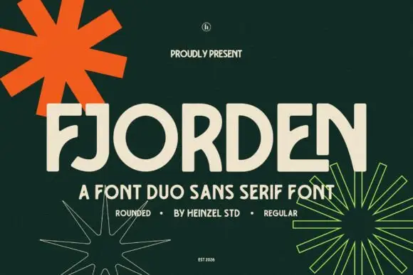
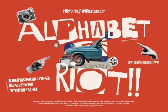
Resquel + Bargain Condensed
Creates crisp high-hierarchy contrast beneath Resquel headlines across menus, websites and labels.
Inspect Bargain Condensed specimen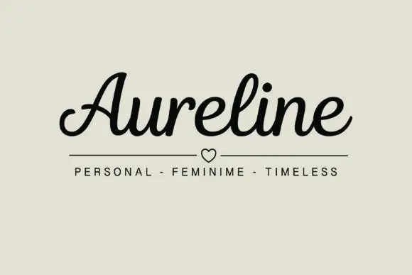
Resquel + Aureline
Adds a warm human signature touch for 1-to-3-word callouts without competing against structured serif capitals.
Inspect Aureline specimenPractical applications
Concrete hierarchy, scale and production guidance tailored to Resquel’s stroke geometry.
Ribbon tails and sparkle counters read as a night-sky monogram, which suits a small jewellery or cosmetics line. The ligatures give a short name a single flowing silhouette.
Hierarchy & layout recipe
Carton 55 x 140 x 30 mm, name 20 pt with 8 mm tail room, legal 5.5 pt. Tag 45 x 90 mm, word 10 mm, eyelet 4 mm clear. Card 85 x 55 mm, name 9 pt, 6 mm margins.
Pre-production check
A ribbon tail under 0.3 mm vanishes on uncoated carton and the word looks naked. Print on coated board, or thicken the tail rather than shrinking the name.
Sparkle counters give an editorial cover a focal letter without an illustration. High contrast separates the title from a dark photographic ground.
Hierarchy & layout recipe
Cover 152 x 229 mm, title 54 pt with 12 mm tail allowance, author 15 pt, 18 mm margins. Collection 129 x 198 mm, title 36 pt. Poster 500 x 700 mm, title 220 mm, imprint 16/22 pt.
Pre-production check
Hairlines over a dark photograph fill with the background tone on a digital press. Check one proof at 100 percent, and add a light offset outline if the ribbon tail disappears.
Star sparkle and ribbon tails read as a celestial valentine rather than a heart graphic, which suits an anniversary. The single mark fills a card without a second element.
Hierarchy & layout recipe
Card 120 x 170 mm, greeting 30 mm with 10 mm tail room, message 8/12 pt, 14 mm margins. Print 210 x 297 mm, word 80 mm, 35 mm margins. Sleeve 180 x 60 mm, word 18 mm, 5 mm die margin.
Pre-production check
A gift sleeve is folded and a tail crossing the crease cracks. Keep the word 12 mm clear of any fold, score before folding, and check one assembled sleeve.
Technical & licence verification
Confirm included OTF/TTF/WOFF formats, full glyph tables and licence coverage on the live store page before batch production.
Closest visual alternatives
Matched across letterform anatomy, stroke behaviour and craft applications.

Flamboyant coiled-swash couture editorial serif
Alerigue is a high-contrast luxury editorial serif distinguished by dramatic coiled spiral terminals and sweeping calligraphic ascender loops.
Ideas for this font

Crisp contemporary editorial serif duo (Regular + Italic, OTF/TTF/WOFF)
Svara is a sharp modern editorial serif family pairing an upright Regular with a lively true Italic across OTF, TTF & WOFF formats!
Ideas for this font

Tall condensed ribbon-swashed glamour display serif
Lumera Editorial is a tall, glamorous display serif braiding sweeping calligraphic loops through condensed high-fashion capitals!
Ideas for this font
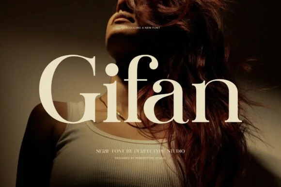
Bold high-contrast modern serif with teardrop ball terminals
Gifan is a bold, voluptuous modern luxury serif distinguished by lush teardrop ball terminals on 'f' and 'a' and notched architectural spurs!
Ideas for this font
Same independent foundry
Allow optional Google Analytics to measure visits and catalogue actions. Your search words and notes are not included. Privacy & storage