Modern Grotesque Body

Stanza + Miniplate
Creates crisp high-hierarchy contrast beneath Stanza headlines across menus, websites and labels.
Inspect Miniplate specimenDisclosure: MakerFileHub may earn a commission from qualifying purchases via paid links on this page. How our links work.
Swashed modern couture serif with hairline stress and curling terminals
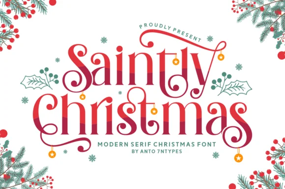
Stanza is a modern serif in which the strokes carry extreme contrast, the terminals curl and the crossbars of the A and the T extend into swashes, so a short word reads as a fashion masthead rather than a title.
Paid link
Get this fontProject & layout blueprintsAt-a-glance maker compatibility
Set Cricut or Silhouette operation to Pen, Foil Quill, or Laser Score — not Basic Blade Cut.
Visual anatomy & craft review
The S closes both ends in curls, the T throws its bar wide and finishes in a fine swash, the A carries a halved crossbar that runs beyond the letter and the N keeps two hairlines with a heavy diagonal, all with high contrast and unbracketed joins. The swashes are the character: they extend beyond the letter body at the top and the base, which is what lets four letters fill a wide plate and what makes the face a poor choice for anything below 30 pt. Hairlines are genuinely thin, so the face wants coated stock and a printer who can hold the line. The green ground, the white ink, the tracked label and the small caption are presentation; the serif is the word shown.
Couture · Swashed · Contrasted
Two-font hierarchy recipes
Tested contrast partners — pairing Stanza with grounded secondary typography.
Stanza + Miniplate
Creates crisp high-hierarchy contrast beneath Stanza headlines across menus, websites and labels.
Inspect Miniplate specimen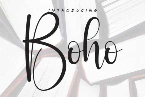
Stanza + Boho
Adds a warm human signature touch for 1-to-3-word callouts without competing against structured serif capitals.
Inspect Boho specimenPractical applications
Concrete hierarchy, scale and production guidance tailored to Stanza’s stroke geometry.
The extended swashes let a short masthead fill a cover, and the hairline contrast gives the page the couture register it needs at 90 pt.
Hierarchy & layout recipe
Print an A4 cover: set the masthead at 90 pt across the upper third, set the issue line in a 9 pt caps sans beneath, and keep 18 mm of margin so the swashes clear the trim on both sides.
Pre-production check
A hairline under 0.1 mm drops out in offset; ask the printer for the minimum line and thicken the hairlines rather than the heavy diagonals.
The curl and the contrast give a label the register of engraved stationery, and the mark still reads at 14 pt on a coated label.
Hierarchy & layout recipe
Print a 45 by 80 mm coated label: set the house name at 14 pt, set the city in a 5 pt caps sans beneath, and keep 6 mm of margin so the swash stays on the flat of the label rather than on the bottle curve.
Pre-production check
Foil on a hairline swash bridges at the pointed ends; check a foil dummy at final size and shorten the swash rather than thickening it.
The extended letters give a title page its editorial gesture, and the extreme contrast reads at 64 pt on a coated annual page.
Hierarchy & layout recipe
Print a 210 by 280 mm title page: set the title at 64 pt across the upper half, set the imprint in a 9 pt caps serif at the foot, and keep 24 mm of margin so the swashes have air on both sides.
Pre-production check
A high-contrast face printed blind on uncoated stock looks grey; check a press sheet and specify a solid ink rather than a tint.
Technical & licence verification
Confirm included OTF/TTF/WOFF formats, full glyph tables and licence coverage on the live store page before batch production.
Closest visual alternatives
Matched across letterform anatomy, stroke behaviour and craft applications.

Elegant display serif with large ornamental swashes
History of Miracles is an elegant display serif in which the stems carry fine serifs and large drawn swashes swing out from several letters, so a two-word title reads as an engraved certificate head.
Ideas for this font

High-contrast display serif with sculpted curves and tucked swash legs
Orvelia is a high-contrast display serif in which the stems alternate thick and hairline weights, the R, V and A end in curved swash legs and the bowls stay sculpted, so a name reads as a crest for a perfume box or a masthead.
Ideas for this font

Sleek classic retro display serif
De Rozzo balances wide classical roman bowls with crisp modern wedge serifs and alternates, built for luxury fashion, magazines and wine labels, where the expansive round O and C counters contrast with slender horizontal hairlines for a confident Mediterranean feel.
Ideas for this font
Decorative ligature serif
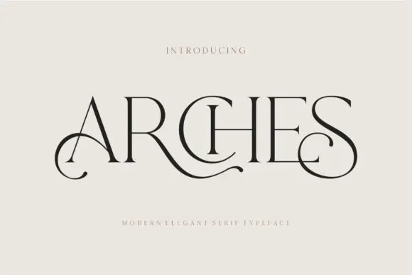
Arches sets one word in dark ink on a warm neutral field, where wide flat serifs sit on hairline cross strokes, the A climbs to a sharp apex, the R leg sweeps into a long horizontal tail that runs beneath the following letters and the S closes with an extended curl.
Ideas for this font
Same independent foundry
Allow optional Google Analytics to measure visits and catalogue actions. Your search words and notes are not included. Privacy & storage