 #1 · Best Overall
Disclosure: MakerFileHub may earn a commission from qualifying purchases via paid links on this page. How our links work.
Heat-transfer vinyl, DTF & screen print
33 Best Fonts for T-Shirts, Hoodies & HTV
Apparel lettering has to survive a press, a wash and a body that moves. Mama and Hangtuah carry a thick brush-pen weight that presses flat without trapping air, William Jameson and Regalyn give the signature look a retail finish, and Memoir Slang and Merry Chunky cover the bold block side of a hoodie range. Boreg handles the oversized street poster look when the print runs to the full front panel.
Quick verdict
Mama is the strongest seller for family and gift shirts, William Jameson handles boutique apparel, and Boreg is the pick for oversized streetwear. Memoir Slang covers the plain bold sans slot that every range needs.
Quick answer
Top 3 t-shirts, hoodies & HTV apparel picks right now.
Short on time? Start with our three highest-rated t-shirts, hoodies & HTV apparel standouts before scrolling the full breakdown.
#1 · Best Overall #2 · Runner-Up Pick
William Jameson
Slanted signature cursive with sweeping underline swash
Get fontPaid link
Read review ↓ #3 · Editor's Choice
How we tested & selected these 33 fonts
We kept 33 of 748 candidates after excluding colour-bitmap alphabets that cannot be pressed as single-colour film. Scored on stroke weight at 10 inch design scale, whether counters survive a 0.5 mm film thickness, and how the face behaves when mirrored.
Side-by-side summary
Top 5 t-shirts, hoodies & HTV apparel picks at a glance.
Compare specimens, OpenType/PUA traits and primary project roles side by side.
| Rank & Font | Style & File Specs | Best Project Fit | Store Listing |
|---|---|---|---|
| ScriptChunky | Mother's Day crewneck sweatshirt, tote bag or tumbler | Get fontPaid link | |
| ScriptPUA encoded · Ligatures · Alternates & swashes | Apparel neck label, hangtag & founder sign-off | Get fontPaid link | |
| ScriptPUA encoded · Alternates & swashes | Harvest market apparel, retro diner mug & fall tote | Get fontPaid link | |
| ScriptLigatures · Alternates & swashes | Barbershop window decal, Moto apparel & coffee tin | Get fontPaid link | |
| ScriptAlternates & swashes | Apparel chest logo, baseball-cap embroidery & tumbler decal | Get fontPaid link |
Scripts & Calligraphy
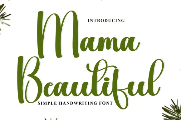
7 fonts#1 · Best OverallMama
Mama is a heavy smooth brush-calligraphy script drawn for bold single-word apparel transfers, where broad cushioned downstrokes and smooth rounded joins give chest graphics rich coverage on sweatshirts and totes.
The downstrokes carry the weight, the joins stay round and smooth, the counters close tight and the word holds its shape at just one or two terms. That cushion is the character: the lettering reads warm and hand-brushed while staying solid enough to weed cleanly from a vinyl sheet, which is why the sample keeps a single short word. The 'vinyl-ready' claim comes from the source rather than a test here, so proof your own word, keep 30 pt for print and check the weeding on a scrap before the run.
Recommended project & layout
Mother's Day crewneck sweatshirt, tote bag or tumbler — Centre lowercase across the chest at 8–10 inches wide and Weld before cutting.
Before you cut or print
Top choice for puff HTV, flock HTV and permanent mug vinyl.
Best paired with
Get fontPaid link
#2 · Runner-Up PickWilliam Jameson
William Jameson is a lively monoline signature script with broad looping capitals and a bold underline swash tail.
William Jameson is a slanted signature cursive with a sweeping underline swash: a fast forward-leaning stroke, letters joined at the baseline, and a long flat swash that draws under the whole name and lifts at the end. The swash is the design, so the face needs a wide measure rather than a square panel. The swash thins are the finest element and they break first in print and in foil. It needs roughly 30 mm for the swash and the slant to read, and it is best one dark ink on a smooth stock.
Recommended project & layout
Apparel neck label, hangtag & founder sign-off — Stack the first name slightly left of the surname so the descending 'J' or capital loop balances the underline swash across a 3-inch width.
Before you cut or print
For HTV hoodies or t-shirts, size the lockup at least 3.5 inches wide so compact 'e' and 's' loops weed without lifting.
Best paired with
Get fontPaid link
#3 · Editor's ChoiceVintage Melinda
Vintage Melinda is a creamy, thick-stroke retro brush script with dramatic curled swash capitals and sweeping baseline loops.
Vintage Melinda is a bold retro-romance brush script with curled swashes: a heavy loaded stroke, a shallow slant, connected letters and swashes that curl off the caps and descenders into a tight spiral. The spirals widen the word and are the finest element, and the loaded weight closes the loops early. It needs roughly 30 mm for the spiral and the brush edge to read, and it is best in one warm ink on cream, or a fine gold on a dark ground where the curls print as bright lines.
Recommended project & layout
Harvest market apparel, retro diner mug & fall tote — Stack a two-word vintage slogan at 4–8 inches wide, choosing one lower underline swash to anchor the bottom edge of the lockup.
Before you cut or print
Always weld connected letters before cutting, and check clearance between row one descenders ('g', 'y') and row two swash capitals.
Best paired with
Get fontPaid link
 #4 · Top Maker Utility
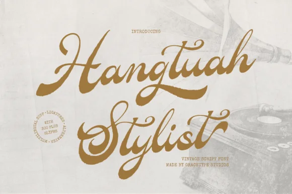
Hangtuah
Hangtuah is a thick, slanted vintage sign-painter script featuring bold brush strokes, dynamic swash capitals, and retro underline tails.
Hangtuah is a bold retro sign-painter brush script with underline swashes: a heavy loaded stroke, a firm slant, connected letters and thick underline swashes that run beneath the word and turn up at the end. The underlines are the design and they fix the block's width, and the brush edge is the finest element. It needs roughly 30 mm for the underline and the brush edge to read, and it is best in one dense ink on a sanded board, or a flat two-colour print on uncoated stock.
Recommended project & layout
Barbershop window decal, Moto apparel & coffee tin — Angle a 1-to-2-word brand name upward 7 degrees and anchor the empty lower-right space with a tapered underline tail alternate.
Before you cut or print
Weld all overlapping brush joins before cutting HTV or gold metallic sign vinyl; thick strokes weed smoothly at 1.2 in+.
Best paired with
Get fontPaid link
 #5 · Standout Silhouette
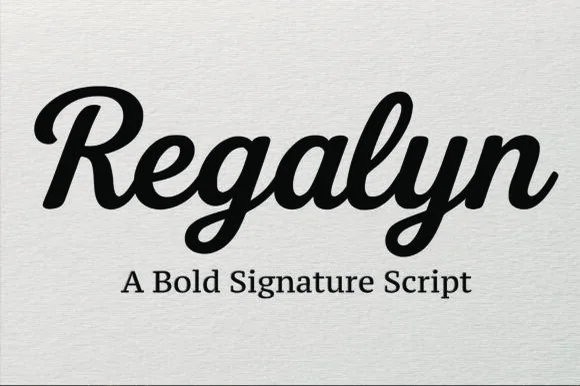
Regalyn
Regalyn is a bold, heavy-bodied signature script with velvety rounded brush downstrokes and sturdy, cutter-friendly lowercase loops.
Regalyn is a heavy retro brush-pen signature script: a thick loaded stroke that ends in tapered flicks, connected letters, a firm rightward slant and a low bounce that keeps the word close to the baseline. The weight closes the loops early, and the tapered flicks are the finest element. It needs roughly 26 mm for the tapered flick and the loaded stroke to read, and it is best in one deep ink on cream and kraft, or a single dark colour on a pale board where the stroke prints as a ridge.
Recommended project & layout
Apparel chest logo, baseball-cap embroidery & tumbler decal — Set single-word brand names at 4–9 inches wide across hoodies, hats, or tumblers above a clean serif subline.
Before you cut or print
Weld all overlapping cursive connectors before cutting HTV or permanent vinyl; weeds cleanly down to 0.7 inches.
Best paired with
Get fontPaid link
 #6
Lovely
Lovely sets a fine signature script in a single dark weight over a pale city photograph, where a wide entry curve opens low at the left, the letters rise into tall slender loops through the middle and a large descending y plus an extended closing sweep make the lower right part of the footprint.
The stroke stays thin and even, the loops stay tall, the entry runs wide and the exit sweeps out. That asymmetry is the character: the word is wider at the right than the left, which is why the sample sits on a generous square field rather than a strip. The building behind it is scenery, not part of the type. Keep 26 pt as the floor, allow 25 mm of clear space at the right for the exit sweep and check the y loop against any line placed beneath.
Recommended project & layout
A quiet wedding invitation heading — Use a single script heading above the names. Keep a clear band beneath its lowest strokes, then set the venue and time in plain text.
Before you cut or print
Print at invitation size and check contrast on the chosen paper. Do not use the fine script for the address or RSVP instructions.
Best paired with
Get fontPaid link
 #7
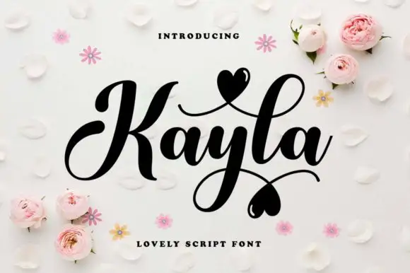
Kayla
Kayla is a bold cursive in which the downstrokes carry weight, the capital loops high, the connected body stays compact and the swashes finish in small hearts above and below the word, so a name reads as a warm handwritten greeting.
The K opens a tall loop, the y drops a descending loop under the centre of the word, the connectors keep one heavy weight and the swash set adds strokes that cross above and below the baseline with hearts at their ends. The heavy body is the character: it keeps a bold line legible where a fine script would thin, which is why the sample sets one word with two crossing swashes. Because the loops overlap, the face needs 20 mm between baselines from 28 pt and the joins must be welded before cutting from 1.1 inches of x-height. The pale ground, the small hearts and the caption are presentation; the dark word and its swashes are the face.
Recommended project & layout
A couple's keepsake cover — Keep the phrase alone on the cover and put the date below the lowest heart in plain type.
Before you cut or print
Verify the actual heart alternates and ampersand.
Best paired with
Get fontPaid link
Display & Decorative Headlines
14 fonts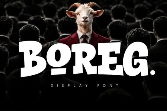 #8
Boreg
Boreg is a stout urban display face in which the letters are short and wide, the strokes are fat and the counters tilt, so a short word reads as a painted hoarding rather than as a sign.
The B closes two heavy lobes of uneven size, the O holds an oval counter set slightly off centre, the R keeps a fat bowl and a short leg and the E carries three thick arms, all at a maximal weight with rounded corners and a low contrast. The tilt in the counters is deliberate: nothing sits perfectly level, which is what keeps the face from reading as a mechanical grotesque at 80 pt and gives it the look of lettering painted quickly on a wall. The fit is tight, so a five-letter word fills a wide format on its own. Counters are small, so the face needs 30 pt minimum and belongs on posters rather than on labels. The dark crowd photograph, the white ink, the small caption are presentation; the display face is the word.
Recommended project & layout
Heavyweight streetwear tee logo or album cover — Set a single uppercase word with a period or underlined vowel alternate.
Before you cut or print
Zero fragile details — cuts and weeds effortlessly on thick puff or flock HTV.
Best paired with
Get fontPaid link
 #9
Memoir Slang
Memoir Slang is a heavy, tight-set modern sans-serif distinguished by crisp neo-grotesk geometry and sharp, horned ear details.
Memoir Slang is a bold neo-grotesk display sans with a hooked double-storey g: even squared stems, tight apertures, a straight-sided g with a hooked ear and a slightly narrow width that keeps a long masthead on one line. The hook is the only detail and it closes when the face is reduced. It needs roughly 22 mm for the hook and the aperture to read, and it is best in one dense ink on uncoated stock, or a single white on a dark ground where the tight apertures still open.
Recommended project & layout
Streetwear lookbook, exhibition poster & album title — Left-align 2-line mixed-case titles at 64–96 pt with tight -15 tracking and 0.94 line-height.
Before you cut or print
Heavy solid stems cut cleanly on large window vinyl and bold DTF/HTV streetwear prints down to 0.75 in.
Best paired with
Get fontPaid link
 #10
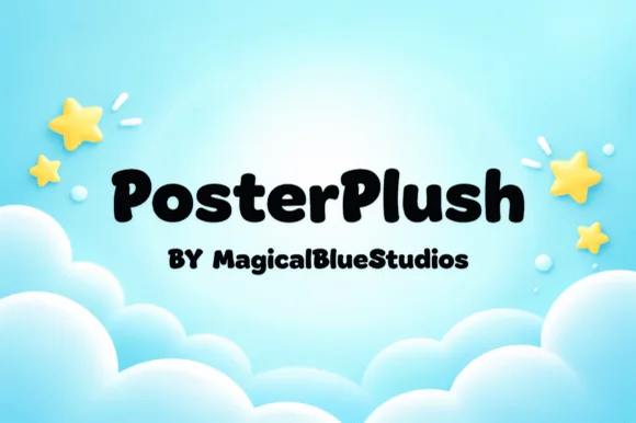
Posterplush
Posterplush is a bold, velvety-thick rounded display font combining heavy black poster mass with warm hand-drawn softness.
Posterplush is a velvety-thick rounded display that mixes heavy black poster mass with hand-drawn softness, in mixed case with plump bowls and a warm, slightly irregular contour. The weight is enormous, so the letters read as a silhouette and the counters are small, which means the face needs size to stay legible. It needs roughly 32 mm for the rounded contour to read as drawn rather than as a fill fault, and it is best in jet black on a bright ground or in cream on deep blue.
Recommended project & layout
Classroom rule poster, hallway directional sign & shirt — Set 1 or 2 mixed-case words at 60–115 pt in solid black, cobalt, or white across balanced outer margins.
Before you cut or print
Ultra-sturdy 100% solid shapes cut and weed in seconds on Cricut cardstock, HTV, and permanent vinyl down to 0.55 inches!
Best paired with
Get fontPaid link
 #11
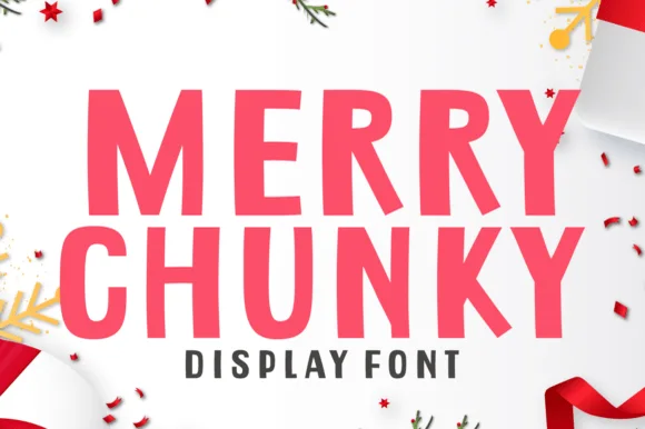
Merry Chunky
Merry Chunky is a punchy, clean-cut geometric poster sans with lively cut-paper angles—and zero holiday clipart attached so it works all 365 days!
Merry Chunky is a clean-cut geometric poster sans in caps with lively cut-paper angles on the stems and squared terminals, so a word reads as letters cut from card rather than as a modern grotesk. The angled cuts are few and deliberate, which keeps it clean at 20 mm and gives it character at 200 mm, and the heavy even weight holds in one ink. It needs roughly 26 mm for the cuts to read, and it is best in raspberry red on white or in one dark ink on kraft.
Recommended project & layout
Modern minimalist holiday banner, gift-bag tag & sweatshirt — Stack 2 centered uppercase lines at 68–130 pt in berry red or forest green above wide-spaced dark sans ('DISPLAY FONT').
Before you cut or print
100% straight-edged, open-counter shapes make this one of the fastest-weeding Cricut HTV & cardstock fonts in the entire catalog!
Best paired with
Get fontPaid link
 #12
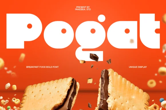
Pogat
Pogat is an ultra-heavy, slab-thick retro packaging font with massive ink mass and tiny circular pinhole counters built for snack and food branding!
Pogat is an ultra-fat geometric display built for packaging and cereal boxes: near-solid slabs, tight counters reduced to small slots, a level baseline and a chunky regularity that reads as a printed carton front. The slots are the only negative space and they close first, and the weight makes a word very wide. It needs roughly 34 mm for the slot and the slab edge to read, and it is best in two flat inks on board, or one ink plus a knocked-out slot on coloured stock.
Recommended project & layout
Cookie/granola pouch, ice-cream pint, burger wrap & merch — Set 1 short 4-to-7-letter brand name edge-to-edge (90–180 pt) in stark white or cocoa brown over saturated orange, yellow, or red.
Before you cut or print
Outer silhouettes weed in 3 seconds on HTV and vinyl—watch tiny pinhole counters inside 'P', 'o', 'g', and 'a' below 1 inch!
Best paired with
Get fontPaid link
 #13
Bouncy Block Deluxe
Bouncy Block Deluxe is a thick, solid-filled bubble display font with pillowy rounded terminals, playful tilt, and tiny counter pinholes.
Bouncy Block Deluxe is a heavy rounded chunky bubble display: fat even-width letters with fully rounded corners, tight counters that almost close and a baseline that lifts a few letters so the word looks stacked and bouncing. It is a signage face, so it wants size and a single flat colour rather than fine detail. The counters are the finest element and they plug as soon as the face is reduced or cut in vinyl. It needs roughly 30 mm for the counter and the corner radius to read, and it is best as one flat ink on a light ground.
Recommended project & layout
Back-to-school tote, water-bottle sticker & kids' tee — Stack 2 or 3 short punchy words ('STAY COOL', 'DREAM BIG') at tight 0.88 line-height inside a contoured die-cut sticker shape.
Before you cut or print
When weeding small decals under 1 inch, use a fine pin pen solely to pop out the tiny teardrop counters inside 'B', 'o', 'a', and 'e'.
Best paired with
Get fontPaid link
 #14
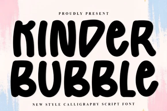
Kinder Bubble
Kinder Bubble is a bold, solid-black hand-drawn block display font with soft organic edges and playful mixed-case letterforms.
Kinder Bubble is a heavy hand-cut playroom block display: fat squared letters with visible scissor-cut edges, slightly mismatched heights and blunt corners, drawn to look as if cut from coloured card and pinned to a playroom wall. The cut edges are the design and they silt when the face is reduced. It needs roughly 26 mm for the cut edge and the height mismatch to read, and it is best as a one-colour vinyl or paper cut on a light ground, or one ink print where the cut edge reads as a shadow.
Recommended project & layout
Daycare cubby nameplates, teacher shirts & backpack tags — Center a child's name or grade level in 1.5–2.5 in solid letters, pairing classroom room numbers in the same bold face.
Before you cut or print
Weeds cleanly on both permanent vinyl and puff HTV; just watch the compact double counters inside 'B' below 0.8 inches.
Best paired with
Get fontPaid link
 #15
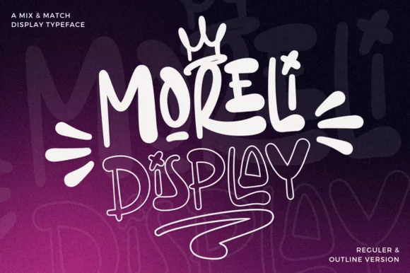
Moreli
Moreli is a playful mix-and-match street-bubble display typeface shipped in both solid Regular and matching hollow Outline versions.
Moreli is a street-art bubble and outline graffiti display duo: the fill cut is a fat rounded bubble with a wide flare and a slight lean, while the outline cut traces the same shapes as a hollow keyline for a second colour behind or in front. The pair is designed to be layered, so the outline only makes sense when it is registered against the fill. The keyline is the finest element and it closes first when the face is reduced. The fill needs roughly 36 mm and the outline 44 mm for their detail to read.
Recommended project & layout
Streetwear drop tee, skate sticker & podcast cover — Stack the solid Regular style on line one at 110% scale above the Outline style on line two, tilting the whole lockup 5 degrees.
Before you cut or print
Use the solid Regular cut for vinyl decals; reserve the fine double-wall Outline version for screen printing, DTF, or large posters.
Best paired with
Get fontPaid link
 #16
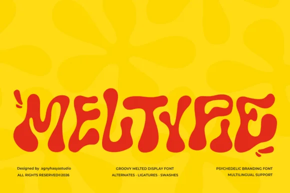
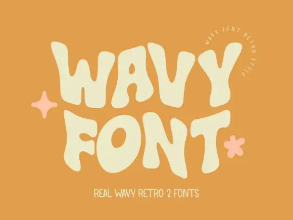
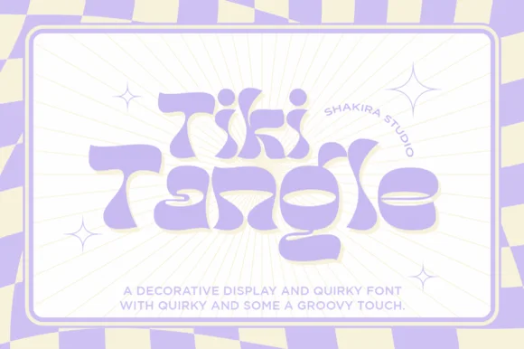
Meltypie
Meltypie is a bold, bottom-heavy psychedelic display typeface with liquid, syrup-like curves that swell and drip along the baseline.
Meltypie is a liquid melted psychedelic groovy display: letters drawn as soft blobs with stretched joins, drips hanging from the baseline and round terminals that sag under their own weight. It is the lettering of a seventies poster, and the drips are what make the word look poured rather than written. The drips are the finest element and they merge into neighbours as soon as the face is reduced. It needs roughly 40 mm for the drip and the blob to read, and it is best in two flat inks on coated stock where the edge stays crisp.
Recommended project & layout
Artisan pizza box, ice-cream pint & cookie-shop logo — Set a single 5-to-9-letter brand or treat name large across the center panel in high-contrast red, chocolate, or butter yellow, paired with a crisp grotesk subline.
Before you cut or print
Rounded, bulbous contours have no fragile sharp spurs, making Meltypie surprisingly easy to cut on bold sign vinyl and DTF shirt transfers.
Best paired with
Get fontPaid link
 #17
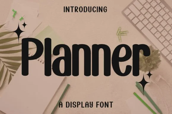
Planner
Planner is a clean, bold condensed display sans (not a messy script) featuring smooth rounded terminals and tall, space-saving lowercase.
Planner is a bold condensed rounded-terminal display sans: narrow squared stems, fully rounded ends, a level baseline and a heavy even weight that fits a long label inside a small box. The condensation keeps a word on one line where a wider face would wrap, and the rounded ends are the only soft detail. It needs roughly 22 mm for the rounded end and the counter to read, and it is best in one bright ink on white, or a single dark colour on pastel paper where the rounded ends stay open.
Recommended project & layout
Binder spine vinyl, GoodNotes tab header & desk bin decal — Set mixed-case labels at 0.65–1.25 inches tall with +5 tracking for crisp, uniform shelf organization.
Before you cut or print
One of the cleanest, fastest fonts in the catalog to cut and weed on Cricut vinyl and HTV at small sizes.
Best paired with
Get fontPaid link
 #18
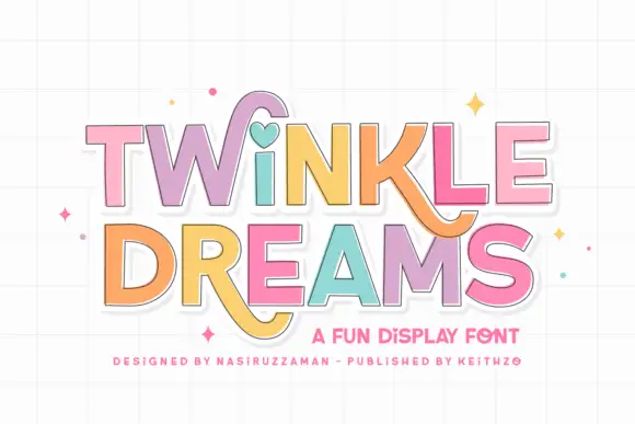
Twinkle Dreams
Twinkle Dreams combines firm block capitals with a heart-shaped dot above the i and curling extensions on selected letters, where the R and K tails swing below the main rows, each letter takes a pastel fill with a fine dark edge and the whole block sits on a faint grid.
The bodies stay blocky and even, the edges stay fine, the fills change per letter and two letters drop long tails under the baseline. That heart dot is the character: a plain display face gains one playful substitution, which is why the sample keeps a short title. The grid and the sparkles are cover treatment. Keep 40 pt so the fine edges stay separate from the fills, verify the heart form in your file and check the swinging tails against the line beneath.
Recommended project & layout
A wish-themed party invitation — Keep the phrase large with clear room below any R tail; place details in plain text.
Before you cut or print
Check the actual letters and do not assume a heart appears in words without i.
Best paired with
Get fontPaid link
 #19
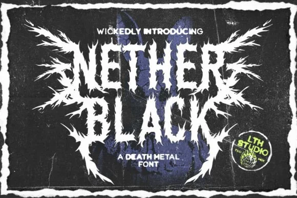
Nether Black
Nether Black is a ferocious death-metal display typeface erupting with symmetrical thorn spikes and splintered outer wings.
Nether Black is a jagged symmetrical death-metal thorn display: dense blackletter-derived stems with spikes thrown from every arm, mirrored ornaments along the vertical axis and a solid inner field that makes each word read as a barbed plate. It is a scene face, so it belongs on a record sleeve and a club flyer rather than on a product label. The spikes are the finest element and they fill into a solid edge when the face is reduced or screened. It needs roughly 40 mm for the spikes and the stems to read, and it is best one white ink on a black ground or the reverse.
Recommended project & layout
Haunted-attraction merch hoodie & horror gig poster — Stack two short 4-to-6-letter words centered on a black garment back, using the winged outer alternates only on the first and last letters.
Before you cut or print
Skip cut-and-weed vinyl on the razor-fine thorn tips—use DTF transfers, screen printing, or high-resolution poster print instead.
Best paired with
Get fontPaid link
 #20
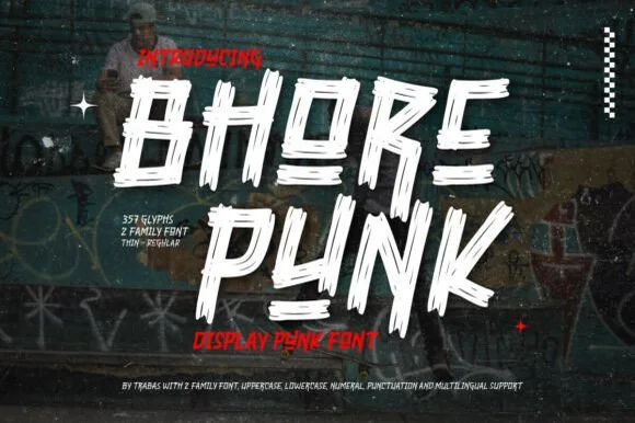
Bhore Punk
Bhore Punk is a fierce, slanted punk-rock display typeface sliced through with diagonal razor-cut stencil splits and jagged dry-brush spurs.
Bhore Punk is a slashed stencil-cut punk and streetwear display: squared letters cut through by three or four parallel slashes, with hard corners, a slightly uneven baseline and small torn bridges left holding the pieces together. The slashes are the design and they merge into solid notches as soon as the face is reduced. It needs roughly 30 mm for the slash and the bridge to read, and it is best as a one-colour vinyl cut or a flat two-colour print on uncoated stock.
Recommended project & layout
Punk gig flyer, skate zine masthead & album cover — Stack 2 short all-caps words tight in stark white and red over high-contrast monochrome photography.
Before you cut or print
For DIY spray-paint stencils or large HTV back prints, scale letters to 2 inches+ so all separated slash fragments stay easy to align.
Best paired with
Get fontPaid link
 #21
Street Blaze
Street Blaze is a heavy graffiti capital alphabet in which the letters swell into bubbles, the contours chip and the stems carry a rough inner edge, so a two-word title reads as something sprayed on a wall.
The S curls a fat spine, the t crosses a thick bar, the r turns a rounded arm, the e fills a heavy eye, the b closes a wide bowl and the l stands on a fat stem, all at a graffiti weight with rounded outer contours and a ragged inner edge. The combination of soft outline and rough fill is the character: it reads as spray paint rather than as vinyl, which is why the sample sets two words over a torn paper ground with splatter around them. Because the shapes are solid, the face holds from 30 pt and prints in one dark colour. The torn paper, the orange splatter, the crown and the marker line are presentation; the black bubble words are the face.
Recommended project & layout
Streetwear chest print, gaming thumbnail or sneaker sticker — Add a white sticker outline over gritty concrete or halftone textures.
Before you cut or print
Solid thick shapes cut cleanly on HTV and sticker vinyl (surrounding spray splashes on cover are backdrop art).
Best paired with
Get fontPaid link
Matched Font Duos & Packs
9 fonts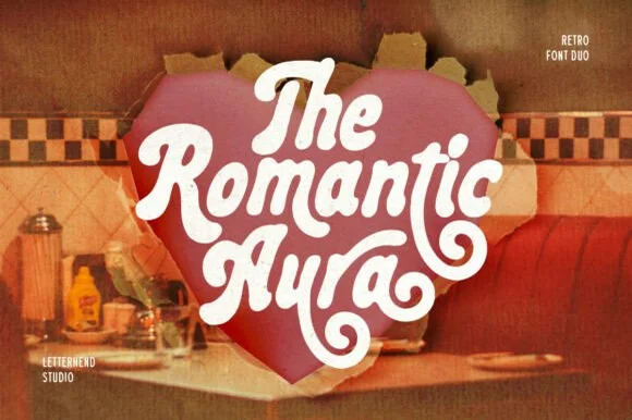 #22
Romantic Aura Duo
Romantic Aura Duo pairs a thick, velvety 1970s swash script with a clean companion voice for nostalgic love notes and merch.
Romantic Aura Duo pairs a nineteen-seventies swashed retro script with a rounded sans: the script runs a high-contrast stroke with wide swelling swashes that lift above and below the line, while the sans is a soft rounded block for details and lists. The pair is a period look, so it works best in two warm flat inks on a light ground rather than in photographic tints. The swash thins are the finest element and they break first. The script needs roughly 32 mm and the sans 20 mm for their detail to read.
Recommended project & layout
Retro Valentine sweatshirt, mug wrap & galentine card — Stack 2 to 3 centered words tightly inside a heart or arch silhouette so rising ascenders nest into the gaps of the line above.
Before you cut or print
Weld all overlapping script letters before cutting HTV, and keep total lockup width at 3.5 in+ so tight inner 'e' and 'a' counters weed cleanly.
Best paired with
Get fontPaid link
 #23
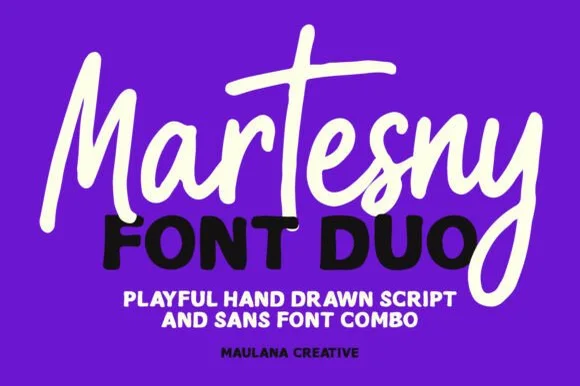
Martesny
Martesny combines a lively, tall-crossed hand-drawn marker script with a solid, rounded geometric uppercase sans partner.
Martesny is a duo of an energetic marker brush script and a chunky rounded sans: the script runs a wet loaded stroke with small flicks and joined letters, while the sans is a fat rounded block with tight counters for badges and prices. The pair carries a loud card in one ink, and the marker edge is the finest element. The script needs roughly 24 mm and the chunky sans 26 mm for their detail to read, and both work in one bright ink on white.
Recommended project & layout
Podcast cover, YouTube thumbnail & custom party hoodie — Let the script's descending 'y' or 'g' overlap slightly across the corner of the bold uppercase sans line beneath it.
Before you cut or print
Both the chunky sans and medium-thick marker script weed reliably on HTV and decal vinyl at 1 inch+ scale.
Best paired with
Get fontPaid link
 #24
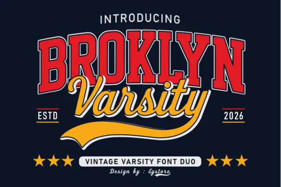
Broklyn Varsity
Broklyn Varsity pairs tall collegiate slab capitals drawn with an inline outline against a sweeping script that sits between them and drops a heavy sport tail below the baseline.
The caps half is nested: a red face with a white inline and a dark edge, every letter narrow and tall, the B and the R carrying small bowls high on long stems and the Y ending in a sharp fork. That nesting is what gives the word its vintage athletic look at a distance. The script half is a bold slanted hand with rounded tails, set across the middle of the caps so the two halves overlap, and it finishes with a broad sport tail that sweeps out to the right beneath both words. The pairing works because the caps supply height and the script supplies motion. The navy ground, the stars, the ESTD and year markers and the small credits are presentation; the duo is the two words.
Recommended project & layout
A varsity-club event header — Keep the block title above the script line and leave the underline a clear bottom margin.
Before you cut or print
Verify both supplied styles and whether the long y underline is accessible.
Best paired with
Get fontPaid link
 #25
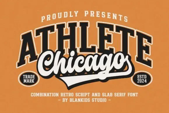
Chicago Athlete
Chicago Athlete pairs a tall arched slab word with a thick flowing script below, where the script carries round loops and a long terminal that forms the lower edge of a badge.
The slabs stay tall and arched, the script thickens and flows, the loops close round and the final stroke flattens out to close the shape at the bottom. That shared edge is the character: the two members read as one badge rather than two lines, which is why the cover binds them with cream borders and shadows. The overlap is a designed lockup and not an automatic alignment, so build the arch and the edge yourself and check that any two words will actually meet that way.
Recommended project & layout
A neighbourhood club identity study — Keep the slab row above the script and allow the lower tail to define the badge edge.
Before you cut or print
Verify both supplied styles and confirm any club or location naming rights.
Best paired with
Get fontPaid link
 #26
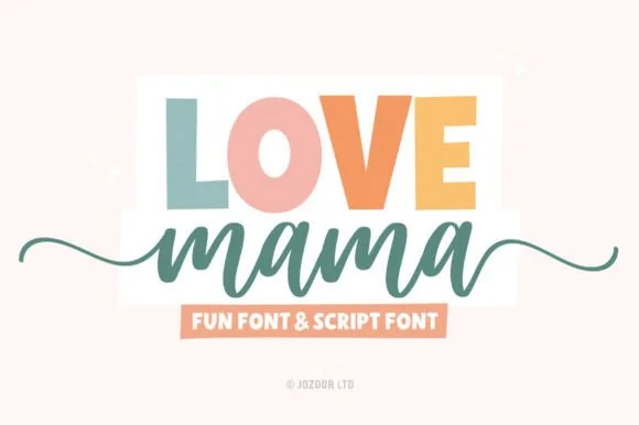
Love Mama
Love Mama pairs a bold, slightly tapered block sans with a smooth horizontal-tailed script, presented for custom mom shirts, mugs and baby gifts where the block line sits above a tailed lowercase script line.
The block letters stay bold and tapered, the script stays smooth, the join runs continuous and the tail sweeps horizontally under the word. That role split is the character: a statement line and a soft signature share one layout, which is why the sample keeps the block above and the script below. Confirm both files and their metrics, check how the tail interacts with the line above, and keep the script at 20 pt or more so the joins do not collapse.
Recommended project & layout
Custom Mama & Mini shirt set, mug wrap or tote bag — Colour each uppercase letter in muted earth/pastel tones above a solid script line.
Before you cut or print
Both members have sturdy stroke widths that cut and weed cleanly on HTV.
Best paired with
Get fontPaid link
 #27
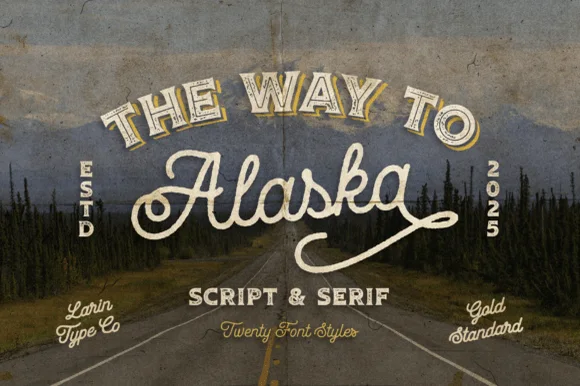
Way to Alaska
Way to Alaska is a monumental 20-font vintage signboard superfamily by Pasha Larin pairing heritage brush scripts with arched Western/signboard serifs!
Way to Alaska is a twenty-font vintage signboard superfamily built around a heritage script and a companion serif, with layered shadows, inlines, outlines and small ornaments that all share one skeleton. The size of the family means a whole shopfront can be built from one voice, but the layers must be picked deliberately or a panel turns into a stack of outlines. The script needs roughly 24 mm and the serif 20 mm for their detail to read, and two inks cover most of the family.
Recommended project & layout
Craft distillery / brewery badge, coffee roaster & apparel line — Arch the vintage Serif ('THE WAY TO', 54 pt) above sweeping 'Alaska' Script (110 pt) flanked by vertical 'ESTD / 2026' stamps!
Before you cut or print
Use the clean solid styles for crisp Cricut HTV, Oracal 651 & laser engraving; use textured/inline styles for DTF, print & labels!
Best paired with
Get fontPaid link
 #28
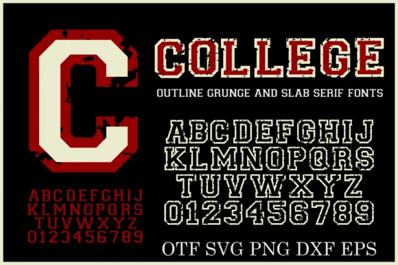
College Grunge
College Grunge is a powerhouse 2-font + cut-file varsity pack pairing a rough distressed slab WITH a crisp double-outline collegiate slab in OTF, SVG, PNG, DXF & EPS!
College Grunge is a two-font collegiate pack of a distressed varsity slab and a clean double-outline cut, with vector and raster files for cutting: the distressed cut carries chipped edges and uneven ink, while the clean cut has a second keyline inside the first. The pair lets one shirt show a worn name and a crisp second line, and the clean cut is the weaker element at small sizes. The distressed slab needs roughly 30 mm and the double outline 34 mm for their detail to read.
Recommended project & layout
Cricut varsity hoodie, senior banner & letterman decal — Layer the clean Outline font in white HTV around solid athletic crimson or navy—or print the Grunge fill on vintage tees!
Before you cut or print
Use the CLEAN Outline style + included SVG/DXF files for fast Cricut/Silhouette vinyl cutting; use the Grunge style for DTF & print!
Best paired with
Get fontPaid link
 #29
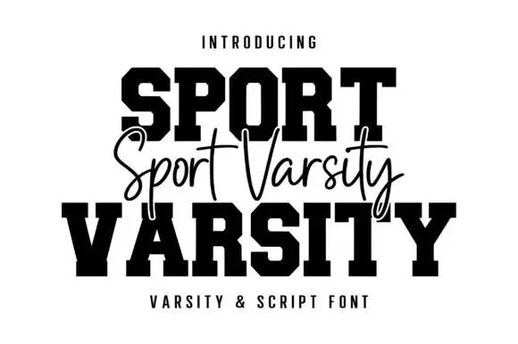
Sport Varsity
Sport Varsity pairs heavy clipped-corner slab capitals with a much thinner flowing script, where the block O has a tall angular counter and the script crosses the centre with long t bars, a deep y loop and a sweeping entry stroke from the left.
The caps stay square and heavy, the corners clip at an angle, the script stays fine and crosses the block row, and two strokes sweep far outside the word. That crossing is the character: the script is placed on the join between the two cap rows rather than under them, which is why the sample stacks three rows. Keep 48 pt for the caps and 22 pt for the script, leave 20 mm for the entry sweep and check the y loop against your bottom margin before locking the stack.
Recommended project & layout
A school-team fundraiser poster — Keep the large title in two lines and place a script accent in a separate gap, not over essential counters.
Before you cut or print
Check which styles are included and whether the fine script prints clearly.
Best paired with
Get fontPaid link
 #30
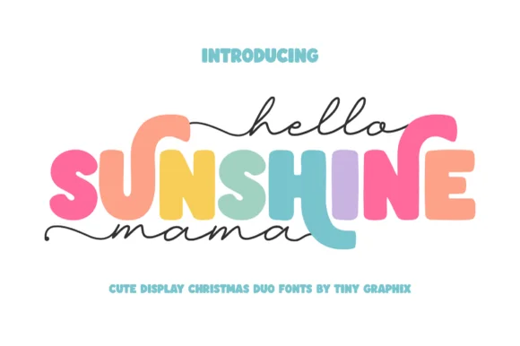
Hello Sunshine Mama
Hello Sunshine Mama pairs chunky rounded caps that can each take a different colour with a fine monoline script that runs above and below the caps in long flat strokes.
The cap half is heavy and soft: the S swells through two fat curves, the U holds a deep bowl, the N keeps one thick diagonal and the E carries three even arms, all rounded and even in weight. Because each letter is a separate shape of equal weight, the sample fills them in different colours, which is how the pair is meant to be used on children's pieces. The script half is a light monoline with flat entry and exit strokes that extend well past the caps on both sides, and that sweep is what holds the composition together. Contrast comes from weight, not from style, so the two layers never fight. The white ground, the pink script, the pastel fills and the two caption lines are presentation; the duo is the lettering.
Recommended project & layout
Mother's Day sweatshirt, tote or tumbler — Set the middle keyword in rainbow/earth-tone caps and sandwich with lowercase tailed script.
Before you cut or print
Thicken the thin monoline script slightly (0.02" offset) if cutting small adhesive vinyl decals.
Best paired with
Get fontPaid link
Serifs & Slab Serifs
3 fonts #31
Varsity Spirit
Varsity Spirit is a layered varsity capital alphabet in which each letter carries an inline stroke, a keyline and a set of matching numerals, so a team name reads as the appliqué on a college jacket.
The V cuts two thick diagonals with an inline running between them, the S holds a stepped spine, the A pinches a flat apex, the R turns a notched leg and the numerals carry the same inline and keyline, all at a heavy slab weight with square serifs. The inline is the character: it divides each stroke into two bands, which is why the sample sets a stacked word above a full numeral line. Because the inline is narrow, the face needs 40 pt before it stays open, and each layer has to be a clean vector for a vinyl or embroidery cut. The white timber ground, the format strip and the small badge are presentation; the black and white layered words are the face.
Recommended project & layout
A school-spirit event poster — Put a broad title over a separate plain schedule and keep the inner lines away from background patterns.
Before you cut or print
Check every required numeral and letter rather than assuming the sample alphabet is complete.
Best paired with
Get fontPaid link
 #32
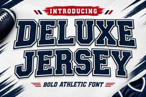
Deluxe Jersey
Deluxe Jersey is a classic double-outlined collegiate varsity slab serif built for athletic chests, senior jerseys, and team banners.
Deluxe Jersey is a collegiate varsity block slab with an inline border: extended block letters with thick unbracketed slabs, a thin keyline running just inside the outer edge and a small notch on the terminals that reads as a stitched jersey patch. The inline border doubles the footprint and closes first when the face is reduced. It needs roughly 32 mm for the border and the notch to read, and it is best in two flat inks on jersey, or one thread colour on a patch where the border becomes an inner stitch line.
Recommended project & layout
Senior-night jersey chest, spirit hoodie & megaphone decal — Arch the school or team name slightly across a 10.5-inch chest width above large centered player numerals.
Before you cut or print
Because the built-in outer outline creates a thin channel around every letter, scale HTV cuts to at least 1.5 inches tall or use DTF/sublimation for tiny badges.
Best paired with
Get fontPaid link
 #33
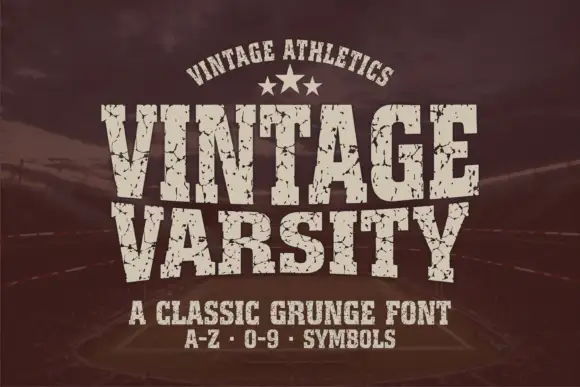
Vintage Varsity
Vintage Varsity is a condensed athletic capital alphabet with heavy flat slabs and a cracked wear texture, so a short word reads as a printed team jersey from decades ago.
The letters are narrow and tall: the V closes to a sharp point, the A keeps a low bar, the R carries a straight leg and the S reverses through flat terminals, with slabs at every stem and no bracketing. The wear is drawn into the letterforms rather than applied as an effect: cracks run through the slabs and a few counters show chipped edges, which is what gives the face its printed-jersey look. Weight is heavy and uniform, the fit is tight enough that a long team name holds a single line, and because the texture is coarse the face needs a decent size to stay legible. The dark ground, the cream ink, the star rule and the two small caption lines are presentation; the typeface is the two words.
Recommended project & layout
A reunion match poster — Keep dates and scores in a clean companion face.
Before you cut or print
Inspect cracks in the narrowest strokes.
Best paired with
Get fontPaid link
Practical buyer checklist
Frequently asked questions.
Key cutting, printing and pairing answers before choosing a t-shirts, hoodies & HTV apparel typeface.
What is the smallest text that survives on heat-transfer vinyl?
About 0.25 inch cap height with strokes no thinner than 0.5 mm. Below that the weed process pulls letters apart, and the press can fold a narrow stroke over itself, leaving a lump after the first wash.
Do I mirror the design for HTV or for DTF?
Mirror for HTV because it cuts face down on the carrier. DTF transfers are printed and pressed face down too, so mirror those as well. Adhesive vinyl decorates a flat surface face up and needs no mirroring at all.
Why does my script shirt crack along the joins?
Thin connector strokes on a stretchy knit take all the movement. Place the design so it does not cross the highest stretch point, use a stretch-capable film, and press a second pass through a cover sheet to bond the joins fully.
Can I use one font for both a shirt and a tumbler?
Often yes, but the sizing rules differ. Apparel can go larger and thinner; drinkware needs shorter lines and thicker strokes. Keep the same face across a product range and change the layout rather than the typeface.
Keep exploring
Related collections & guides.
Explore adjacent maker roundups or check our practical pre-production checklists.
01 / Branding & Print
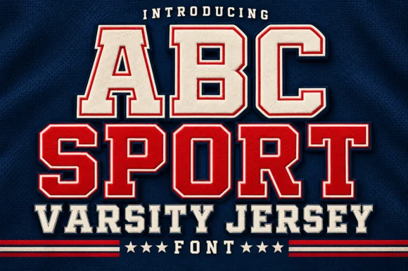
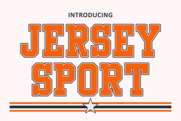
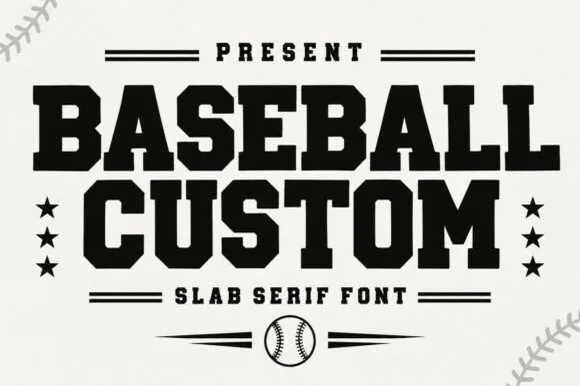
Varsity & athletic
25 curated fonts · Previews & pairings
02 / Type Styles
Brush & streetwear
27 curated fonts · Previews & pairings

03 / Occasions & Milestones
Mama shirts, Dad gifts & family
20 curated fonts · Previews & pairings
04 / Type Styles
Retro 70s & groovy
31 curated fonts · Previews & pairings
Guides: Invitation font checklist · Vinyl & cutting checklist · How to pair script & sans fonts