Neutral Sans Workhorse

Pogat + Memoir Slang
Lets Pogat own the focal silhouette while handling secondary copy, sizing and subheads cleanly.
Inspect Memoir Slang specimenDisclosure: MakerFileHub may earn a commission from qualifying purchases via paid links on this page. How our links work.
Ultra-fat heavy-packaging & cereal-box geometric display
Pogat is an ultra-heavy, slab-thick retro packaging font with massive ink mass and tiny circular pinhole counters built for snack and food branding!
Paid link
Get this fontProject & layout blueprintsAt-a-glance maker compatibility
Sturdy stroke walls and open counters weed cleanly on adhesive vinyl, HTV apparel film, and cut cardstock.
Visual anatomy & craft review
Pogat is an ultra-fat geometric display built for packaging and cereal boxes: near-solid slabs, tight counters reduced to small slots, a level baseline and a chunky regularity that reads as a printed carton front. The slots are the only negative space and they close first, and the weight makes a word very wide. It needs roughly 34 mm for the slot and the slab edge to read, and it is best in two flat inks on board, or one ink plus a knocked-out slot on coloured stock.
Cereal-box-fat · Pin-counter · Snack-bold
Two-font hierarchy recipes
Tested contrast partners — pairing Pogat with grounded secondary typography.
Pogat + Memoir Slang
Lets Pogat own the focal silhouette while handling secondary copy, sizing and subheads cleanly.
Inspect Memoir Slang specimen
Pogat + Vanielst Elegant Serif Display Stylistic
Grounds bold display lettering with classic typographic authority on posters, badges and apparel.
Inspect Vanielst Elegant Serif Display Stylistic specimenPractical applications
Concrete hierarchy, scale and production guidance tailored to Pogat’s stroke geometry.
An ultra-fat geometric display reads as a supermarket carton rather than a designed logo, which is what a small food brand wants on shelf. The slots hold at 40 mm on a box, and two flat inks print the carton and the shelf card in one order.
Hierarchy & layout recipe
Box front 200 x 280 mm, word 60 mm with 10 mm slot clearance, claims 10/14 pt, 15 mm margins. Shelf card 148 x 105 mm, word 30 mm, 8 mm margins. Label 90 x 60 mm, word 20 mm, 5 mm die margin.
Pre-production check
A 90 x 60 mm label at 20 mm closes the slots entirely and the name reads as a solid tile. Raise the label word to 28 mm, and check one label on the product before the run.
An ultra-fat display turns a magazine cover into a printed carton front, which is what a food issue wants on shelf. The slabs hold at 84 pt on a coated cover, and two flat inks keep the slots open against the photograph.
Hierarchy & layout recipe
Cover 210 x 297 mm, title 84 pt with 12 mm slot clearance, cover lines 10/14 pt over two columns of 82 mm, 15 mm margins and a 10 mm head. Opener 60 pt with 10 mm of clear ground. Section head 30 pt with 8 mm above and 6 mm below.
Pre-production check
At 30 pt on the section head the slots fill and the head reads as a solid bar. Keep the face at 48 pt and above, and proof one spread at 1:1.
An ultra-fat display reads across a field at a summer festival where a thin face would vanish. The slabs hold at 160 mm on a poster, and two flat inks print the poster and the tote from one separation.
Hierarchy & layout recipe
Poster A2, word 160 mm with 15 mm slot clearance, details 44 mm, 20 mm margins. Stage banner 3000 x 800 mm, word 280 mm, 60 mm safe edge. Tote print 300 x 300 mm, word 80 mm, 25 mm margins.
Pre-production check
Screen printed on a tote at 80 mm the slots bridge and the word fills into a solid block after the first wash. Use a 2 mm stencil bridge, and wash one sample before the order.
Technical & licence verification
Confirm included OTF/TTF/WOFF formats, full glyph tables and licence coverage on the live store page before batch production.
Closest visual alternatives
Matched across letterform anatomy, stroke behaviour and craft applications.
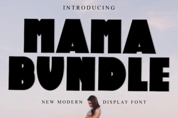
Fat condensed display with notched counters
Mama Bundle is a fat condensed display in black on a pale sky: extremely heavy strokes, counters reduced to narrow slots, letters set almost touching, and small notches cut into the tops of the M and the A that keep the mass from reading as a solid block.
Ideas for this font
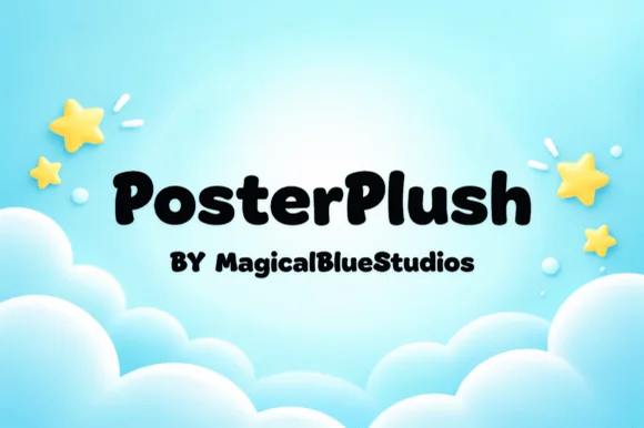
Heavy plush hand-drawn rounded poster display
Posterplush is a bold, velvety-thick rounded display font combining heavy black poster mass with warm hand-drawn softness.
Ideas for this font
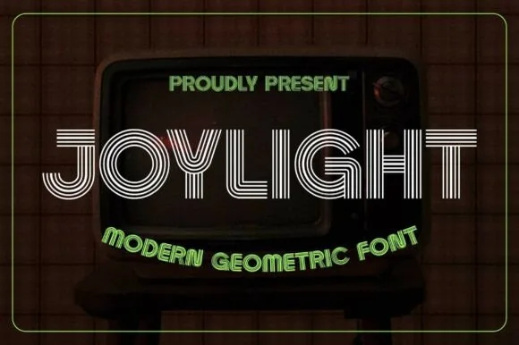
5-line concentric 1980s CRT-TV & synth-funk multiline sans
Joylight is a sleek retro-futuristic multilinear display font tracing geometric uppercase letters in five crisp parallel neon-ready tracks.
Ideas for this font
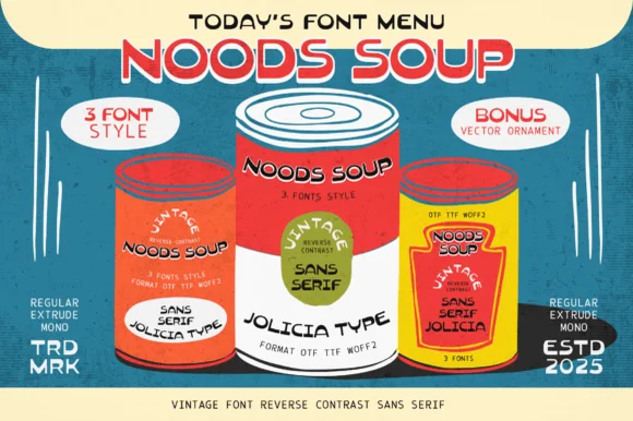
Three-style retro reverse-contrast bundle
Noods Soup is a three-style retro bundle in red, yellow and cream: a reverse-contrast display offered as regular, extruded and mono, shown on three soup-can mockups with a menu-style headline and quarter-circle badges, so the sheet reads as a period packaging kit.
Ideas for this font
Same independent foundry
Allow optional Google Analytics to measure visits and catalogue actions. Your search words and notes are not included. Privacy & storage