High-Contrast Display Serif

Mansory + Grandeur – Elegant Classic Serif
Pairs sculptural editorial warmth with Mansory's clean modern geometry.
Inspect Grandeur – Elegant Classic Serif specimenDisclosure: MakerFileHub may earn a commission from qualifying purchases via paid links on this page. How our links work.
Light contrast capital sans
Mansory is a light contrast sans in black on cream, shown small against a sunlit venetian blind: wide capitals with a broad circular O, fine diagonal joins and hairline uprights, with a small serif line beneath and an italic credit under that.
Paid link
Get this fontProject & layout blueprintsAt-a-glance maker compatibility
Sturdy stroke walls and open counters weed cleanly on adhesive vinyl, HTV apparel film, and cut cardstock.
Visual anatomy & craft review
The word is set small on a large sheet, which is an unusual and useful choice: it shows that the face is not only a display cut and that the thin diagonals hold at a modest size on a plain ground. The drawing is a contrast sans in caps: the O is broad and circular, the joins are hairline diagonals, and the uprights are thin, which gives the face an elegance that a grotesque cannot reach. The blind behind it is staging that provides a soft shadow rather than a subject. The two lines beneath are set in a serif and an italic at a fraction of the size, which shows how the family is meant to pair. Because the strokes are fine, the face works on coated stock and on screen at moderate sizes.
Sans serif, light, elegant, minimal
Two-font hierarchy recipes
Tested contrast partners — pairing Mansory with grounded secondary typography.
Mansory + Grandeur – Elegant Classic Serif
Pairs sculptural editorial warmth with Mansory's clean modern geometry.
Inspect Grandeur – Elegant Classic Serif specimen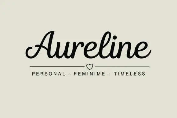
Mansory + Aureline
Introduces organic movement on pull-quotes, signatures and gift tags.
Inspect Aureline specimenPractical applications
Concrete hierarchy, scale and production guidance tailored to Mansory’s stroke geometry.
A light contrast sans gives a practice a mark with presence at modest sizes, which the small setting on the sheet demonstrates.
Hierarchy & layout recipe
Set the mark at 16 pt on a card, 90 mm on a wall and 11 pt in a footer, keeping the hairlines uncut. Keep one colour and clear space equal to the cap height.
Pre-production check
Check the 11 pt footer on uncoated paper, where a hairline can fill; keep the size above 12 pt. Confirm the wall mark reads at eight metres and that the O stays circular in vinyl.
A light contrast sans gives an art cover restraint, and the broad O lets a short title hold a wide measure without a second weight.
Hierarchy & layout recipe
Set the title at 90 mm cap height across 205 mm with wide tracking, the subtitle in a 9 pt serif, and the date at 8 pt. Print one ink on a matte stock.
Pre-production check
Check the title at 90 mm, where a hairline diagonal can break; keep it above 0.25 mm. Confirm the 8 pt date survives lamination and that the tracking stays even across the line.
A light contrast sans reads as contemporary formality, and the thin diagonals hold in letterpress on a smooth, dense card.
Hierarchy & layout recipe
A5 invitation: the names at 24 pt, the request in a 9.5 pt serif, and the date at 8.5 pt caps. Keep 24 mm margins and letterpress one ink on a heavy card.
Pre-production check
Check the 24 pt names in letterpress, where a hairline diagonal can sink; proof the plate first. Confirm the 9.5 pt request reads at arm's length and that the names clear the trim.
Technical & licence verification
Confirm included OTF/TTF/WOFF formats, full glyph tables and licence coverage on the live store page before batch production.
Closest visual alternatives
Matched across letterform anatomy, stroke behaviour and craft applications.
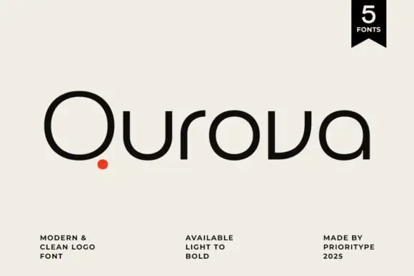
Rounded geometric logotype family
Qurova is a rounded geometric sans in near-black on cream: mixed case with a wide open Q circle, a separate red dot set below the tail, broad arches and an even stroke, with a small format note, a weight range and a credit spread along the foot.
Ideas for this font

Light geometric capitals with circular O and broad angular diagonals
Modern Heritage shows black capitals in two closely stacked lines on white, where thin nearly even strokes form a circular O, a broad M and N and a large triangular A, while the G keeps an open right side with a short inner bar.
Ideas for this font
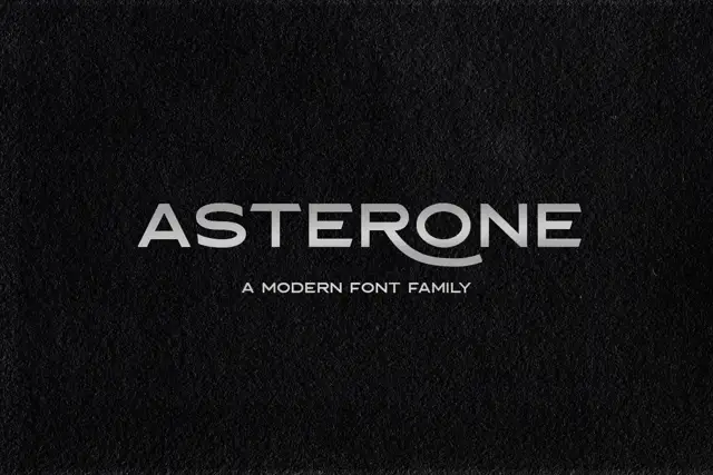
Wide low capitals with flat arms and a sweeping curved R leg
Asterone centres a pale uppercase name on a dark textured field, where wide A and O shapes, long horizontal E arms and near-even strokes make a low extended line and the R leg continues into a curved flourish.
Ideas for this font
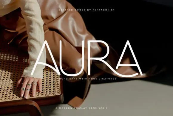
Light rounded capitals with long curved A bars and an extended R leg
Aura shows pale thin capitals over a dark fashion photograph, where near-even rounded strokes build an open U and a broad R bowl, the first A carries a long curved cross-stroke that sweeps toward the centre and the R leg continues below the final A as a broad flowing curve.
Ideas for this font
Same independent foundry
Allow optional Google Analytics to measure visits and catalogue actions. Your search words and notes are not included. Privacy & storage