Neutral Sans Workhorse

Posterplush + Prime Nordic
Lets Posterplush own the focal silhouette while handling secondary copy, sizing and subheads cleanly.
Inspect Prime Nordic specimenDisclosure: MakerFileHub may earn a commission from qualifying purchases via paid links on this page. How our links work.
Heavy plush hand-drawn rounded poster display
Posterplush is a bold, velvety-thick rounded display font combining heavy black poster mass with warm hand-drawn softness.
Paid link
Get this fontProject & layout blueprintsAt-a-glance maker compatibility
Sturdy stroke walls and open counters weed cleanly on adhesive vinyl, HTV apparel film, and cut cardstock.
Visual anatomy & craft review
Posterplush is a velvety-thick rounded display that mixes heavy black poster mass with hand-drawn softness, in mixed case with plump bowls and a warm, slightly irregular contour. The weight is enormous, so the letters read as a silhouette and the counters are small, which means the face needs size to stay legible. It needs roughly 32 mm for the rounded contour to read as drawn rather than as a fill fault, and it is best in jet black on a bright ground or in cream on deep blue.
Plush-chunky · Hand-rounded · Bold
Two-font hierarchy recipes
Tested contrast partners — pairing Posterplush with grounded secondary typography.
Posterplush + Prime Nordic
Lets Posterplush own the focal silhouette while handling secondary copy, sizing and subheads cleanly.
Inspect Prime Nordic specimen
Posterplush + Resquel
Grounds bold display lettering with classic typographic authority on posters, badges and apparel.
Inspect Resquel specimenPractical applications
Concrete hierarchy, scale and production guidance tailored to Posterplush’s stroke geometry.
A velvety heavy rounded face reads as a hand-painted café sign, which is what a neighbourhood bakery uses instead of a logo. The mass fills a box lid at 44 mm in one ink, and the soft contour keeps the heavy weight from looking corporate.
Hierarchy & layout recipe
Box 200 x 150 x 80 mm, word 44 mm on the lid, 25 mm margins. Poster A2, word 280 mm, details 22/28 pt, 30 mm margins. Menu header 210 x 60 mm, word 30 mm, 15 mm margins.
Pre-production check
A 44 mm solid black fill on kraft shows mottled patches where the ink sits unevenly, and the word looks dirty. Add a white underlay or print on a coated label, and check one assembled box before the run.
Heavy rounded letterforms read as a bold magazine opener, which is what a culture title wants above a long read. The mass carries a short title across the trim, and the soft contour gives it warmth without an illustration behind it.
Hierarchy & layout recipe
Cover 210 x 297 mm, title 110 pt, cover lines 9/12 pt, 18 mm margins and 10 mm trim. Opener 420 x 297 mm, headline 120 mm, body 9/13 pt. Quote 120 x 120 mm, text 24/30 pt, 10 mm margins.
Pre-production check
A 110 pt heavy word on uncoated stock gains ink and the small counters close, so two letters merge into a block. Set the title with 2 percent positive tracking, and check one printed cover before the run.
Plush heavy rounding reads as a hand-painted festival bill, which is what a small summer event tapes to a fence. The mass holds at 300 mm on a poster in one colour, and the soft contour looks deliberate at distance where a geometric face looks thin.
Hierarchy & layout recipe
Poster A2, word 300 mm, lineup 22/28 pt, 30 mm margins and 20 mm trim. Banner 2400 x 800 mm, word 380 mm, 150 mm margins with eyelets every 500 mm. Programme A5, cover 60 mm, acts 8/11 pt.
Pre-production check
A stage banner printed on mesh loses a heavy fill at the perforations and the word reads as a dotted silhouette. Print the word on a solid vinyl panel and sew it to the mesh, and check one hung panel in daylight.
Technical & licence verification
Confirm included OTF/TTF/WOFF formats, full glyph tables and licence coverage on the live store page before batch production.
Closest visual alternatives
Matched across letterform anatomy, stroke behaviour and craft applications.
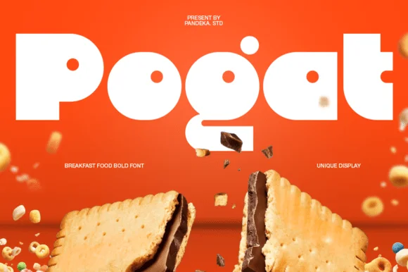
Ultra-fat heavy-packaging & cereal-box geometric display
Pogat is an ultra-heavy, slab-thick retro packaging font with massive ink mass and tiny circular pinhole counters built for snack and food branding!
Ideas for this font
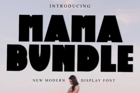
Fat condensed display with notched counters
Mama Bundle is a fat condensed display in black on a pale sky: extremely heavy strokes, counters reduced to narrow slots, letters set almost touching, and small notches cut into the tops of the M and the A that keep the mass from reading as a solid block.
Ideas for this font
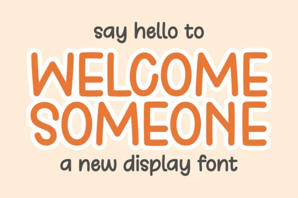
Tall rounded monoline display with keyline
Welcome Someone is a tall rounded monoline display in orange with a white keyline: narrow capitals of even stroke weight, softly squared corners, a slight bounce, and a wide white outline that separates the word from a pale ground.
Ideas for this font
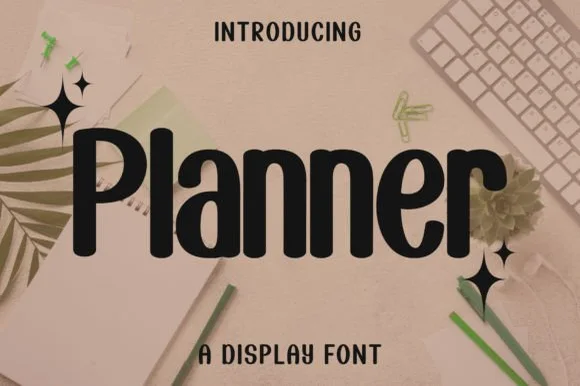
Bold condensed rounded-terminal display sans
Planner is a clean, bold condensed display sans (not a messy script) featuring smooth rounded terminals and tall, space-saving lowercase.
Ideas for this font
Same independent foundry
Allow optional Google Analytics to measure visits and catalogue actions. Your search words and notes are not included. Privacy & storage