Editorial Serif Anchor

Mama + Aureline
Anchors Mama's fluid strokes with crisp Roman proportions on wedding suites, headers and packaging.
Inspect Aureline specimenDisclosure: MakerFileHub may earn a commission from qualifying purchases via paid links on this page. How our links work.
Thick bold brush-calligraphy mama script
Mama is a heavy smooth brush-calligraphy script drawn for bold single-word apparel transfers, where broad cushioned downstrokes and smooth rounded joins give chest graphics rich coverage on sweatshirts and totes.
Paid link
Get this fontProject & layout blueprintsAt-a-glance maker compatibility
Weld or Unite overlapping script joins into one continuous vector path before sending to the blade.
Visual anatomy & craft review
The downstrokes carry the weight, the joins stay round and smooth, the counters close tight and the word holds its shape at just one or two terms. That cushion is the character: the lettering reads warm and hand-brushed while staying solid enough to weed cleanly from a vinyl sheet, which is why the sample keeps a single short word. The 'vinyl-ready' claim comes from the source rather than a test here, so proof your own word, keep 30 pt for print and check the weeding on a scrap before the run.
Chunky · Warm · Vinyl-ready
Two-font hierarchy recipes
Tested contrast partners — pairing Mama with grounded secondary typography.
Mama + Aureline
Anchors Mama's fluid strokes with crisp Roman proportions on wedding suites, headers and packaging.
Inspect Aureline specimen
Mama + Hermano
Keeps small-scale dates, URLs, nutrition facts and care instructions crisp and legible below script titles.
Inspect Hermano specimenPractical applications
Concrete hierarchy, scale and production guidance tailored to Mama’s stroke geometry.
The chunky brush script suits a family card, and the heavy strokes stay solid at 34 pt on an A6 sheet, where the cushion carries the warmth of a brush line.
Hierarchy & layout recipe
Print an A6 card: set the greeting at 34 pt on one row, keep 18 mm of clear ground beneath for the descenders, and set the name at 12 pt in a plain serif at the foot.
Pre-production check
Two heavy script rows on a small card crowd each other; check the card and keep the second line in a serif.
The bold script holds up as a single garment word, and the thick joins stay connected at 60 mm on a cut vinyl transfer, thick enough that the whole word weeds in one piece.
Hierarchy & layout recipe
Cut a 200 mm transfer: set the word at 60 mm, keep every join at 4 mm minimum so the vinyl weeds in one piece, and keep 12 mm of clear vinyl around the outer strokes.
Pre-production check
A join under 2 mm tears during weeding; check the cut file and hold the word at 50 mm or above.
The warm brush lettering suits a kitchen gift, and the heavy forms hold a short phrase at 24 pt on a 50 mm label, where the cushion keeps the word solid even on a narrow strip of paper.
Hierarchy & layout recipe
Print a 50 by 30 mm label: set the phrase at 24 pt on one row, keep 6 mm of clear ground beneath for the descending loop, and keep 4 mm of border on each side so no thick join is trimmed.
Pre-production check
A thick script printed at 14 pt fills its counters; check the plate proof and keep the phrase at 22 pt.
Technical & licence verification
Confirm included OTF/TTF/WOFF formats, full glyph tables and licence coverage on the live store page before batch production.
Closest visual alternatives
Matched across letterform anatomy, stroke behaviour and craft applications.
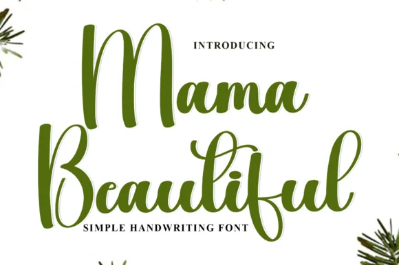
Tall looping brush script with expressive vertical ascenders
Mama Beautiful is a tall looping brush script in which the ascenders stretch far above the x-height, the downstrokes carry ink weight and the entries curl wide, so a two-word greeting reads as written with a brush pen.
Ideas for this font
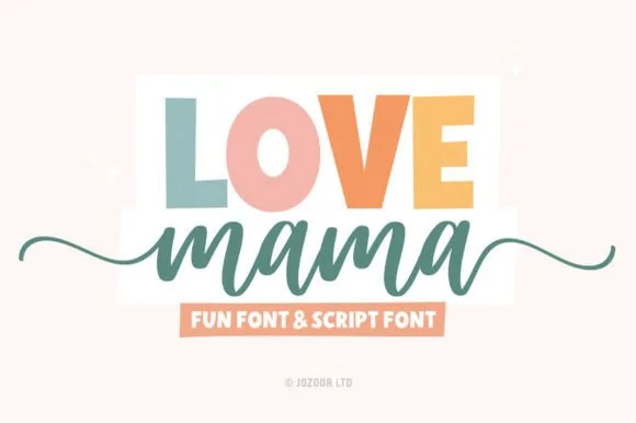
Chunky block sans & tailed cursive duo
Love Mama pairs a bold, slightly tapered block sans with a smooth horizontal-tailed script, presented for custom mom shirts, mugs and baby gifts where the block line sits above a tailed lowercase script line.
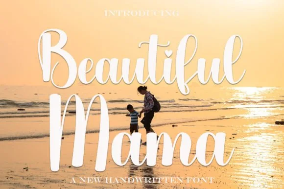
Bold bouncy sunset-beach brush calligraphy script
Beautiful Mama is a warm, thick-stroked brush calligraphy script (not a block display) featuring tall upright loops and sturdy vinyl-ready curves.
Ideas for this font
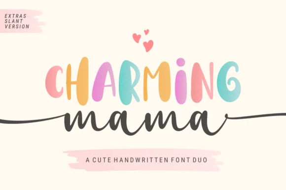
Playful tall sans & side-tailed script duo
Charming Mama combines a bouncy tall handwritten sans, supplied with a slant version, and a long-tailed cursive script for mugs, shirts and nursery signs, where the PUA-encoded beginning and ending horizontal tails stretch across wide sweatshirt chests and round signs.
Same independent foundry
Allow optional Google Analytics to measure visits and catalogue actions. Your search words and notes are not included. Privacy & storage