Neutral Sans Workhorse

Street Blaze + Lemon Milk Pro FTR
Lets Street Blaze own the focal silhouette while handling secondary copy, sizing and subheads cleanly.
Inspect Lemon Milk Pro FTR specimenDisclosure: MakerFileHub may earn a commission from qualifying purchases via paid links on this page. How our links work.
Heavy graffiti bubble caps with rough edges and paint splatter
Street Blaze is a heavy graffiti capital alphabet in which the letters swell into bubbles, the contours chip and the stems carry a rough inner edge, so a two-word title reads as something sprayed on a wall.
Paid link
Get this fontProject & layout blueprintsAt-a-glance maker compatibility
Sturdy stroke walls and open counters weed cleanly on adhesive vinyl, HTV apparel film, and cut cardstock.
Visual anatomy & craft review
The S curls a fat spine, the t crosses a thick bar, the r turns a rounded arm, the e fills a heavy eye, the b closes a wide bowl and the l stands on a fat stem, all at a graffiti weight with rounded outer contours and a ragged inner edge. The combination of soft outline and rough fill is the character: it reads as spray paint rather than as vinyl, which is why the sample sets two words over a torn paper ground with splatter around them. Because the shapes are solid, the face holds from 30 pt and prints in one dark colour. The torn paper, the orange splatter, the crown and the marker line are presentation; the black bubble words are the face.
Graffiti · Bubble · Rough
Two-font hierarchy recipes
Tested contrast partners — pairing Street Blaze with grounded secondary typography.
Street Blaze + Lemon Milk Pro FTR
Lets Street Blaze own the focal silhouette while handling secondary copy, sizing and subheads cleanly.
Inspect Lemon Milk Pro FTR specimen
Street Blaze + Resquel
Grounds bold display lettering with classic typographic authority on posters, badges and apparel.
Inspect Resquel specimenPractical applications
Concrete hierarchy, scale and production guidance tailored to Street Blaze’s stroke geometry.
The sprayed bubble shapes read as street signage, and the rough inner edge holds its detail at 35 mm on a cut vinyl sticker.
Hierarchy & layout recipe
Print a 70 mm round sticker: set the shop name at 35 mm, keep 5 mm inside the die so the chipped edge stays whole, and print the fill flat rather than with a texture overlay.
Pre-production check
A texture overlay on top of a drawn rough edge doubles the noise; check the printed sticker and keep only the drawn edge.
The graffiti weight fills a street art night headline on its own, and the rough contour still reads at 100 mm in one dark ink.
Hierarchy & layout recipe
Print an A2 poster: set the headline at 100 mm across the upper half, keep 30 mm of border, and set the time in a 16 pt marker sans in the lower band with 25 mm of clearance.
Pre-production check
A rough contour printed at 100 mm can look like a registration fault; check the proof and keep the inner edge consistent across letters.
The bubble weight suits a youth club zine project cover, and the chipped edge stays readable at 56 pt on a photocopied sheet.
Hierarchy & layout recipe
Print an A5 zine cover: set the title at 56 pt, keep an 18 mm margin all round, and photocopy from a 600 dpi original so the rough edge does not fill in.
Pre-production check
A photocopier at 300 dpi closes the rough inner edge; check the copy and print the master at 600 dpi.
Technical & licence verification
Confirm included OTF/TTF/WOFF formats, full glyph tables and licence coverage on the live store page before batch production.
Closest visual alternatives
Matched across letterform anatomy, stroke behaviour and craft applications.
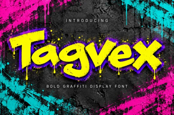
Dripping chisel-tip marker street-graffiti font
Tagvex is a chunky mixed-case graffiti display font combining wide chisel-marker strokes with hanging wet-paint drips.
Ideas for this font
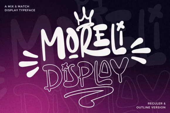
Street-art bubble & outline graffiti display duo
Moreli is a playful mix-and-match street-bubble display typeface shipped in both solid Regular and matching hollow Outline versions.
Ideas for this font
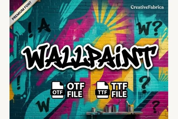
Graffiti brush display
Wallpaint is a graffiti brush display in black with a white outline on a painted brick wall: heavy strokes with wet, ragged edges, chunky joins, a tall ascender and a loose baseline, with spray-painted marks around the word, so the plate reads as a fresh piece rather than a lettered sign.
Ideas for this font
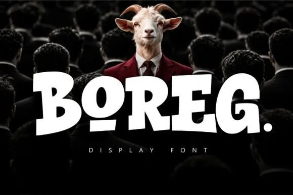
Stout heavy block urban display with rounded corners and tilted counters
Boreg is a stout urban display face in which the letters are short and wide, the strokes are fat and the counters tilt, so a short word reads as a painted hoarding rather than as a sign.
Ideas for this font
Same independent foundry
Allow optional Google Analytics to measure visits and catalogue actions. Your search words and notes are not included. Privacy & storage